On a narrow, sloping site in Muswell Hill, architect pH+ has responded imaginatively to a host of site constraints to produce a compelling example of how London’s awkward little corners can help tackle the capital’s housing shortage.
Last month’s Budget focused the mind, if any additional focus was needed, on the acute state of the UK’s housing crisis. The government committed to building 300,000 homes a year and, while there was broad scepticism on how or if this figure would ever be achieved, many acknowledged the renewed political willingness to address the problem.
In recent years, and in the Budget itself, much of the debate around increasing housing supply has (controversially) moved on to developing greenbelt rather than brownfield land. However, it is a stark fact that about 2% of London’s total area, or approximately 13 square miles, is unused or underdeveloped brownfield land. This is an area significantly bigger than Westminster and the City combined. Last year, property consultant Savills estimated that better use of this land could lead to an extra 1.4 million homes for the capital.
We often think of brownfield land as inhabiting broad expanses of deindustrialised landscape in the outer reaches of the capital, say in Hounslow and Havering. But a significant amount of it is actually in tiny, awkward and poorly accessed sites lurking among the more built-up areas of inner London.
In recent years, many London boroughs have seemingly acknowledged this situation and initiated projects that imaginatively reclaim sites such as former garages for housing. But in affluent Muswell Hill in north London, the private sector is leading the charge to transform London’s forgotten and unglamorous urban spaces into housing with an innovative new housing scheme.
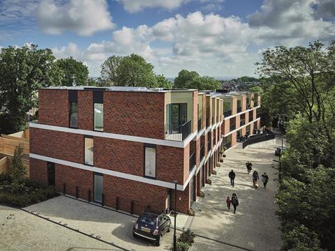
Pinnacle N10 has been designed by pH+ Architects for developer Jamm Living. It provides a total of 28 flats, six town houses, a community space and a commercial unit, all set within three buildings. These are located on a steeply sloping site that runs downwards from Muswell Hill itself, one of the highest points in the capital.
The site’s challenging topography was just one of a whole host of constraints that make it a perfect example of the kind of difficult brownfield nooks and crannies that might once have been ignored by both developers and councils but could now be part of the solution to London’s housing crisis.
Constraints
The first building lies at the top of the hill by the site entrance and includes a converted former pub with a new-build extension behind it. This building contains the commercial and community spaces on the ground floor and provides 14 flats, six of them affordable, on the upper two floors.
The next building, further down the slope, offers six three-storey town houses. And the final building, at the lowest point of the slope, contains 14 flats, again on three storeys.
As well as having a steep gradient, the site is an awkward shape – covering a linear, relatively narrow patch of land with only one vehicular access point. Despite this, any new development had to retain a public right of way through it. Not only is the site located next to a school, but it also itself housed a school, which would have to be accommodated within any new development.
To add to the challenge, the school was a special educational needs school for children with cerebral palsy, requiring sensitive consideration with regard to relocation, construction and design of its new premises.
The site is also located in the Muswell Hill conservation area and therefore finds itself in one of the most assiduously protected residential neighbourhoods in north London – with this protection being regularly and meticulously enforced by the council and a galvanised and highly empowered band of local residents. The fact the site is hemmed in by the rear facades of several adjacent properties meant overlooking and privacy issues had a profound impact on the final design.
And finally, despite the former pub now incorporated into the development being a revered local landmark, both it and the sheltered pub car park that once clustered behind it had a certain reputation for insalubrious activity.
In short, for all these reasons, if one were seeking sites appropriate for new housing, this would be far, far down the list.
Luckily, none of this fazed the design team, with pH+ director Andy Puncher proudly proclaiming that “constraints are what make design interesting”. It is evidently these constraints that have crafted many of the architectural decisions made on the scheme.
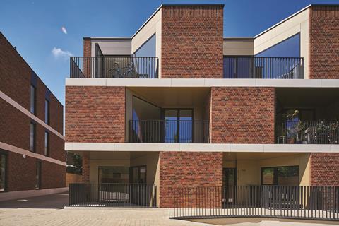
Probably the most obvious such effect of the constraints is the scheme’s overall architectural style, which a pH+ associate describes as a “contemporary reinterpretation of local Edwardian terraces”. Accordingly, each building is clad in distinctive red brickwork, whose rich hue resembles fired clay. This is subdivided by thick, white horizontal bands of stone that create a more temperate version of the rich stone dressings that commonly adorn Edwardian facades.
Contemporary reinterpretation
Decoration, at least in a muted, abstracted state, comes in the form of the raking monk bond brickwork pattern subtly etched into the patchwork like a quilt. And even the ubiquitous London terrace bay window reappears here, but in an inverted form that allows for the insertion of recessed balconies throughout the scheme. In a further twist, the recesses are clad in subtly shifting shades of bronze-coloured powder-coated aluminium.
All this is conveyed through stripped, streamlined surfaces and minimalist detailing. But even without the historical allusions, the buildings work as expressive, sculpted volumes in their own right.
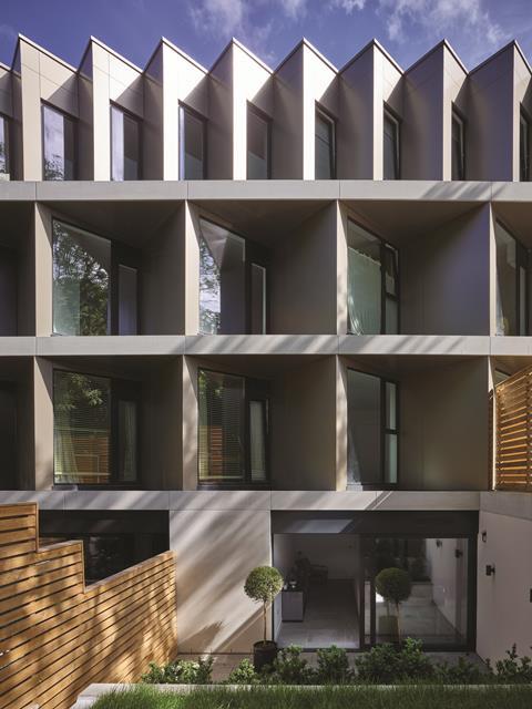
The rear facades, clad in aluminium rather than brick, are perhaps not quite as visually effective. But these too present a dynamism all their own, generated once again by an architectural response to a constraint. These facades face directly on to the rear gardens and facades of housing opposite. In order to minimise the overlooking that planners are so keen to avoid, the facade becomes a jagged profile of sawtooth bays inclined at an oblique angle, preserving the privacy of adjacent neighbours.
Topography, another major site constraint, has also been used for practical and visual benefit. Each building has a strongly articulated stepped quality. The town houses are most effective at conveying this quality, with each one expressed as a series of vertical blocks that march downwards like dominoes. By embracing the site’s difficult topography and embedding this into its architecture, the development creates a strong and distinctive character of its own.
Of course, the hill also offers stunning views over north London. In a nice piece of egalitarian engineering, it is the affordable units located within the highest building that enjoy the best views.
This highest building, which also incorporates the converted pub, also plays a crucial role in addressing the site’s other big constraint: the school. Originally located at the bottom of the hill, the aim was to improve accessibility by placing the school in this building right by the site entrance.
While the site was being redeveloped, the school was temporarily moved to a new location elsewhere in the borough, also designed by the same architect. But staff and pupils became so enamoured of their new premises that they decided to stay there.
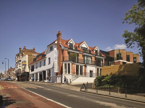
From school to home
This potentially left an inconvenient physical and commercial hole in the scheme. Luckily, as Puncher explains, a solution was to hand. “We’d always designed the school aligned with the structure and dimensions of residential accommodation. This was demanded by the client as a future-proof guarantee against any changes in site usage and, essentially, because residential development is a more stable investment.” So, during the construction phase, the upper two storeys of what had originally been earmarked for the school were built out as flats, with no disruption to structure or programme. The lowest floor has been left available for commercial and community uses – a relocated Muswell Hill library could be one of the potential end occupiers.
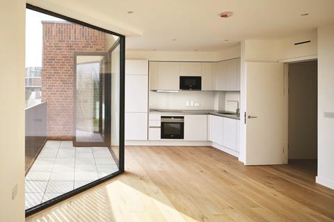
The housing itself was a tricky sell, for an awkward site that had never previously had a residential use. So the internal design of the units became paramount in establishing their market offer. The private units offer all the neutralised, minimalist accoutrements one has come to expect from the higher echelons of the London property market. The town houses, priced at £1.8m-2m, are particularly impressive, with floor-to-ceiling glazing and a generous amount of vertical transparency delivered by a dramatic series of plunging internal balconies and voids.
Possibly the most startling aspect of the town houses, however, is the “free” electric car given to each of the six households. Internal garages have been incorporated into the ground floor. While it is not uncommon for developers to offer ostentatious domestic trinkets of varying kinds in an attempt to induce purchase of higher-end properties, a car is virtually unheard of.
But as Jamm Living’s Tim Jackson explains: “It was certainly part of the market offer but combined with the charging points powered by rooftop solar panels it was a core part of improving the development’s green credentials.”
In its innovative response to a challenging set of constraints, Pinnacle N10 provides a compelling case study in how unused urban edge or gap sites can be dramatically reused for housing. Doubtless the affluence of the Muswell Hill neighbourhood concentrates the minds of the collective client and design body on quality in a way that lower land values in other areas might not quite achieve. But exactly the same challenges of topography, access, usage and context are manifest everywhere, and this ambitious scheme shows how these forgotten brownfield assets in our cities can be unlocked.
Project Team
Architect: pH+ Architects
Client: Jamm Living
Main contractor: Gilbert Ash
Structural engineer: Mason Navarro Pledge
Quantity surveyor: Jackson Coles
Landscape architect: pH+ Architects
M&E consultant: Sweco
Downloads
170518 p hplus muswell hill 043
Image, Size 70.96 mb

Follow Ike on Twitter View full Profile














No comments yet