LiverpoolŌĆÖs year of glory as European Capital of Culture is launched this weekend at the cityŌĆÖs brand new arena and convention centre. The 41,000m2 leviathan combines an exhibition hall, auditorium and arena that are all immense in scale. And it takes pride of place on the riverfront next to the Albert Dock. Martin Spring hunts it down, harpoon at the ready
A great beached whale of a building has been washed up on LiverpoolŌĆÖs waterfront. Its huge grey smoothly curving form lends itself to other marine interpretations, too. Glimpsed from the city centre, itŌĆÖs like the prow of an ocean-going liner nosing its way towards the monumental brick warehouses of Albert Dock.
This is the ┬Ż115m Arena & Convention Centre Liverpool. It has been developed by a foursome of heavyweight public authorities, including the city council, as ŌĆ£a national and international destination for conferences and entertainmentŌĆØ, the latter ranging from rock concerts to ice shows and sporting events. It is the result of a competition-winning design by double Stirling prize winner, Wilkinson Eyre Architects. And this weekend there will be the inaugural opening of the first phase of the building, its 10,600-seat arena. At the same time, the arena will host the launch of the cityŌĆÖs one-year reign as European Capital of Culture 2008.
The building is LiverpoolŌĆÖs largest indoor visitor attraction, so it makes sense to give it pride of place on the riverfront, close to the city centre and right next to the cityŌĆÖs most prized chunk of architectural heritage, the Albert Dock.
That said, large modern visitor attractions come with inherent urban design problems. They tend to be big, bulky, inward-looking buildings without the animation of human-scaled elements, such as windows and doors, and of constant social activity, as in the neighbouring Albert Dock. These problems have been counteracted ŌĆō if only in part ŌĆō by Wilkinson EyreŌĆÖs design for the building and EDAWŌĆÖs masterplan for the whole 14.6ha Kings Waterfront development, a ┬Ż390m mixed-use scheme that replaces the old KingŌĆÖs Dock.
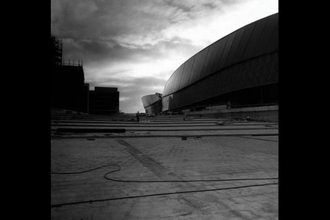
As laid out in the masterplan, a wide, fan-shaped pedestrianised piazza directs visitors towards the main entrance of the Arena & Convention Centre at the midpoint of its landward side. Other than a tiny, glazed cafe pavilion on one side, the fan-shaped piazza is lined by bulky, impassive buildings. Facing the great curving convention centre are two six-storey hotels ŌĆō lumpy, brick-faced, pseudo-traditional usurpers that have replaced the elegant, elliptical building that appeared on earlier masterplans. The piazza is cut off at its further end by a gaunt six-storey car park. As designed by landscape architect Gustafson Porter, the piazza is paved in grey granite, softened by a few willow trees and stepped to serve as an outdoor amphitheatre for performances, or markets. Even so, it is a space that will rely on big arena events, or a constant flow of street markets, or open-air performances, to enliven it. Without them, it could be as enticing as a seaside resort in winter.
As for the Arena & Conference Centre itself, this is as big as they get. Wilkinson Eyre has amalgamated three huge, normally separate facilities ŌĆō a 3,725m2 multipurpose hall, a 1,350-seater convention auditorium along with 18 meeting rooms, and the 10,600-seater arena ŌĆō into what director Chris Wilkinson calls ŌĆ£a unique all-in-one buildingŌĆØ of 41,000m2. More than that, it is a standalone building, entirely surrounded by public walkways, and with no service yard. The goods entrance lies out of the way next to the multistorey car park and leads to the centreŌĆÖs lower-ground floor through a tunnel below the piazza. The building has the symmetrical form of two giant clam shells laid end to end. Seen from ground level, the shells appear as two huge bulbous forms that tilt forward at the curved prows at either end.
As Wilkinson explains, the shell shape is the natural expression of the large arena, which has a U-shaped plan of tiered seating. ŌĆ£We then found we could make a complementary shell shape out of the conference centre stacked above the exhibition hall,ŌĆØ he continues. ŌĆ£After that, we locked the two shells together with a galleria, or public circulation space, that runs between them and connects the piazza to the waterfront.ŌĆØ
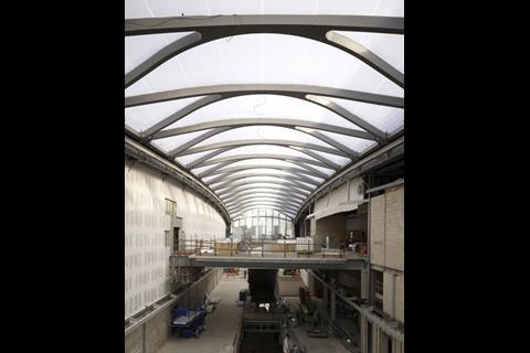
The internal spaces are largely dictated by the standardised, predominantly American, requirements of arena, conference and exhibition facilities. These preclude natural daylighting in the arena and auditorium, but Wilkinson Eyre has compensated for this by introducing the spacious three-storey galleria into the heart of the building. Here, a wide mezzanine floor and two upper footbridges bask in full daylight below a vaulted roof of translucent, colourless ETFE. At the further end, an open-air, upper-level terrace offers an amazing front-row panorama of the whole sweep of the Mersey with Birkenhead on the opposite riverbank.
In addition, the perimeter walls of the whole building are largely made up of glazing, which provides a visual connection between inside and outside and animates the building when events are in progress. The arrangement works best in the perimeter concourse around the arena, where clear glazing invites passers-by to look in and offers participants head-on views out to Albert Dock.
The other big innovation of Wilkinson EyreŌĆÖs design has been to stack the convention auditorium directly on top of the huge column-free exhibition hall. The nearest precedent, according to project architect Sam Wright, is an even larger seven-storey convention centre in Hong Kong, where an exhibition hall was stacked on top of two auditoria in 2004. In Liverpool, three massive steel double-jumbo trusses were needed to span the entire 50m width of the exhibition hall, while at the same time supporting the auditorium above. But the pay-off is that the multi-purpose hall can be opened out through the galleria to the arena, adding up to an immense enclosed area 200m in length and the two and a half football pitches in area all on the same floor level.
Further flexibility comes in the form of two revolving drums, each containing 250 seats, within the raked auditorium. The drums are another American invention, first introduced in Britain at Terry FarrellŌĆÖs conference centre in Edinburgh. They can either form part of the main auditorium, or be rotated within a few minutes to form three smaller auditoriums operating simultaneously.
As for the large multi-purpose hall, this can be sub-divided into four smaller halls by sliding 7.5m-high, sound-proof partitions out below the edges of the jumbo trusses. The spaces left between partitions hanging from both sides of the trusses serve as corridors.
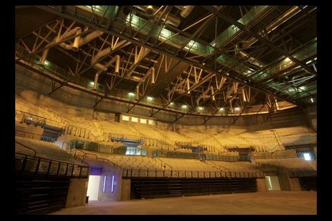
Other than the galleria, with its web of elegantly curved roof trusses, the interiors have the raw, industrial feel of a huge power station. Overhead, box-framed steel trusses, access gantries, and air-supply ducts are all openly expressed. And the glazing on the upper floors is heavily fritted with white polka dots that restrict views outside.
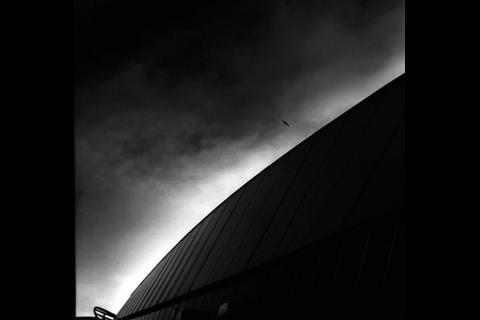
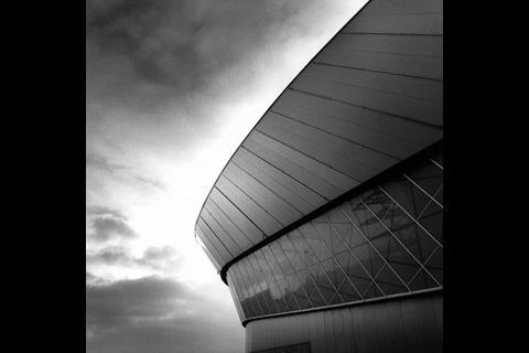
Externally, the buildingŌĆÖs huge pair of bulbous forms is cleanly expressed with sleek curvilinear surfaces and crisp edges. It rises no higher than the grade I-listed Albert Dock which it faces head on. And its apparent height is lessened by sinking the floors of the arena and exhibition hall 1.5m into the site and using the spoil to raise the piazza to the entrance level 4.5m higher.

Left: An arena (1) and an auditorium above an exhibition hall (2) make up the buildingŌĆÖs two clam shells
Right: Within LiverpoolŌĆÖs 14.6ha KingŌĆÖs Waterfront development, the Arena & Conference centre (1) faces across a pedestrian piazza (2) to a cafe-bar pavilion (3) two hotels (4) and a multistorey car park (5)
On the other hand, the gargantuan building, the size of a football stadium, and its curving geometry and sleek, uninterrupted surfaces have nothing in common with the human-scaled intricacy of Albert Dock, or any other building within sight. It is impersonal in scale and alien, even forbidding in character.
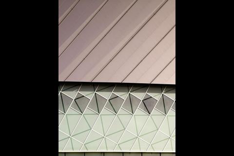
The cladding reinforces the big, bold, imposing character. It is divided horizontally into three wavy bands. The topmost band is a coronet of large, grey steel panels, which are laid at an angle so that it juts outwards at either end. The second band of cladding is made up of translucent glazing in a sickly greenish tinge and with an abstract zig-zag pattern unrelated to the overall curvilinear form. The lowest layer is clear glazing interspersed with more grey steel panelling.
Fortunately, relief, or at least partial relief, should come when the building is occupied. Then large expanses of glazing will act like a beacon and offer views into the activities going on inside. And the great, sweeping daylit public galleria should welcome in passers-by, as well as event participants.
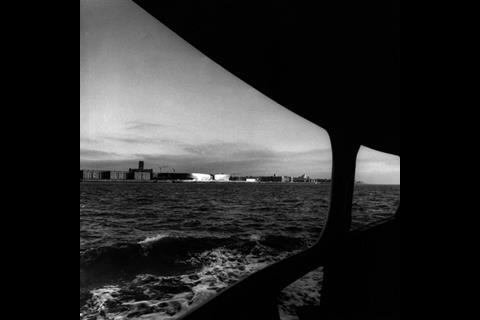
The view from the Mersey Ferry is something completely different. From out here in midstream, the roofline does not break the city skyline nor intrude on the monumental hulk of Giles Gilbert ScottŌĆÖs Anglican Cathedral. The wide, sweeping, gleaming forms on the waterfront are perfectly in scale with the tidal rivermouth they confront. This is by far the best view of LiverpoolŌĆÖs big new venue. ItŌĆÖs just a pity you have to leave the city centre to appreciate it.
Structural engineering
The problem with combining arena, conference centre and exhibition hall in a single building is that they all need to be acoustically separated from each other and from the outside world. That meant that all three facilities had to be laboriously enclosed within double skins, including roofs, walls and intermediate floors, and the cavities stuffed with sound insulation. At the same time, up to 50mm of vertical movement in the roof had to be accommodated, in the case of the perimeter wall by overlapping, sliding joints between the three bands of cladding.
The other big challenge facing Buro Happold was how to support a 1350-seat auditorium and 18 meeting rooms directly above a 80 ├Ś 50m column-free exhibition hall. The structural engineerŌĆÖs solution was to provide three powerful steel box trusses 4.5m deep, reinforced by secondary trusses 3m deep.
Project team
Clients Liverpool City Council, Liverpool Vision, English Partnerships, Northwest Regional Development Agency
Architect Wilkinson Eyre Architects
Structural engineer Buro Happold
Services engineer Faber Maunsell
Quantity surveyor Davis Langdon landscape
Architect Gustafson Porter
Design-and-build contractor Bovis Lend Lease
Topics
The Liverpool Issue
- 1
- 2
- 3
- 4
- 5
- 6
 Currently reading
Moby Dock
- 7
- 8
- 9
- 10







No comments yet