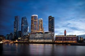
Fulham Island is a ┬Ż9.5m triangular development squeezed between several roads ŌĆō the name refers to the traffic variety of island, as well as Pacific. And it is currently stopping traffic with a very Miami Beach (OK, so that's east coast) bright-blue rendered commercial block and a lime-green residential building, both designed by CZWG for joint-venture developer Manhattan Loft Corporation/The Osborne Group.
The development is opposite the imposing St John's Church. The choice of brick as a cladding material for this residential block was the key to the development responding to the church while still adhering to architect Piers Gough's Californian vision. To merge with the church, the predominant facade of CZWG's brick-clad addition is finished in a background-colour brick of pale yellow buff ŌĆō similar to the weathered brickwork of the church. The fun is provided by coloured brick polka-dots of grey, lilac blue, lime green, yellow, minty turquoise, terracotta and white dotted throughout the facade. Because of the facade's colourful dots, its builders nicknamed it the Smarties building. (Trust builders to name it after a snack ŌĆ”)
Curves are a key aspect of this project. One elevation of the block's double frontage undulates in slow waves, the second elevation is straight, but both have curvaceous balconies of several sizes and shapes hanging from them. The building features a ground-floor restaurant, three floors of high-quality apartments and two penthouses on the fifth storey. The large rooftop balcony area and circular design of the penthouse shell determines the curvature of the facade facing the church. Sweeping inwards from its four-storey extremities, the facade bulges out at its centre as the brickwork continues upwards to include the circular fifth storey. Gough, a partner at CZWG, says: "The front wall is free from the need to hold a normal straight back-of-pavement street line, and the wavy form allows additional light into the living areas of the apartments."
The building's structure is also curved: the load-bearing super-structure of the block is a curving insitu concrete shell, with large window openings punched through. This is a quicker and more rational solution than a conventional in-situ concrete frame and infill, due to the curvature of the facade. The waves are gentle enough to allow it to be clad in standard bricks with no faceting. These are tied back to the building with steel ties in channels.
The brick manufacturer had its work cut out, though, when dealing with the acute angles at almost every corner of the building. Project associate Sanjiv Gohil explains: "There are virtually no right-angles on the project, even though it may look like it. We have had to work very closely with the manufacturer to cut and bond lots of specials that were just a few degrees off 90 in order to successfully complete the project."
This close partnership between architect and brick manufacturer has been the key throughout the project. What may at first seem like the random spacing of coloured blocks on the building's face, is in fact a carefully calculated pattern. The glazed bricks, from the manufacturer's special collection, are first used as a seven-course band at the base of the building. Here, a "random" layout has been created by the architect, in order that no two bricks of the same colour touch and no pattern is formed. "We couldn't leave it to be solved on site," says Gohil, "because it isn't as easy as it sounds to produce a random pattern."
Higher, where the buff brickwork takes over, the five-brick-high stack-bonded polka-dots are also set out with a high degree of precision. In addition to not putting blocks of the same colour near each other, CZWG and the manufacturer had to contend with the wavy facade and the need for special glazed bricks at reveals, corners and soffits. Gohil explains: "Once we had designed the wavy facade, we realised that calculating the numbers of glazed bricks and their positioning would be difficult. There was to be no deviating from our layout for the specials and so, if one came at a corner or intersection with a window, it had to be manufactured with two glazed faces or a glazed soffit and so on." The architect flattened out the facade on paper to allow the manufacturer to calculate the exact number of bricks and what specials were required.
As if all of this wasn't enough for a bricklayer to contend with, the glazed bricks are specified in a larger size than the background bricks (see "Pin-point precision"). And, they had to be bedded in black mortar, as opposed to the sandy buff mortar used on the main facade brickwork, in order to disguise the joints. Unfortunately, this demanding specification was an onerous task for the bricklaying contractor, who nevertheless seems to have coped adequately.
Overall, the building strikes an eye-catching pose in the centre of Fulham, and the laid-back LA living ethos at the heart of the design seems to have spread to the surrounding area, with residents lounging in the watery English sunshine outside adjacent cafes. CZWG's design for this building and its colourful neighbours has turned what was a collection of rundown streets into west London's very own corner of California.
Pin-point precision polka-dots
CZWG partner Piers Gough describes the glazed brick design as ŌĆ£coloured blobs bubbling out of the swamp of colour below.ŌĆØ He refers to the seven courses of randomly mixed glazed bricks that skirt the base of the building and the five-course stack bonded polka-dots that adorn the facades. But this playful use of colour is not achieved as easily as you might think ŌĆ”The buff-coloured background brickwork incorporates standard 65 mm deep bricks and 10 mm bucket-handle mortar joints in a complementary light shade. However, the architect specified a glazed brick measuring 220 x 70 mm and black mortar within the coloured band and polka-dots in order to reduce and disguise the joints. ŌĆ£We did not want to interrupt the glazed colours with large mortar joints,ŌĆØ says Gough. ŌĆ£The blocks are meant to be viewed as solid and so we reduced joints to a minimum and used a darker mortar to lessen the visual impact.ŌĆØ
The mortar joint between background and coloured brickwork is 7.5 mm in buff mortar. However, in order to allow for their larger size and to close up the gaps between coloured bricks, the joint between them is reduced to 5 mm wide and black mortar is specified. Each of these joints is set out to be centred on the larger 10 mm joints butting up to them.
Drawings were prepared for site showing the complicated setting out for both the coloured band and blocks. This included specifying the mortar bed widths and colours (seen in the diagram) and also the overall spacing of coloured blocks within the flat and undulating facades. For this, detailed drawings showing every brick in each facade had to be produced.
Vital statistics of a Baywatch-esque babe
Project name Fulham IslandConstruction start date May 2001
Completion date January 2003
Location Fulham, London
Total contract value&▓į▓·▓§▒Ķ;┬Ż9.5│Š
Downloads
Pin-point precision polka-dots
Other, Size 0 kb
Credits
Client Fulham Village Ltd (Manhattan Loft Corporation and The Osborne Group) Architect CZWG Architects Main contractor HG Construction Structural engineer Alan Baxter Associates M&E Optima (BES) and ESP Quantity surveyor Tropus Brickwork HG Construction (direct labour)
Brick Bulletin June 2004
- 1
- 2
- 3
- 4
- 5
- 6
- 7
- 8
 Currently reading
It's just, like, so L.A
- 9
- 10
- 11
- 12


.jpg)


No comments yet