Cambridge university’s Newnham College wanted diners in its restaurant to have a view as well as privacy. The architect and glass specialist on the project explain their solution
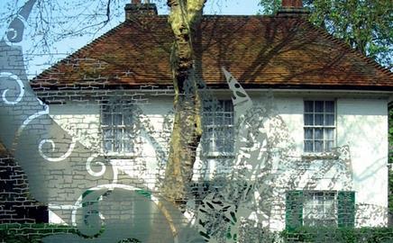
The new Buttery restaurant for Newnham College at the University of Cambridge faces a public thoroughfare. To maintain privacy but still provide views and let daylight in, the architects teamed up with glass specialist Daedalian Architectural Glass Design to create 10 large, triple-glazed windows etched with a design by artist Beverley Bryon. David Emond of architect RH Partnership and Chris Walmsley of Daedalian describe the process.
What was the intention of the design?
David Emond Set within a brick arcaded wall, it was a long space facing the street, so we had to devise a way of providing privacy for those inside, while creating the right ambience. The idea of etched glass evolved into a design competition, which the college organised.
What did you think when you were first approached?
Chris Walmsley At about 2.5m2, the glass panes were the biggest we’d ever tackled. We had to think through how we were going to approach it, as it was going to be a complex process, but we thought we could do it.
How was the design developed?
DE The design competition was won by an artist called Beverley Bryon who had worked closely with Daedalian before. Large, full-scale prints of the design were created to see how they would look, along with small cuts of the glass to give an idea of what the finished window would be like.
CW Beverley’s design was based on a sunflower. We sandblasted the intricate design onto the glass. This could not just be applied to one pane, as it would have looked flat. For a three-dimensional look, we bonded two sheets of glass together and sandblasted the design on to the second, third and fourth faces – the first being the external face. It’s a process we pioneered in 1999 on a project at Worcester cathedral. The skill is in deciding which part of the design goes on which face. Our in-house artist does this – it is critical that it’s done correctly or it won’t look right.
How did you transfer the design to the glass?
CW Using a software called FlexiSIGN to produce stencils. It was critical that when these were applied, all three lined up to prevent the design looking blurred. When a stencil was on the glass we blasted it with aluminium oxide to etch the design onto the surface. We then put the panes together. We sent them to an external company to be laminated, as they were too big to handle.
Did the client have any concerns?
CW The college wanted us to use toughened glass so it wouldn’t crack. We used two 8mm-thick, toughened panes of glass, bonded together to make a laminated unit using a process called poured resin.
How did you maximise the design’s impact?
DE The wall behind the windows is a dark reddish colour to provide contrast. We considered using edge lighting around the windows, but instead decided to use the whole room behind as a giant lightbox.
How were the panels installed?
CW After they were laminated, we made the panels into double-glazed units by placing them into aluminium frames, with another sheet of glass. The completed units weigh about 400kg. These were raised into place by a mini-crane with suction lifts. The installation was quite straightforward. It took four hours to install all 10 units.
What do you think of the finished project?
DE The overall effect was exactly what we wanted. It allows a view of the sky and trees and maintains privacy for the diners.
CW We’re really pleased. It looks brilliant.
Topics
Specifier 11 April 2008
- 1
- 2
 Currently reading
First glass honours
- 3
- 4
- 5
- 6
- 7
- 8
- 9
- 10
- 11
- 12
- 13


No comments yet