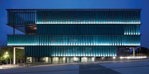
Laboratories are most often architecturally dull affairs but in Sheppard Robson’s New Science ��ɫ����TV, at the University of Hertfordshire, louvres wrap the building in a metallic veil that suggests intrigue and activity within
There was a time not too long ago when laboratory buildings were viewed as strictly functional affairs without any distinctive architectural merit. There were exceptions of course; Louis Kahn’s seminal 1963 Salk Institute in San Diego in the US remains one of the best regarded modernist buildings of the mid-20th century. But, generally speaking, the last generation of laboratory buildings, at least architecturally have largely remained unprepossessing and utilitarian efforts.
In recent years this has changed and a new generation of laboratories has emerged that have been defined as superlative works of architecture in their own right. Stanton Williams’ superb Sainsbury Laboratory in Cambridge remains a benchmark in the genre and won the Stirling Prize in 2012, the first and so far the only laboratory building to ever do so.
Others have taken inspiration, with HOK’s Francis Crick Laboratory, Ian Ritchie’s Sainsbury Wellcome Centre and Sheppard Robson’s Bristol Life Sciences ��ɫ����TV all revelling in a bold, dynamic and conspicuously aesthetically driven new laboratory architecture.
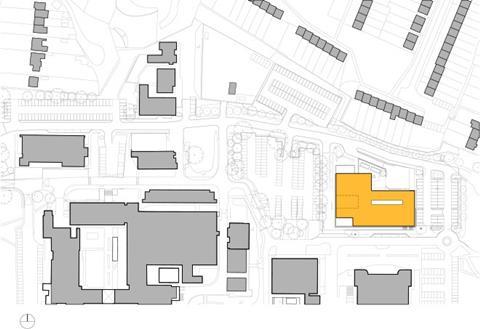
One of the latest additions to this group has recently opened at the University of Hertfordshire’s College Lane campus in Hatfield which opened last month. The 9,000m² £30m New Science ��ɫ����TV has been built on the site of a former car park and sees Sheppard Robson revisiting the laboratory format in a manner that is visually and technologically distinct from the firm’s previous work at Bristol. Yet the new building extends the trend of high-profile laboratory architecture even further.
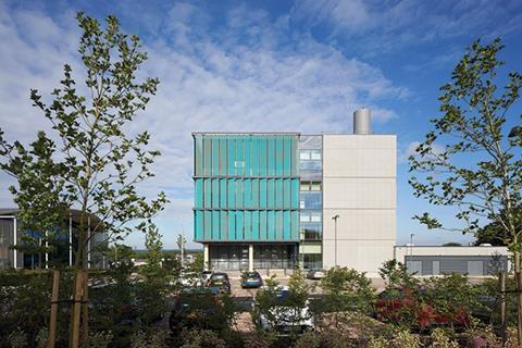
It provides a highly specialised, state-of-the-art teaching and laboratory space for undergraduates and researchers in the chemistry, biomedical, physics and pharmaceuticals fields. The building also lies at the heart of the university’s 2020 vision which will see the campus transformed with new buildings, routes and public spaces by the end of the decade. As such, the new building directly employs architecture as a branding signifier for the campus’s ongoing renewal.
As Sheppard Robson partner Tony Poole explains: “The building had to do more than provide technically excellent and controlled spaces within a box. We wanted the architectural language to be a beacon for the university’s ambitions, with a finely tuned and bold response that did not compromise on efficiency.”
The response is based on an architectural concept that identifies three key design considerations that drove the entire project. The first was to create column-free teaching spaces. The second was to base the building on an internal structural grid that was meticulously proportioned to deliver the most efficient workspaces possible. And the third and arguably the most aesthetically significant ambition was to create a building that maximised daylight.
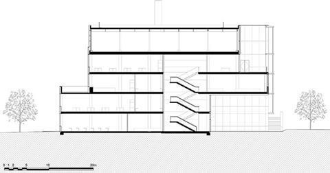
It is perhaps this last feature that has the biggest impact on the building’s external appearance. The new facility is a strictly orthogonal rectangular box comprising five storeys, the lowest of which is partially submerged to the rear due to the sharply sloping site.
Each floor is expressed externally as a discernible layer, neatly trimmed with a steel channel at its top and bottom, between which a continuous series of vertical fins are fixed. The fins fully encase three sides of the building with the remaining north elevation faced in concrete and glass. The arrangement is only broken above the south-western corner of the building where the fins are peeled away on the ground floor to reveal the entrance and on the penultimate storey to accommodate a roof terrace.
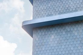
The fins are absolutely central to the building’s aesthetic and environmental aspirations. Each one is a minutely perforated expanded aluminium mesh panel that acts as a rainscreen separated from the building’s external glass envelope by an accessible maintenance gantry that wraps around the building. Consequently, the fins act as a vertical brise-soleil that provide shading to the three elevations of the building most exposed to solar glare while admitting as much daylight as possible to the interior.
While environmentally expedient, excessive brise-soleil can eliminate any trace of architectural charisma from building exteriors, as multiple business parks and several EU administrative headquarters aptly demonstrate. But here the effect is both nuanced and masterful with the louvres acting as a delicate metallic veil that completely wraps the building and suggests intrigue and activity within.
This aesthetic ruse is greatly assisted by the gentle gradations of copper-like colour that are incorporated onto the louvres. Also, while the louvres are fixed and not motorised, orientation-determined variations of the angle at which they are inclined adds an extraordinary sense of depth, rhythm and animation to elevations that could so easily have appeared sterile and flat. Only on the top floor are the fins set flat against the building to conceal plant.
Consequently, this variety of shading and angles unleashes a captivating series of waves across the elevation that ripple like dominoes surging across a board. They also shift in according to the point at which they are viewed and emerge suddenly, like holes scorched into a stretched gossamer gauze through which sunlight has burned.
The north elevation is less successful, evoking what seems to be an entirely separate building conceived on more clunky and conventional lines. Admittedly, this elevation was tempered by planning restrictions because it overlooks private residential property directly opposite. Equally, the sheen created by the copper mesh-encased glazing used to denote the entrance and roof terrace where the aluminium veil is peeled back seems slightly incongruous when set against the more textured and patinated surface grain that the veil establishes.
As well as the gantry and the glazing, the aluminium veil conceals the gridded structural frame on which the entire building is based.
A structural frame comprising post-tensioned concrete slabs offers 15m deep column-free spaces, one of the key architectural concepts. The south elevation is lined with classrooms on each floor, each one is based on a 6.6m by 9m grid containing a series of 3.3m sub-grids optimised to provide efficient laboratory workspace.
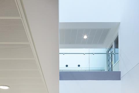
The 9m-deep plan benefits greatly from the surprisingly generous amounts of daylight still admitted through the aluminium fins. The variety of surface treatments visible externally is also apparent internally with the orientation of the fins creating sharp variations in opacity and transparency within every room.
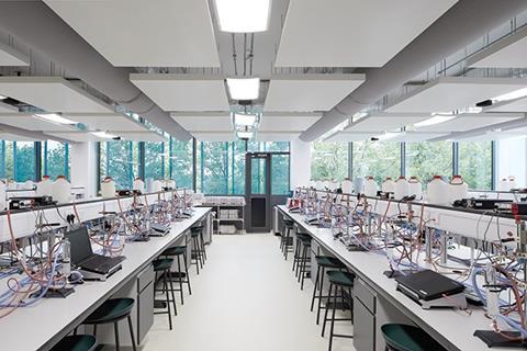
Classrooms can accommodate up to 90 students and provide a variety of fixed scientific and experimental apparatus arranged on workbench rows. They also incorporate multiple fume cupboards which are directly linked to the building extract system in order to limit exposure to toxins. The building’s numerous supply and extract flues are arranged along the rear classroom walls directly opposite the external facade. This avoids the kind of glazed transparency between laboratories and circulation areas that is an increasingly prevalent feature of laboratory design. This feature has been incorporated into both the Sainsbury Laboratory and the Francis Crick and is said to foster the kind of spontaneous social interaction that is thought to drive creativity and invention. However, there is less of a requirement to provide such a facility within a university format as there are multiple buildings on campus where students convene for social interaction, freeing academic buildings more exclusively for teaching.
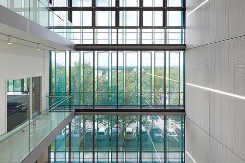
The circulation areas themselves are simple and functional spaces. A full height foyer sports a cafe and a steel cantilevered staircase, and its full height glazed curtain wall takes advantage of the building’s elevated position to provide generous views out over the flat Hertfordshire countryside.
So while the internal structural grid reveals an optimised organisational efficiency that enables the building to satisfy its functional requirements, the core architectural character of the building remains invested in its striking external veil. It is this that most effectively expresses the nuanced culmination of a subtle and inventive design solution that cleverly consolidates functional, environmental and aesthetic concerns.
Project team
Architect Sheppard Robson
Client University of Hertfordshire
Main contractor Bouygues UK
QS / Project Manager Turner and Townsend
Structural engineer Aecom
M&E Couch Perry Wilkes
Landscape architect The Landscape Partnership






No comments yet