The former Commonwealth Institute has been resurrected as London’s new Design Museum. But how do the new interventions match up to the original 1960s architecture and that memorable roof? Ike Ijeh finds out
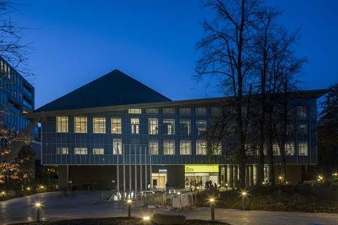
One of 2016’s most eagerly anticipated cultural openings is set to take place next week. After closing its doors on its Shad Thames venue this summer the new Design Museum opens in the comprehensively refurbished former Commonwealth Institute. The Grade II-listed institute itself has laid empty and derelict ever since it closed to the public for good in 2004.
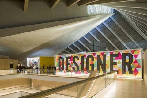
Designed by RMJM and opened in 1962, the awkward modernist pavilion formed one of the more curious entries on London’s cultural trail. But it was designed with one highly distinctive architectural feature, its spectacular parabolic roof providing vulture-like surveillance over the sedate and decidedly more traditional confines of adjacent Holland Park and High Street Kensington. While the building itself has been virtually rebuilt, the roof has been retained and forms the conceptual cornerstone of the new design.
The new project has been undertaken by a trio of prominent architects. Radical Dutch collective OMA collaborated with Allies and Morrison to complete structural works on the exterior and roof while John Pawson has completed the interior design. Another adjunct to the scheme is the recently opened Holland Green luxury housing development next door to the museum which helped finance the institute’s renovation. This trio of residential blocks now nestle around the approach to the museum and were also designed by OMA and Allies and Morrison.
Structurally the institute renovation was radical and ambitious. The former Commonwealth building was in an appalling state of disrepair and virtually all its structure, with the exception of the roof, has been rebuilt. At one point and as part of a highly sophisticated engineering solution devised by Arup, just the external shell of the building was standing with its interior entirely gutted before new structure was built on either side of a new structural slab.
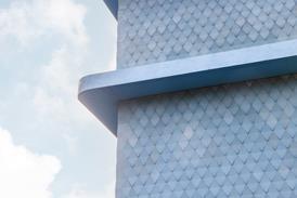
Externally the rebuilt curtain-wall facades are meticulously faithful to the original with the new double-glazed skin maintaining the opaque blue-coloured glass effect with matching mullions and a fritted pattern of printed dots added.
There have also been further external changes. A new landscaped plaza has been added outside complete with fountains and crisply executed external works. One of the former Commonwealth Institute’s big problems was its location, deeply set back from High Street Kensington with no frontage onto the street and its sheltered aspect effectively concealing it from public view.
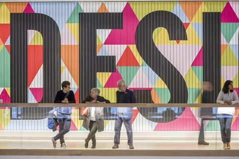
Now this seclusion has been cleverly capitalised upon with the installation of a kinked spatial sequence that leads from the street to the museum and that is animated with large signage and alternating sense of openness and enclosure (the route passes through the base of one of the Holland Green blocks). The result is a palpable sense of gathering anticipation and excitement as the museum is approached.
But of course, as the external façades of the building appear more or less as they did prior to the renovation, crisply redefined as they are, it is the completely worked interiors where most of the surprises lie in wait. This is John Pawson’s biggest UK commission to date and marks something of a departure from the boutique stores and hotels in which he has made his name.
Pawson also has a reputation for rapacious minimalism, not an approach that springs instantly to mind when considering the rambunctious rawness of the institute’s original 1960s design. How do the two approaches fare against each other?
The first clue can be found in the words of project architect Jan Hobel. “First and foremost we wanted to create a space and an interior that was entirely focused on the roof, that is really the star of the show and we treated the interior essentially as a backdrop.
“We also wanted to create an exciting and welcoming space that used a mannered and limited palette of new materials to engage with the original structure and created more openness and transparency.”
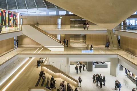
To a degree, all these intentions are apparent when entering the building. The visitor is immediately thrust into a large, full-height atrium topped, as Hobel suggested, with the extraordinary, billowing form of the roof swerving high above. Rightly it dominates the space and this clearly legible view of it marks a significant spatial improvement form the more staggered arrangement in the old institute where the roof was primarily viewed in partial glimpses.
But it is not just the roof on show here. The atrium is wrapped in a series of new, soft-lit walls and balconies all finished in light oak panels. A ceremonial central staircase leads up to the first level where terrazzo panels salvaged from the original building complement the oak finishes and white walls. A final side stair leads to the top level where the bulk of the galleries are located. Additional galleries are located in two substantial new basement levels located underneath the building.
Directly topped by the contorted roof it is the uppermost galleries that are the most dramatic as they allow the intensely kinetic nature of the roof to be viewed at close quarters. Also impressive are the direct views out onto to the rich parkland outside that certain spaces, such as seminar rooms on the first floor and the top floor restaurant, offer.
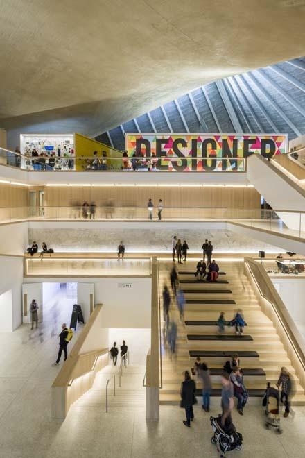
Hobel reveals that the atrium was partially driven by the insistence from English Heritage that the roof play centre stage. Also, the enclosed nature of the atrium which, for the most part, only offers glimpsed views of the park outside for its upper floors, helps explain Hobel’s interesting admission that their architecture was more interested in “the contrast between solid and void rather than a sequence of transparent openings through the building”.
But notwithstanding the omnipresence of the roof, the atrium and much of the other inward looking interiors provide an incessant and unnerving feeling of dislocation from the exterior of the building and the spirt of the original architecture, despite the architects’ insistence that this was not their intention.
Taken as individual objects, the oak finishes and soft lighting are skilful enough. But their minimalism and restraint are almost too passive and sterile for this context and they cower helplessly under the thunderous raw gaze of the roof above. This passivity was intentional and not necessarily ill-judged when seeking deference to the original architecture and the exhibits within.
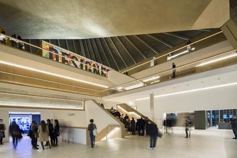
But one imagines that the incongruity was not intentional and, for all their smooth panache, the interiors haven’t quite managed to shake off the boutique and hotelier pedigree from which they were undoubtedly inspired. This juxtaposition allows for its own set of tense interpretations, at times the atrium feels as if a stylish contemporary closet has crash-landed Oz-style into a sullen 1960s cave.
However, these observations need not detract from the fact the Design Museum marks a brave and masterful attempt to rescue a derelict building and reimagine its function for an entirely new programme, surely a process that goes to the heart of what conservation means.
Challenges remain for how the public will react. Kensington is certainly easier to reach by public transport than Shad Thames but it remains to be seen whether the public will take to a design museum in a location more associated with retail and residential exclusivity than artistic pilgrimage. But Southwark was hardly a cultural mecca before the Tate Modern opened and look what happened there.
ARCHITECT (Exteriors): OMA / Allies and Morrison
ARCHITECT (Interiors): John Pawson
DEVELOPER: Chelsfield Developments / Ilchester Estates
MAIN CONTRACTOR: Mace
STRUCTURAL ENGINEER: Arup






No comments yet