Part of the University of the Arts London, the London College of Fashion has brought its six separate sites under one roof for the first time in more than 100 years and becomes the first building to complete at the Stratford Waterfront development. Tom Lane reports
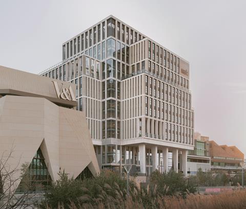
For more than a century the disparate disciplines of the London College of Fashion have been scattered across six different sites. Now these have been brought together for the first time in a new building that is also the first to be completed at Stratford Waterfront, the London Legacy Development CorporationŌĆÖs ┬Ż1.1bn bid to inject some cultural pizazz into the former Olympic Park and an area dominated by shopping, railways and a rash of residential towers.
Located on a sliver of land between a road and railway lines running into Stratford station on one side, and the river Lea on the other, ambitions for the waterfront are high. When completed, the four buildings will house the V&A East, Sadlers Wells East and a new home for the BBC Symphony Orchestra.
The first two have been designed by OŌĆÖDonnell & Tuomey with the BBC and London College of Fashion designed by Allies and Morrison, who also masterplanned the site.
The buildings are arranged as a row along the waterfront and are linked by the concept of ŌĆ£castŌĆØ external materials such as concrete, brick and tiles. V&A East is distinguished by its sandy coloured triangulated, folded shapes, Sadlers Wells by its industrial, brick sawtooth roof and clay tiles and the BBC by a combination of smooth precast concrete, dark steel and glass.
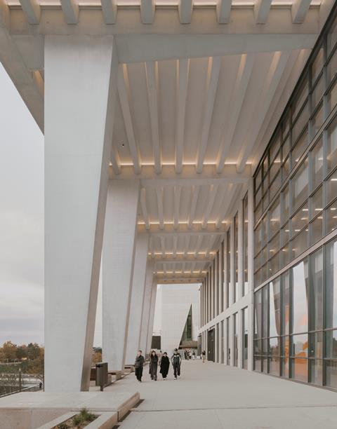
More conventional looking than the other buildings, the ┬Ż216m London College of Fashion is distinguished by an imposing civic presence thanks to a grand colonnade which is reached by a stepped terrace leading up from the river. The other point of difference is the buildingŌĆÖs 15-storey height, double that of its neighbours.
The London College of FashionŌĆÖs footprint is just 60m by 60m thanks to the constrained nature of the site. The building needed to accommodate 5,000 students, which required 42,000m2 of space, so the only way was to go up.
The institutionŌĆÖs previous buildings included a 1960sŌĆÖ slab block in central London, a red-brick arts and crafts building to the west and a Victorian school in Hackney. The challenge for Allies and Morrison was how to introduce this sense of individuality and character into a brand new, orthogonal tower block sited in a raw area still developing a sense of place.
There was a risk that the heads of the former schools would try to recreate their former departmental identities, which were very different. These include fashion photography, journalism, hairdressing, footwear, jewellery and clothes design.
Fortunately, this was not an issue. Indeed, project architect Bruno Marcelino is full of praise for the client, saying there was no pressure to recreate former departments. Instead everyone was relieved that they would no longer have to spend time traipsing around London to different parts of the college.
ŌĆ£For the first time in 100 years this was the opportunity for everyone to be in one place,ŌĆØ he explains. ŌĆ£The client was really excited about the potential synergies that could be generated between different disciplines such as someone from the fashion business school collaborating with someone developing a new type of shoe. This was really fundamental in the way we thought about how to organise the building.ŌĆØ
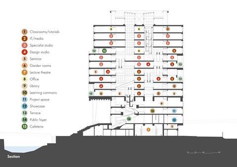
To provide public space to promote collaboration as well as private studio space for project work, the building has been divided into two distinct zones in plan. Marcelino calls the public space the ŌĆ£heartŌĆØ; a 36m by 36m area in the building centre that incorporates all horizontal and vertical circulation including the two cores.
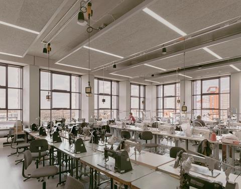
This space occupies a third of the buildingŌĆÖs area and includes teaching space and the library. This public teaching space involves sewing and knitting machines but acoustician Buro Happold has employed strategically placed sound-deadening to reduce noise to a background hum.
The perimeter zone wraps around the heart and houses workshops, offices and seminar rooms. The north and west-facing perimeter space is shallow in plan and houses offices and seminar space. The shallow plan combined with the use type means this space can be naturally ventilated, with heating provided by radiators.
The perimeter space to the east and south is deeper in plan and is used for workshops. These are mechanically ventilated because of the deep plan and need for high air change rates for workshop processes including resin casting and silicone moulding. The windows can still be opened in these areas.
Marcelino likens the plan to a tree ŌĆō the heart is the trunk and the branches the workshops, teaching and office space.
To give the building a distinctive identity Allies and Morrison has drawn upon the history of the site, which was once occupied by factories, and combined this with elements from one of the collegeŌĆÖs former sites. Like a factory or warehouse, the building features generous floor-to-ceiling heights with plenty of natural light.
Project team
Client University of the Arts/London Legacy Development Corporation
Architect Allies and Morrison
Structural, services, facade, acoustics and lighting engineer Buro Happold
Cost consultant Gardiner & Theobald
Landscaping LDA Design
Construction manager Mace
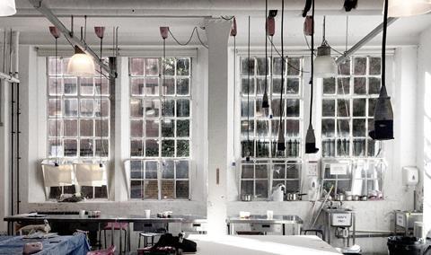
The perimeter space is conceived as one, long space and divided up with partitions that can be easily reconfigured in the future. The external wall and window arrangement borrows from the collegeŌĆÖs Lime Grove site. This features large Crittall windows fitted between splayed columns to help maximise natural light.
Benches between the columns were popular places to sit. This arrangement has been replicated in the perimeter spaces, although the glass panes are larger for efficiency reasons. Marcelino says the individual departments will create their own identity through the equipment and artifacts in the workshop and teaching spaces.
The heart of the building is where it comes alive. This is split horizontally into lower, middle and upper elements with each one given a distinctive architectural identity.
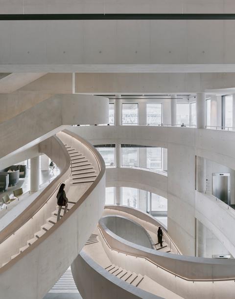
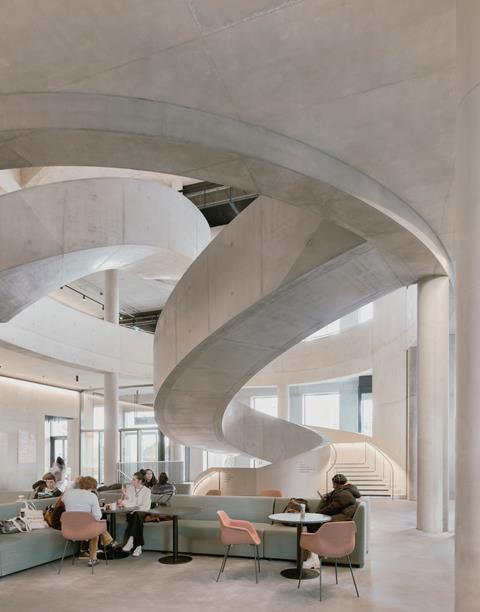
The lower five levels are the most theatrical and are characterised by very generous floor-to-ceiling heights, large open spaces and oversized beams. The piece de resistance is a sculptural concrete stair that starts life on the lower ground floor, then takes off from the ground floor into a great swooping curve up to the first floor. Marcelino describes this as the ŌĆ£orange peelŌĆØ stair.
The staircase linking the first and second floor is more modest in scale although still impressive, and the one above smaller again. A giant ellipse has been carved out of the floorplates to accommodate the stairs which accentuates the organic nature of this part of the building.
According to Marcelino the practice looked to the work of Italian architect Francesco Borromini, who was instrumental in the development of Baroque architecture, and notable for sculptural stone stairs, to understand how to successfully integrate an organic stair into an orthogonal building.
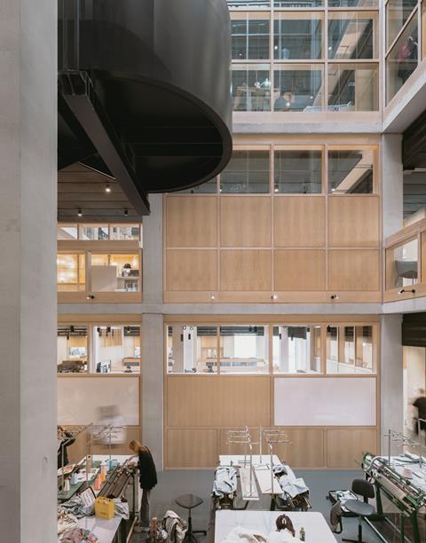
The transfer from the lower to the middle section at level five is marked by a series of huge, 2.5m deep beams spanning across the heart space. These are necessary because the generous spaces of the lower section shrink down to a 6m by 6m grid above as this includes smaller spaces.
The giant beams, which are post tensioned, transfer the loads from the grid to the heart space perimeter. The post tensioning steel tendons running through the beams need to splay out at the ends to spread the tensile loads over a wider area.
The tendons have been artfully disguised by radiating the ends of the beam outwards in a curve. This echoes the organic nature of the stairs and stair enclosure.
The transition from lower to middle is marked with straight rather than curved stairs and switching from all concrete construction to a steel base and timber treads. The stairs at this level are housed within rectangular cutouts.
The cutouts are determined by the structural grid, being 6m by 12m and are three to four floors deep, with some areas extending to 12m by 12m and dropping a further three floors. The cutouts vary in position in plan down the building which means people can only see a maximum of six floors up or down in any one location.
ŌĆ£The client didnŌĆÖt want a single atrium as they thought being able to look all the way down the building would be uncomfortable,ŌĆØ explains Marcelino. ŌĆ£So, we explored the idea of carving a route through the heart space through a sequence of open spaces where you might sometimes see three or four stories up, but never all the way up.ŌĆØ
Each stair between floors is perpendicular to the set above or below, a visual effect visually reminiscent of the drawings by the Dutch artist MC Escher.
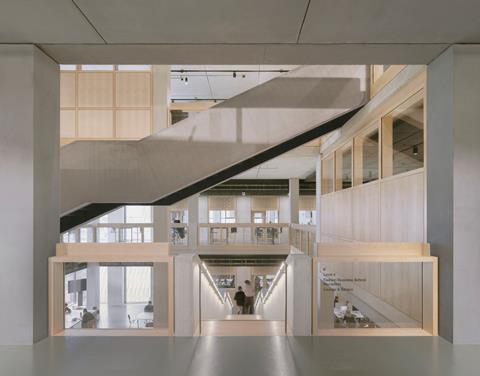
This arrangement compels people to meander through the building as they must cross each floor to reach the stairs to the next level, passing the teaching areas, social spaces and cabinets displaying fashion items. ŌĆ£People use the stairs because it is quicker than using the lifts to move three or four floors,ŌĆØ Marcelino says.
ŌĆ£As they walk down the building, they will see a cross-section of the functions within it; people cutting hair, making jewellery or shoes. The purpose of the heart space was to bring people together and promote these casual encounters.ŌĆØ
The top part of the building is architecturally simpler, with all four floors served by relatively conventional, continuous stairs housed in two mini atria. All are steel with timber treads. This arrangement is thanks to fire regulations as the atria act as ventilation chimneys to the roof and are separated from the floors with glass screens.
To avoid the heart space feeling enclosed, the perimeter workshops are truncated on the south and west-facing facades over the buildingŌĆÖs full height. This allows natural light to flood into the heart and offers students a sweeping panorama over the Olympic Park and London. This softens the buildingŌĆÖs orthogonal form and expresses the heart externally.
This effect is emphasised by the top part of the building stepping back from the levels below, which has the benefit of providing plenty of external space. This includes a large terrace for the refectory and some of the terraces are linked by external stairs so it is possible to go from level ten to twelve outside the building.
Externally the building features the oversized Crittall-style windows of the studios separated by vertical concrete panels. Formed from acid-etched concrete to add texture, these panels are horizontally ribbed to help animate the facade when the light changes.
The ratio of concrete panel to glass increases at the ends of the truncated workshops to the south and west to reduce solar gain. A nice touch is a perforated metal screen at ground level ŌĆō this references the concrete tracery mullions of the former main building in John Princes Street in central London.
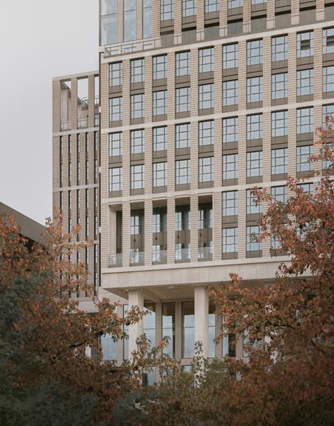
The most impressive external element is the colonnade. Five huge, 15m-high tapering columns endow this part of the building with a monumental quality. This is emphasised by the stepped terrace leading down to the river Lea. Students can enjoy views over the river towards the former Olympic Stadium, now West Ham UnitedŌĆÖs football ground. The building has impressive sustainability credentials too with a BREEAM Outstanding rating partly due to the use of 50% GGBS in the insitu building structure.
The building manages to house a huge variety of disciplines within a compact form and the heart space features plenty of visual conceits to lift it well above the ordinary. The stair arrangement is more than just decorative ŌĆō these encourage students to take longer routes through the building and stimulate much-prized interaction between disciplines.
Externally the colonnade and stepped terrace encourages the occupiers into the public realm ŌĆō Marcelino reports that the terrace is very popular with students on sunny days. This extends the benefits of the building to a wider audience than just the inhabitants.
These students ŌĆō and those who will occupy the buildings still under construction ŌĆō will bring much needed dynamism to an area that sorely needs it.








No comments yet