Nicholas Hare Architects‚Äô refurbished David Attenborough ∫√…´œ»…˙TV preserves the integrity of the original design while ensuring the radical remodelling works well for its new users - becoming an exemplar of sustainability was something it took in its stride

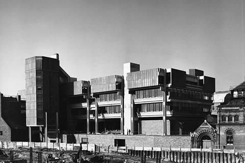
The approach to the newly refurbished David Attenborough ∫√…´œ»…˙TV is a curious experience. Cambridge‚Äôs densely packed city centre means that buildings of various height, massing and age jostle for attention. Some iconic gems end up completely hidden. The former Arup ∫√…´œ»…˙TV, considered one of the best examples of brutalism in Cambridge, is one. Pass through an archway off Pembroke Street and nothing quite prepares the visitor for the sheer scale and monumentality of the largely concrete structure, which rises up in a vast inverted ziggurat shape.
The 16,000m2 building was designed by Arup Associates and completed in 1971. It was built to house laboratories for the university’s mathematics, metallurgy and zoology departments in the three upper floors, and the 450-seat Babbage lecture theatre and Museum of Zoology in the podium and two lower levels. Academic offices were located within its two freestanding east and west towers. The building sits in what is called the New Museums Site, a hotchpotch of buildings associated with many of the university’s science departments.
‚ÄúIn the brave new world that was the 1960s, the Arup ∫√…´œ»…˙TV had been part of a bigger vision to redevelop the New Museums Site, which involved the creation of this great podium that would link the university to the city centre,‚Äù says Carol Lelliott, partner in charge of the refurbishment at Nicholas Hare Architects. ‚ÄúHowever, the building was the only element of the plan to be implemented, so it has an odd relationship with the surrounding buildings and levels because it has this isolated piece of podium. It was intended to be much more joined up and integrated.‚Äù
When Nicholas Hare Architects was appointed to refurbish the building in March 2012, it quickly became aware that the project would be particularly challenging. “The building wasn’t listed, but we had to behave throughout the four-year project as if it might be spot-listed at any time,” says Lelliott.
Balancing act
A careful balancing act had to be employed between preserving the integrity of the original design, while remodelling the building to ensure that it worked well for new users. The building also needed to move into the 21st century in terms of energy and thermal performance. Given it’s named after the famous naturalist and is the new home of the Cambridge Conservation Initiative (CCI), a strategic collaboration between the university and nine biodiversity conservation organisations, it was important that the building was an exemplar of sustainability.
But the architects faced a challenge here. The building was one of the worst energy performers in the university’s estate – not surprising given it had no insulation and was single glazed. Not only did the brief require a building that was adaptable, but it also had to radically reduce its carbon footprint and running costs.
To fulfil the client’s ambitions, some bold interventions were required. The first involved addressing the defensive nature of the front elevation. Most entrances were hidden from the ground and located at podium level which was difficult to access.
“The podium was intended as the piano nobile of the entire site and was conceived as a level surface, but instead, we found eight different changes of level,” says Lelliott. “It took away all the vibrancy associated with building entrances and pushed the entrance up in the air so the ground level was separate”.
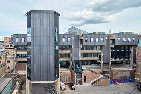
The client also wanted to put the internationally renowned Zoology Museum on the map. Containing world-class collections made by the great naturalists including Charles Darwin, rare and extinct animals will for the first time be on display to the public. A grand new staircase, ramp and a generous forecourt to the museum have been constructed on the front elevation, providing a more accessible and welcoming face. These alterations partially conceal the existing heavy, brick plinth, but now highly distinctive entrances to both the Museum and the Department of Zoology, draw people up and into the building.
To spark people’s interest in the museum, the collection’s remarkable 70ft-long finback whale skeleton will be housed in a new 7.5m x 21m double-height glass extension located to the front of the building. This simple, thermally and environmentally controlled space contains a modern spiral stair and gantry, which will enable visitors to walk the full length of the skeleton once it is in place early next year. The finback had previously been positioned outside on the building’s podium, but this previously open and dark undercroft has now been partially glazed to provide a public cafe that will open soon.
The museum will remain in the two levels below the podium, but the spaces have been refurbished. This included replacing the glass to the original 1960s display cases and laying a new terrazzo floor. The fit-out is being carried out and, once finished, the priceless exhibits will, for the first time, be housed in state-of-the-art environmental conditions. New museum stores have been inserted in the lower two levels together with learning rooms for schools.
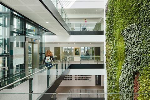
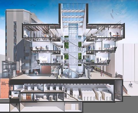
Another daring move was to provide the CCI and the other conservation organisations with their own entrance. To achieve this separation from the other uses in the building, the architects have squeezed in an 8m x 10m in plan atrium between the museum and the refurbished Babbage lecture theatre in the middle of the building. By hollowing out the existing concrete beams and floors from podium level upwards, a wonderful light-filled space has been created.
Inside, a lush, green wall extends up the atrium’s full height serving as a “living artwork” behind the reception. Water collected from the top of the atrium roof is used to help keep the plants watered.
A stair wraps around a lift taking staff and visitors up to three colour-coded offices.
The generous floor to ceiling height open-plan offices are located around the buildings perimeter and benefit from daylight and natural ventilation. The offices have access to opening windows and, together with the exposed concrete soffits, assist in night-time cooling.
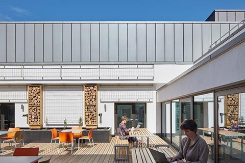
Cellular offices and meeting-rooms are restricted to the centre of the building and are mechanically ventilated. Break-out areas, a library, and a first floor common room have also been incorporated. Two external roof courtyards can be accessed by staff and feature a sustainable water drainage system whereby hoppers discharge water from the roof into planters. Rainwater is also collected in a reservoir that lies beneath the courtyards’ timber decking and is eventually fed back into the drains.
The more private office areas, such as finance, are located in the refurbished freestanding towers that are accessed internally.
On the tower roofs, bat boxes and speakers playing swift calls have been installed. These unconventional office fixtures have been placed here by building occupants, the RSPB and BirdLife International, to attract and increase bird numbers in urban habitats.
Thermal strategy
A significant part of the refurbishment has involved completely renewing the building services with carbon saving interventions, such as a combined heat and power system, and greatly improving the building fabric. An interactive, thermal strategy was developed with services engineer Buro Happold to identify the different types of construction and assess how each area could be updated to contribute to an overall improvement in thermal performance.
“We wanted to try intervening in the less architecturally sensitive areas and see if it was possible to minimise the treatment to other parts,” says Lelliott. “This exercise helped us to determine the effects on the overall thermal performance of the building.”
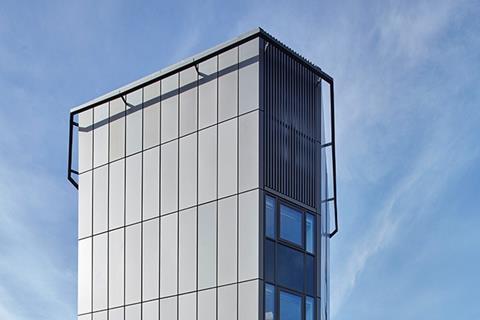
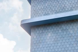
The thermal strategy identified the need to employ high levels of insulation where needed and replace all the glass with double-glazing. The distinctive window fenestration pattern and mullion profiles were carefully matched to replicate the original rhythm. The lead cladding employed on the building’s higher levels and towers had to be removed. The material had been fixed vertically and as a result, had slumped and deteriorated over time. This was replaced with a more robust, anodised aluminium of a metallic grey colour to match the original lead.
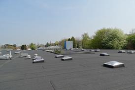
The building’s main roof had originally comprised a wood wool slab over existing concrete beams. This was fairly thin and flimsy compared with the muscular concrete structure of the building. The roof has been replaced with a structural metal deck, and insulated with a warm roof construction. It has been finished with a green roof designed to replicate the local chalk land environment and will be used as an experimental area by the CCI. Some roof bays incorporate PV arrays.
“In terms of CO2 emissions, the aspiration was for the refurbished building to have a minimum 25% improvement over building regulations Part L2B 2010,” says Thomas Cosker, senior mechanical engineer at Buro Happold. “The design stage energy model showed an improvement of 30.8% and we are confident that the As Built Energy Performance Certificate will confirm that this target has been achieved once it is completed over the coming weeks.”
The ¬£39m refurbishment has been an exhaustive and technically challenging one. But there is no doubt that Nicholas Hare Architects‚Äô carefully detailed and sympathetic alterations have enhanced the David Attenborough ∫√…´œ»…˙TV.
“What I have learnt on this project is that this structure has a number of hidden assets,” says Lelliott. “By working with those, you can really make this building sing, both in terms of its appearance and its performance.”
Project Team
Client: University of Cambridge
Architect: Nicholas Hare Architects
Structural engineer and project manager:Aecom
Services engineer and sustainability: Buro Happold
Biodiversity and green infrastructure: Green Roof Consultancy & Robert Bray Associates
Main contractor: Kier Construction
Becoming human

Ike Ijeh, ∫√…´œ»…˙TV architectural correspondent
Cambridge can‚Äôt have many more surreal sights than a partially concealed 70ft long whale skeleton loitering menacingly in the darkened undercroft of the former Arup ∫√…´œ»…˙TV. This curious anatomical conceit summed up perfectly what architectural historian Barnabas Calder calls the ‚Äúenjoyable terror‚Äù of 1960s architecture, a gargantuan creature of the deep, cowed and inert in the face of the even larger monster within whose ribcage it lurks. The planned relocation of the whale therefore is a symbolic event and cuts to the heart of how Nicholas Hare‚Äôs thoughtful renovation seeks to re-present the renamed David Attenborough ∫√…´œ»…˙TV to the outside world. The skeleton will be moved to a new glass-fronted pavilion constructed beside the main entrance and that entrance itself has already been radically reconfigured.
Formerly the entrance was raised on a podium two storeys above the ground and was only accessible via a labyrinthine network of stepped level changes, a sequence that rendered the building all the more defensive and intimidating. Even worse, were the concrete and relative inaccessibility not enough, those visitors intrepid enough to surmount the podium were then forced to navigate a gigantic sentinel whale before being admitted entry.
The new scheme sweeps all this churlish aggression away by introducing a new forecourt and sweeping stair that links ground level to podium. The sunken voids once occupied by the repatriated whale have been encased in glass and will eventually provide a cafe. Additionally, a new light-filled atrium has squeezed into the interior plan that offers another independent entrance to the building’s conservation bodies.
While internally the refurbishment contains many advanced strategies to improve the building’s woeful thermal performance, from a strictly architectural and urbanistic point of view, the driving theme of the project and its principal change in the public’s eyes will be the attempts to soften the building’s aggressive impact by the determined introduction of a visible new entrance.
Brutalism’s preoccupation with the power of sculpture and object meant it had little concern for entrances, a serious flaw visible in scores of brutalist buildings. Yet entrances are one of the core humanising features of architecture. While objects are about isolation, entrances are about interaction, a process that was generally anathema to the isolationist instincts of brutalist orthodoxy.
Therefore, while the David Attenborough ∫√…´œ»…˙TV‚Äôs refurbishment approach makes much of preserving the integrity of the building, its emphasis on accessibility and openness marks an inevitable dilution of the core brutalist principles on which that building was originally conceived. It requires a broad and permissive approach to conservation. But it is one that has provided the benefit of making what was once a militaristic and oppressive block appear instantly more human.






No comments yet