AHMM’s design for the new Knauf HQ is a masterclass in lineal precision, fitting seamlessly into its industrial riverside setting despite its modernist white exterior. Here’s how, with the use of some of the manufacturer’s own materials, the project stacked up to just £1.8m
Kent may be known as the Garden of England but there is nothing pastoral about the flat, industrial landscape to the north-west of the county. For hundreds of years the mills and factories specked across this sodden English prairie land have produced everything from ships to paper and today productivity continues in the scores of rigidly functional and rectilinear industrial buildings dotted across the landscape.
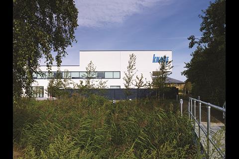
Which is why it comes as something of a surprise to find a new commercial headquarters here that owes as much to the sparkling white pavilions of thirties’ modernism as it does to the gruff industrial context that surrounds it. Furthermore, at a cost of just £1.8m for this 1,100m² corporate HQ, it also represents a masterfully cost-effective commercial construction enterprise.
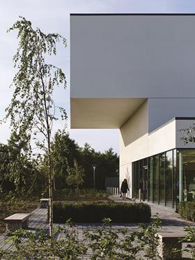
The new UK headquarters for German building materials manufacturer Knauf has been designed by architect AHMM and is located just north of Sittingbourne. It sits between Knauf’s former HQ - an unprepossessing two-storey eighties’ brick office block - and the vast angular volume of its main UK production factory.
The site is strategically located on the banks of the River Swale which separates the Isle of Sheppey from the mainland and allows foreign gypsum to reach the facility by boat, a curious logistical consequence of rival British Gypsum’s automatic legal ownership of all gypsum produced in British mines.
Cleverly, the building has also been designed as a corporate showcase for Knauf with the manufacturer’s products being selected for a wide variety of applications ranging from floor decking to external cladding. But the building’s design concept extends much further than this and is summarised by AHMM associate director Andrew O’Donnell when he describes the building as a “floating box or pavilion object situated between the river and the factory”.
“The building sits on a big box landscape” explains O’Donnell, “so we wanted something that maintained this efficient, orthogonal language and that was also emblematic of its landscape. It also had to strongly address the factory and the Swale.” This is essentially the design challenge that has been convincingly realised in the finished offices.
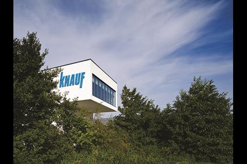
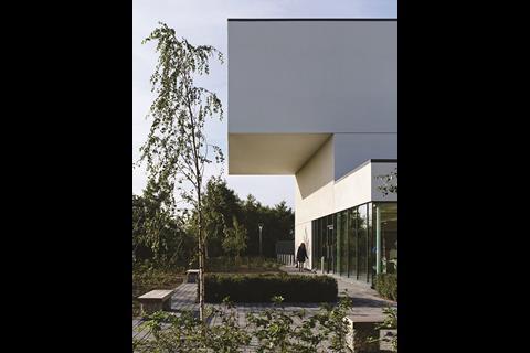
The building is formed by a series of stacked rectangular volumes all clad in the Knauf ThermaFrame through-wall system. This, in turn, is finished with spray-applied Knauf Marmorit render on Aquapanel boards. The uniform application of white painted render first evokes the thirties’ modernist feel and this is an association further enhanced by the building’s clean, streamlined edges, the dramatic surface interplay between recess and projection and the thrusting horizontal massing evident in its sparingly located strips of windows and the staggered building form.
This is no arbitrary application of a historic architectural style but, as O’Donnell explains, an aesthetic response grounded in context.
We’ve achieved a compact building with a variety of spaces and a pure articulated volume by using a simple structural and layout strategy and a limited palette of materials
Andrew O’Donnell, AHMM
“The building’s footprint is generated by the geometries around the site; we’ve extended the lines and axes from the factory and office next door to help create the new volume in between.”
The concept is a simple one but it works incredibly well. Although dwarfed by the massive factory building next door, this geometric alignment helps fix the building into its context and even establishes a visual dialogue with the nondescript original office HQ next door.
Even the linear strips of planting that comprise the site’s new landscaping and the new courtyard created between the old and new HQs conform to this invisible grid and thereby appear not
only extensions of the new building but of the site itself.
The overall ensemble forms an arresting masterclass in contextual composition. By paying axial homage to its neighbours the new building is able to undertake a fluid and dynamic new form entirely its own, yet still remain entirely rooted to its site, even while clad in resplendent yet locally incongruous white.
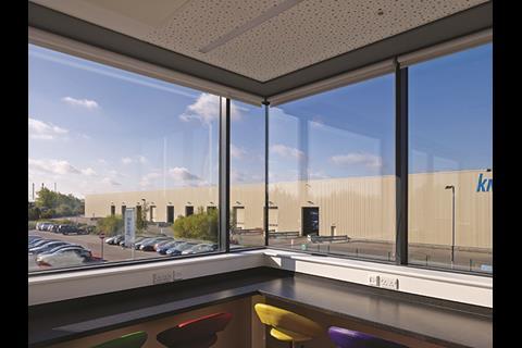
However, function as well as context helped generate the building’s distinctive form. The brief specified three key areas of accommodation for the new building: office, marketing and a workshop incorporating R&D. Each area is loosely allocated a floor in the new three-storey building and finds external expression in the trio of stacked boxes which form the overall building volume. The uppermost box contains a seminar room which is dramatically cantilevered towards the Swale, providing the building’s chief means of relating to the river as well as impressive views of the surrounding landscape.
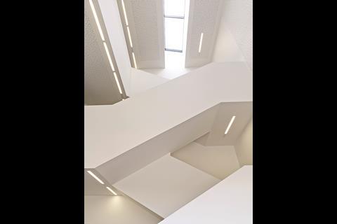
Despite the energetically choreographed exterior, the internal plan is ruthlessly compact and efficient. It provides eight principal spaces: reception, atrium, stair, gallery, office, workshop, research area and WCs.These are all hermetically squeezed onto gridded floorplates that display the same rectilinear rationality that helped generate the site response outside.
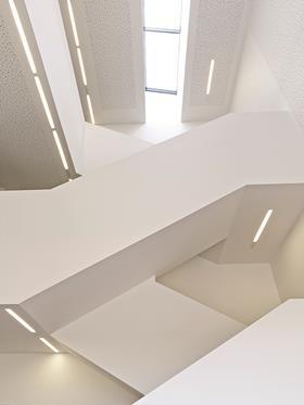
Moreover, despite its form so expressively denoting a three-dimensional “object” building, functionally the new block manages to inconspicuously sustain front and back faces. The side facing the old HQ and the new courtyard contains the entrance while a service area providing direct access to the workshop is discreetly located at the rear.
The building’s structure also displays the same efficiency as the plan. A steel frame holds profiled roof and floor decks with a truss applied to the uppermost floor to accommodate the river-facing cantilever. The frame enables clear internal spans and a flexible interior, most effectively demonstrated in the long volume of the ground floor gallery designed to display Knauf products.
For O’Donnell, a “lightweight structure” and “efficient plan” were key determining factors in achieving such a competitive cost for the project. “We’ve achieved a compact building with a variety of spaces and a pure articulated volume by using a simple structural and layout strategy and a limited palette of materials.”
Of course, this “limited palette of materials”, as well as the tight budget, were inevitably assisted by Knauf providing considerable quantities of building materials for use in the project, a welcome boon which O’Donnell readily admits. As well as the external wall frame and render, these also included insulation, grid ceilings, internal partition walls and raised access floors.
But it is perfectly reasonable to expect the headquarters of a building products manufacturer to deploy some of those products for its construction; it cleverly transforms the building into a three-dimensional marketing catalogue which in turn helps ward off the sterile anonymity that is so often the sensory effluence of corporate architecture.
What truly generates the Knauf building’s character, as well as its parsimony, is the simplicity and pragmatism of its design approach. The controlled diagrammatic rigour that characterises its design is evident in structure, elevations and plan. But, together with the contextual alignment sought by the concept, it finds real architectural expression in the volumetric movement and sculpted geometric precision of its assertively three-dimensional envelope.
Source
This feature is published in print with the headline Geometry Lesson













No comments yet