Venture inside the library hall and you are confronted by an even more unlibrary-like spectacle. The double-height space is dominated by three great gourd-like objects that are so large they burst through the roof. The gourds bring to mind vats in a brewery, although instead of copper, they are covered in a curious stitched patchwork of plywood.
These are not the only visual surprises awaiting unwary visitors to the library, which is due to open in January. In fact, the entire building, inside and out, is a heady mix of weird shapes, vivid colours, unorthodox materials and outlandish juxtapositions.
On one side, the library hall stands on seven gravity-defying stilts leaning at giddy angles. On the other, it rests on a narrow 7 m wide building strip, so that the horizontal and vertical forms fuse together into an inverted L-shaped block five storeys high. And above the roofline peeks a vermilion-coloured flying saucer-shaped lid, nicknamed "the beret" by the architect.
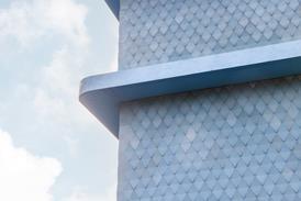
Aside from its upside-down arrangement and rooftop hat, the building is faced in three unorthodox and quite unrelated cladding systems. Variously opaque, translucent and transparent, they switch with unnerving abruptness at the corners. Three sides are sheathed in a patinated copper skin punctured by tiny windows. In contrast, the ceiling and flank wall to the void below the library hall are faced in an undulating diaphanous mesh of narrow stainless steel rods. And on the fourth side, the external face of the five-storey wing is clad in a sheer, transparent curtain wall, with large panels of yellow, magenta and turquoise glass E E that create a variegated pattern of colours across the entire wall.
Flouting architectural convention gives a particular thrill to Will Alsop, designer of the newly opened North Greenwich Station on London's Jubilee Line Extension and British architecture's leading enfant terrible. Alsop rejects the neo-modernist mainstream practised by Wilkinson Eyre, Hodder Associates, Lifschutz Davidson and other former protégées of Lords Foster and Rogers.
"That is a polite, rigid modernism trapped by rationalism," he says. "Our buildings are the real modern architecture."
The element of surprise
For his redefined version of modern architecture, Alsop takes an unapologetically sensuous and emotive approach – one that is partly inspired by contemporary painting and sculpture and one where surprise plays a major role. "We are always thinking about how to produce a pleasurable experience, such as the wash of daylight on vertical walls and the curved gourds in a rectangular building that pop through the roof in a cheeky way. We enjoyed designing this building. There's a sense of joy about it and I'm absolutely confident this comes through to the users." But what, you may ask, have such musings to do with the building's function as a library? Alsop's answer is to quote the advice of his client, Southwark council's chief librarian Adrian Olsen. He said the only way to get people to use a library was to attract children below the age of 10. The sense of joy and surprise in the building is intended to hook the child in us all.
Indeed, the council's brief stated: "Local people must be able to relate to the architecture and design as well as to the services provided, and they should feel pride in, affection for, and ownership of the building." More specifically, the council required that, as well as offering books, this community library for the 21st century should contain a range of IT-based learning facilities for local people. On top of that, the building is intended to play a major role in the regeneration of the run-down inner-city area, which, through the Peckham Partnership, has been awarded the country's largest Single Regeneration Budget grant by the DETR. The council's urban regeneration director, Fred Manson, planned the library to open on to a new landscaped pedestrian square and stand close to a new health and fitness centre, so that together the two buildings would service a healthy mind and a healthy body.
In its own contrary way, the new library building manages to address all these functional, social and practical issues.
Why is it upside-down?
In Alsop & Störmer's scheme of things, the upside-down L-shape is not as arbitrary as it first seems. "We wanted to create another gateway to the new square," says Christophe Egret, Alsop's fellow director. "So, the building is formed as an arch between Peckham Hill Street and the square. We raised the library hall 12 m above the ground so it doesn't feel like a weight above your head, and we lined the ceiling and side wall with undulating stainless steel mesh to reflect the light and make the place feel safe. This creates a sheltered space in its own right that can be used for public events and a portico through which you enter the building." The obvious challenge posed by the arch arrangement is how to siphon passers-by off the street and up four storeys to sample the books and services on offer in the overhead library hall. Alsop & Störmer's solution was, first, to line both sides of the five-storey block with transparent glazing, so its contents – although not those of the library hall – are highly visible, and second, to make the vertical route up to the library hall as pleasurable as possible. The pleasure is generated by the coloured transparent glazing panels, which cast bold colour washes on walls and floors, and by more stainless steel, draped down the centre of the stairwell.
The three lowest floors of the narrow block contain a collection of neighbourhood, information and learning services. On the ground floor, a council one-stop shop directs local enquiries to the relevant departments. Above it are an adult learning centre, with 50 study places wired into the national libraries' computerised learning system, and a children's library.
Saving the best for last
On reaching the key fourth floor, visitors are treated to a double and quite unexpected spectacle. On the north side, a wide vista opens up over the rooftops to central London's forest of towers.
On the other, there is the library hall itself, filled with its three mysterious gourds.
"We elevated the library above the ground so that it would be a little bit apart from the normal humdrum life of Peckham," explains Egret. "People would come out of the lift and into another world. We wanted to reveal views of the city that people wouldn't have seen before. And we wanted the library to be like an attic, where people can concentrate without distractions." The library hall is a plain rectangular white box with tiny windows that frame the sky, and perimeter skylights through which even daylight spreads over on the walls below. The three gourds are raised on concrete legs above reading tables. Their rounded surfaces are faced in small squares of thin plywood stapled together like leather patchwork, a sensual, organic surface set off beautifully by the flat white walls of the enclosing hall.
The three gourds all contain meeting or activity rooms. The two outer gourds, which are fully enclosed, have an irresistible womb-like feel inside, making them inspiring settings for children's group activities or intimate community meetings. The central gourd, in contrast, is cut away so that it is open to and visible from the library hall. It serves as an African-Caribbean study centre.
Patchwork and Brillo pads
The finishes of the patchworked gourds were inspired by the sculpture of Richard Deacon; their embellishments also have a sculptured appearance. The internal light fittings, devised and assembled by artist Joanna Turner and nicknamed "Brillo pads", are soft cushions of aluminium chain mail that diffuse the light from point sources. The skylights to the two enclosed gourds are shaded "butterflies" – hinged pairs of curved plywood shutters.
And the open central gourd is encircled by clerestory windows above the roof level and shaded by the large vermilion beret that is so eye-catchingly visible from neighbouring streets.
Alsop & Störmer's new library building sports enough architectural surprises and delights to ensnare the most anti-literate inner-city dwellers. Whether they will continue to take the lift up to the fourth floor over the coming years will, however, depend on the services offered by the council's library department.
Peckham Library
- 1
- 2
- 3Currently reading
Tale of the unexpected


