Ken Shuttleworth practice's first big scheme is hotbed of people-oriented sustainability. It also employs an policy of sourcing much of the products used from within these shores
- Decision to retain dilapidated former M&S headquarters
- Procurement and specification of key feature carried out with UK firms
- Detailed assessment of building services element
A sinister legacy
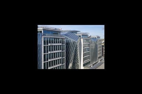
It is hard to believe that the building now standing at 55 Baker Street once blighted its surroundings. But the 93,000 sq m scheme, once M&S’ 1950s-built headquarters, formed an impenetrable wall between Baker and Rodmarton Streets and helped wither the strip. Meanwhile, nearby Marylebone and Oxford Street flourished. Perhaps it is even partly to blame for Jerry Rafferty’s mournful song which uses Baker Street as a metaphor for loneliness and isolation.At any rate, the last thing Ian Lomas, project architect from Make, wanted to do when he got the 2005 commission to transform the modernist behemoth into a speculative office development, was to cause more fuss and bother to the local populace. He decided to take the bold step of leaving most of the building in place and carrying out a refurbishment (albeit a sculptural one) rather than a knock-down-and-build-afresh. It was a bold move for developer London & Regional.
“We wanted to create less dust and noise,” the architect tells me, as we walk round of the half-finished building. The gamble paid off for both Make and L&R; the building has achieved BREEAM 'Excellent' rating and 55 Baker Street is nearly fully let with top notch tenants including Knight Frank and BDO Stoy Hayward.
Re-Make
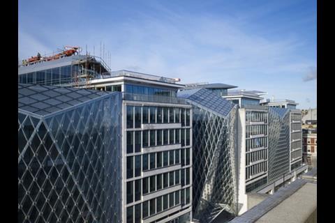
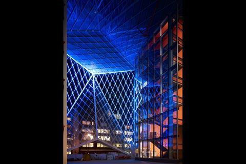
The decision to refurbish - 50% of existing building fabric remains - was one of a number taken in the interests of people-oriented sustainability taken by Lomas and the rest of the team. For passers-by, the scheme is already an attraction. There’s gawping on a large scale at the ‘masks' or infills linking the Baker Street-side fingers and covering the seven-storey atria. Before scheme is fully up and running by May, the masks will be lit by strafing LEDs (designed by Jason Bruges studio and to be programmed by a revolving cast of artists) and the forecourts will be open for public access to catering and shopping outlets around the clock. The building can welcome people onto the site and perhaps atone for a few more modernists sins. Round the back, the developer has had 23 mews houses built, including key worker and social housing.Buy British
But Make were also keen to make use of ‘locally sourced’ products in the building, namely those from British manufacturers and suppliers. “It’s better for everyone if we can employ craftspeople and keep the trades going,” Lomas says. “We are keeping tradition alive as well.”Clearly, closer to home means less CO2 emitted in travel and shipping as well. But specifying locally was of prime importance to this project in particular. And virtually everything has been made bespoke for the development.
Everything that can be triangular in 55 Baker Street is. Elements are based on a triangular ‘net’ that can be seen most clearly in the masks. Indeed, the building even has a logo based on triangles. This covers it roller blinds. Elsewhere, from the door handles to the toilet roll holders to the fire safety signs to ceiling panels to fabrics, three-sidedness rules. This degree of specification required control at every stage of the product design and creation. And control is something that many firms end up losing when working with companies on the other side of the world.
Mission: control
Keith Gill is manager at WG Simpson, Middlesex, a specialist tiling contractor which sourced the polished granite from Italy. Although the materials were from overseas, he says that their local knowledge was crucial to Make getting the products they wanted. “The material was specified through consultation,” he says. “We have good contacts with the people in the quarries. Things are much easier when you know and trust someone in the market.”Furthermore, Simpson’s Kengate works in Shepperton made the pre-cast terrazzo for the back staircases. “We are one of the few manufacturers who do this in the UK. We get by on smaller orders like this,” says Gill. “We can’t sustain the larger ones.” He doesn’t blame people who don’t go down the local path, though: “British craftsmanship is good but it tends to be a bit more expensive. An architect should not specify British if the quality is compromised and you don’t get value for money.
It’s better for everyone if we can employ craftspeople and keep the trades going. We are keeping tradition alive as well
Ian Lomas, project architect, Make
“But [if you go British] you can always go to a factory to meet with someone. If you go abroad you lose a bit of control and you put your trust in someone you can’t see.”
Foyer design
Control was even more important when Make came to design the chairs for the foyer. When it presented its first design to High Wycombe furniture maker, Davison Highley, it discovered it was for an impossible object. It wanted a tent chair but the manufacturer advised that it would have to be a timber-framed. So Make and Davison worked together in order to produce something that was equivalent to the original concept.“If they had sent their drawings to the Far East, they would have got something that was reminiscent, but didn’t have the nuances of the detail that we were able to produce,” says sales director, Tim Armitt. Instead, Make, an hour’s train ride away, were able to meet regularly with the team through several different prototypes. And not just the designers.
“They met the cutter and upholsterer and the frame builders who were involved in making the special angles. They met with the seamstresses who had to make the long, pointed terminuses – it was a big team effort – they bought into that hands on approach. “We could all stand round the chair and say, ‘do this and do that,’” says Armitt. What’s more the job came in under budget. “People think that when you have a bespoke service from the UK, it will be ridiculous money,” Armitt says. “But we make new designs but we know they work because the components are things that we have tried and tested and they are price comparable. If you don’t reinvent the wheel you don’t break the bank.”
Not any old iron
Working with British manufacturers allowed Make to create the triangular door handles and toilet roll holders (from architectural ironmonger, izé) and the accessible lifts (Elan, Dartford) with proper recessed handles rather than the ugly bars that Lomas detested. The kick plates on the doors are triangular (using less metal) as are the windows. As a result, they are friendlier looking than your average access point.Lomas’ eye for reinventing things most architects take for granted and the insistence on triangularity has resulted in some interesting other sustainability features. For instance, the orange struts, made by Lee Warren in Hayes, which hold up the 30% fritted, glaze atria roofs were not what the suppliers had in mind.“They thought I wanted something flat,” says Lomas. “They said: ‘if you don’t use that you will have to have struts in the roof.’ I said that was what I wanted and in the end I kind of like them. I think they look like an insect hanging from the roof. They are very playful and a more efficient structure.
“People assume they know what architects want They shouldn’t. We think it’s more exciting to push formal possibilities. The aesthetic is worth that extra bit of work.” The architect thinks the struts saved 30% of steel because they were able to create thinner members due to the greater stability and calls this interplay of design and sustainability ‘a virtuous circle.’ A good definition of both quality and great art is that it makes sense in every way.
One of Lomas’ few sadnesses is that he couldn’t find a British manufacturer to work on the signature masks. They were a product of glass-façade manufacturer, Seele, in Austria. “We have lost that expertise in Britain,” Lomas says.
Too complicated?
Could Make have not avoided the need to use British firms by making things simpler? Possibly. Creating everything bespoke may seem lavish and, indeed, with one or two extra people on a team of 13, it certainly added money to the job, but with a refurbishment rather than a rebuild, the budget could support it. And Make still has to prove itself despite much excitement.Several schemes they have designed, such as King’s Reach tower, Southwark and Hampstead Road have not left the drawing board. And there are reported problems with the Cube in Birmingham and a large scheme for the Hammersmith riverfront (which needs all the help it can get.) Make has built the delectable Dartford judo club and the prefab St Paul’s Cathedral visitor centre, but this is their first major project.
An architect should not specify British if the quality is compromised and you don’t get value for money.
Keith Gill, general manager, WG Simpson, a specialist tiling contractor

55 Baker Street is a triumph of consistency and wit. There are simply too many riches to write about here. From the tree-like transfer structure in the foyer (pictured above) which mimics the pear-tree trained to grow in the same shape in the garden behind the reception desk; to the painted stairwells which glow into the night; to the pavilion on the roof not visible from the street, which Make got as a gift from Westminster council for good behaviour, everything about this building is good, including the building services (see fact file below).
“We used problems as an opportunity to come up with interesting solutions to them rather than obvious ones,” says Lomas. “In creating the office, we were fighting with the perceptions of refurbishment as being second class. We wanted to make it better.”
No Ordinary Refurb
• M&S continually added non-structural elements to the interior creating a warren. Make removed these and existing cores within the fingers as well as the bridging elements.
• It replaced 12 columns in the foyer with a tree-like transfer structure (Watts in Bolton) which is on castors it can move with the building. Make added eight perimeter staircases. Beyond that, the existing concrete infrastructure was left in place.
• The building is a mix of 50% glazed and non-glazed, which includes every material from brick to metal panels. Make replaced very old glass with high-performance glazing but left the high-performance glass that had been fitted in the 80s.
• Heating and cooling are provided by bespoke chilled beams with holes which can be plugged or unplugged to increase capacity, reduce waste and allow for flexibility. The use of chilled beams also allowed the team to reduce the ceiling voids and increase floor-to-floor space to BCO standards in an older building. 90-95% of the space is grade A.
• Their use allowed the client and tenant to take advantage of energy savings of approximately 1w/m2, reducing running costs and carbon emissions. The beams also incorporate lighting, fire alarms and environmental controls.
• The chilled beams also supply heating for the building, which comes from gas-fired condensing boilers distributing low temperature hot water to them.
• Radiators have been installed in limited areas of retained façade to offset the effects of cold radiation and down drafts from the existing glazing. Cooling is provided by 6.2mw of air-cooled chillers. These incorporate free cooling coils to maximise the energy efficiency of the machines during periods of low ambience.
• Getting the mix of lighting and cooling correct was challenging. “The problem was the spacing of the beams and the spacing of the lights to keep the uniformity of the units, says services engineer,” Mike Pile of Blyth and Blyth.
• But the team achieved compliance with principle of CIBSE LG 7, uniformity 0.8 and the design lux levels. To maximise energy efficiency a fully addressable lighting control system was fitted with PIR switching and daylight linking.
• The offices are 15m deep with a 2m corridor dictated by the steel members of the 1950s building.
Postscript
Picture credits: Make


