DonŌĆÖt be fooled by the classical Edwardian exterior ŌĆō GrimshawŌĆÖs modern conversion for the London School of Economics is as exciting as it is innovative. By Martin Spring Photographs by Jens Willebrand
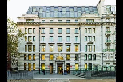
You could easily pass by GrimshawŌĆÖs latest building without giving it a sideways glance. This is despite it winning an architectural design competition, standing in the heart of London and being opened last month by the Queen. The building you see from the street, though, is subdued, an eight-storey classical Edwardian block that is primly buttoned up by a stone facade. ItŌĆÖs only when you venture inside that you are hit by GrimshawŌĆÖs modernist conversion.
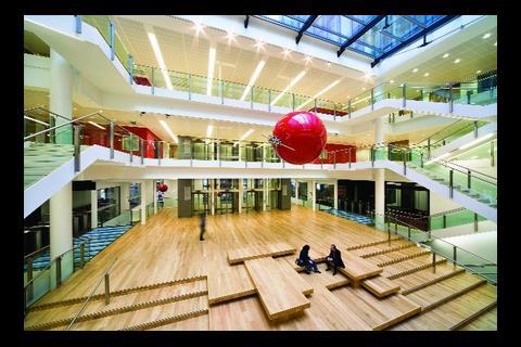
Until 2004, the building contained a warren of cellular offices for the grey-suited bureaucrats of an obscure civil service department. Now, at a cost of ┬Ż71m, it has been transformed into 12,700m2 of academic accommodation for the London School of Economics, based around a great column-free atrium. This huge, exhilarating space is awash with daylight. Inside it, casually clad students glide up and down open staircases on either side, hot-desk at PCs on a mezzanine gallery or chat on clusters of timber benches at its base.
So what has been going on here? If the external envelope has hardly changed since 1916, could it be that Camden councilŌĆÖs planners held the whip hand here? Yes, thatŌĆÖs true, admits Julian Robinson, the LSEŌĆÖs development director, who explains that the building lies within a conservation area.
Does it also mean that Grimshaw has at last committed the ultimate architectural cop-out of retaining the historic facades and replacing everything behind them? No, nothing as crude as that. Look more closely, and what you find is a clever conversion that manages to be radical, subtle and pragmatic, all at the same time.
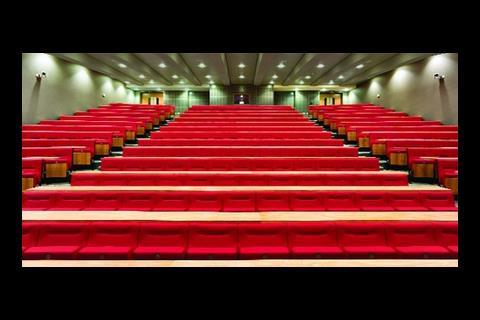
Andrew Milward-Bason, associate at Grimshaw, says the existing building had a conventional u-shaped plan, with each wing containing cellular offices on either side of the central corridor. With the help of structural engineer Alan Baxter & Associates the architect decided to rip out the inner ring of offices, along with the steel beams and columns supporting them, while retaining the outer ring. This neatly created an outer
ring of offices, to serve the academic staff and researchers, and an enlarged hollow core with enough column-free space to house a 400-seat auditorium.
We have turned a building that was closed off from the street into a modern university building that wants to announce its presence
Andrew Milward-Bason, Grimshaw
The large auditorium has been slotted into the basement, and its lid doubles conveniently as the floor of the atrium directly above it. The sloping ceiling of the raked auditorium is echoed above in a shallow amphitheatre hollowed out in the atrium floor. Here clusters of timber benches serve as an informal social area for students and staff.
The atrium is three storeys high and bounded on three sides by teaching spaces. Above its glass roof, the top six floors have been given over to cellular offices on either side of open-plan secretarial space. As the inner ring of offices on these upper floors effectively cantilever over the atrium, they are supported by steel hangers suspended from a new storey-high steel truss on the second top floor. This lightweight solution avoided the need for a heavy transfer floor.
As for the original Portland stone box enclosing these spaces, a series of light touches has been introduced. For a start, the sills of the ground-floor windows have been dropped down to pavement level. Not only does this put student activity around the basement auditorium on view to passers-by, it also offers those inside views of the street. A similar effect has been created at the two corners of the building, where a public cafe and stationery shop, with clear-glazed internal partitions overlooking the collegeŌĆÖs circulation spaces, have been inserted. These subtle interventions set up the visual interplay between inside and out that is so dear to modernist architects, without undermining the classical facades.
On top of that, the main entrances at the front and rear have also been glazed, although set back from the stone facades. They are aligned on an axis that offers unobstructed views through the building and also a pedestrian route between Holborn tube and the rest of the LSE campus. And in the rear courtyard overlooking LincolnŌĆÖs Inn Fields, metal railings have been replaced with more inviting stone benches to create what Milward-Bason calls ŌĆ£a mixing valve between the college and the publicŌĆØ.
On a more practical note, the building attains an ŌĆ£excellentŌĆØ BREEAM rating. More than half of the original fabric has been retained, and its environment combines natural ventilation and displacement air-conditioning.
LSEŌĆÖs Julian Robinson says: ŌĆ£GrimshawŌĆÖs building boosts the LSE to world class architecture, and this puts us on a level with Harvard and the Massachusetts Institute of Technology in attracting top students and staff.ŌĆØ For Milward-Bason: ŌĆ£We have taken a softly softly approach to turn an Edwardian government building that was closed off from the street into a modern university building that wants to announce its presence.ŌĆØ In other words, the building sets a new benchmark for introducing contemporary sociable uses to a formal historic building without destroying its architectural and structural integrity.
Downloads
How it all fits together
Other, Size 0 kb





No comments yet