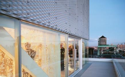
A Japanese architect and a UK cladding specialist came together to develop the shimmering expanded aluminium veil that has been used to clad the New Museum of Contemporary Art.
Situated in the lower east side of New York it uses a total of 3,270m2 of the material, the first installation of its type in the country. Here Toshihiro Oki of architect Sanaa and John Champion, technical director of facade specialist James & Taylor explain how it was done.
What was your vision for the building?
Toshihiro Oki Originally we started with flat cladding panels as we wanted a very crisp building with hairline joints, but we realised it was impossible to achieve in the US because of the construction and installation tolerances they work to. We started looking at different materials, one of which was expanded aluminium mesh.
What did you think when you were presented with the design?
John Champion Every project we do is bespoke, so we are used to coming up with a solution that suits the building in question. In this case the architects had gone to great lengths already to understand the system and the material well. So our initial reaction was, great. Then there was the question of it being in New York and the logistics this entailed but it didnŌĆÖt seem insurmountable.
How was the design developed?
TO The mesh is typically made in a smaller diamond. The one we wanted was 199mm across the diagonal, so we didnŌĆÖt have any examples. When we were speaking to the Expanded Metal Company they mentioned James & Taylor and it turned out that they were working on a project, the Young Vic in London, that had a very similar specification. We had different intentions in that we wanted a monolithic block with no visible joints and so our detailing was different. The end of the mesh panels overlaps by about 15mm to give the appearance we wanted while giving the installer a much greater tolerance.
JC The architects knew what visual effect they wanted and the porosity of the mesh so it came down to being a process of elimination. It was quite a long-winded process but itŌĆÖs much easier to work with a firm that has a clear vision.
What was the main challenge?
TO We wanted the fixings holding the mesh to the structure to be as minimal as possible and initially designed a flat L-shaped bracket, but when we saw the mock-up we decided we wanted something smaller. So together with James & Taylor we came up with a stainless steel rod with a coined end. This is 10mm in diameter and so is a lot less intrusive visually.
JC As well as the fixing the other issue was the extremes of temperatures you get in New York. This meant ice build-up became an issue. Basically you have to treat the mesh as if it was a giant lollipop stick and calculate for it building up a solid sheet of ice. This limited how thin we could go with the mesh, which impacted on the cost.
Did the client have any concerns?
TO One of their concerns was pigeons sitting on the mesh; however, because the angle of the mesh is quite steep itŌĆÖs too uncomfortable for them. Also its close mounting, an inch and a half from the building, makes it difficult for them.
How did you go about the installation?
JC We found an installer in Minnesota that specialises in museum projects.
They built a two-storey mock-up. Then we all flew in to see it and agreed to go ahead ŌĆō it can look a lot different to a six inch square on your desk. It took around 12 weeks to install.
Do you like the finished building?
TO ItŌĆÖs exceeded all the expectations we had. It has the effect of blurring the edges of the building and when the sun shines on it you get different patterns forming on it which change from noon to sunset.
JC WeŌĆÖre extremely pleased, but I would say that. WeŌĆÖve worked on around 10 projects using this system and every one is different. IŌĆÖm longing for the day when we get one that is similar to the previous project.
Specifier 07 March 2008
- 1
- 2
- 3
- 4
- 5
- 6
- 7
- 8
- 9
- 10
- 11
- 12
- 13
- 14
 Currently reading
What a mesh!


No comments yet