A tidal wave of protest greeted this modern development sitting alongside traditional houses on the Dartmouth estuary. But the Riverhouse delights in its views, sense of space and daylight. Quite enough to shut the neighbours up, says Martin Spring
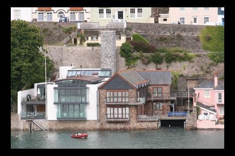
Right from the start, the Riverhouse was a controversial project. The client, a London businessman and his family, insisted that the design should be ŌĆ£unashamedly contemporaryŌĆØ. The trouble was that the site was on the waterfront at Dartmouth in south Devon, where the native architectural species are grand Victorian and Edwardian villas with brick or stone walls and double-pitched slate roofs. Indeed, the architect, Robert Seymour, whose office lies just a couple of blocks away, is by his own admission a traditionalist and studied for an extra degree in historic building conservation.
ŌĆ£Our advice was that gaining planning permission was going to be a battle,ŌĆØ says Seymour. But with the help of several architects in practice well versed in modern design, he eventually came up with what he thought was a good design. ŌĆ£We made a large model of it and took it to the council. To my surprise, the council was enlightened enough to say this was smashing. One councillor even said Dartmouth shouldnŌĆÖt just be thinking of the past.ŌĆØ
This was not a view shared by many Dartmouth residents, however. ŌĆ£When the house was under construction, people would peer over the street wall,ŌĆØ says Seymour. ŌĆ£One woman said to me: ŌĆśItŌĆÖs absolutely awful, it doesnŌĆÖt fit here.ŌĆÖ I answered: ŌĆśPerhaps it shouldnŌĆÖt fit in with the other buildings. Perhaps it should stand on its own merits.ŌĆÖŌĆØ
In truth, even the neighbouring buildings pale into insignificance next to the spectacular natural setting. The house stands right at the waterŌĆÖs edge of one of EnglandŌĆÖs most beautiful estuaries, designated as an area of outstanding natural beauty. Dartmouth estuary is a long narrow stretch of tidal water bounded dramatically by steep hills on either side, and with the view out to the sea framed by a steep gorge and a 16th-century stone castle in the middle distance. The design of the house is ŌĆ£all about the light and the context of being by the waterŌĆØ, Seymour says. The key question, then, is whether the modern design and use of materials make the most inspiring use of the surrounding daylight, water and views.
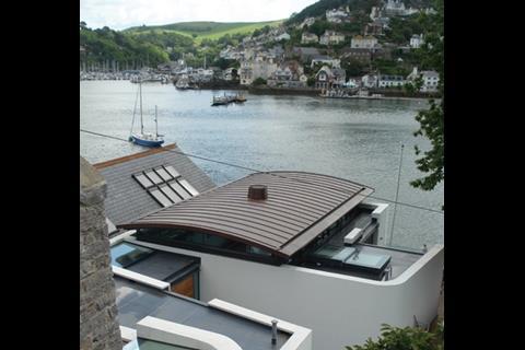
The main external view of the house is from the access road at the top of a 20m-high cliff, with the house nestled between the foot of the cliff and the waterŌĆÖs edge. Looking down from the road, a shallow barrel-vaulted roof in copper presents a clear-cut, gently curving profile against the dappled water beyond. Alongside it, the rest of the house is more of a jumble of flat roofs, skylights, white-rendered parapets and narrow patios.
Inside looking out
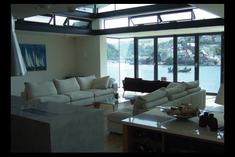
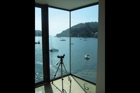
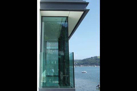
ItŌĆÖs inside the house where the modern design and use of materials really comes into its own. After venturing down a steep external staircase and through a couple of top-lit corridors, you find yourself in a large, open-plan, L-shaped living room, dining room and kitchen. Here you are instantly transfixed by the view out of the opposite side of the living room. A clear glass wall stretching from floor to ceiling and the entire width of room presents a mesmerising panorama of the estuary, its boats and the village and hills on the opposite shore. More than that, the window-wall projects outwards by 1.5m so that the view takes in a full 180├× sweep of the estuary including the shoreline on this side.
After gorging yourself on the view, you take in the rest of the L-shaped room. The shallow barrel-vaulted roof seems to float overhead above a continuous ring of clerestory windows. These windows flood the deep-plan space with daylight. Its centrepiece is a free-standing fireplace below a copper funnel suspended from the ceiling.
One woman said to me: ŌĆśItŌĆÖs really awful, it doesnŌĆÖt fit here.ŌĆÖ I answered: ŌĆśPerhaps it shouldnŌĆÖt fit in. Perhaps it should stand on its own meritsŌĆÖ
Robert Seymour, architect
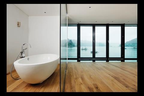
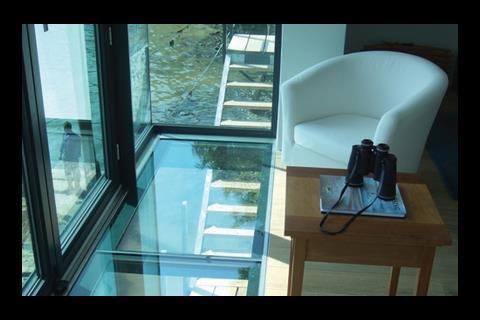
The master bedroom, which lies below the living room, is yet more spectacular. It is dominated by another projecting bay window-wall just like the one above. But here the floor of the bay is also clear glazed, so that you glance straight down from the eye-level panorama to water lapping against the stone wall of the house just 3m below your feet.
A truly sybaritic touch in the master bedroom is the bathroom, which shares the same mesmerising view from behind a clear-glazed partition. Seymour relates that the lady of the house initially requested that electrochromic ŌĆ£smart glassŌĆØ be specified so that, while reclining in her bath, she could instantly switch the see-through partition into an opaque modesty screen from passing boats. But later on she relaxed her demand.
The rest of the house, it must be said, is on the convoluted side. This is no doubt because the large 600m2 house, including five bedrooms and seven bathrooms, has all been squeezed into a narrow site bounded by high party walls on either side and the sheer cliff face at the rear. The challenge was how to provide daylight into all the rooms. SeymourŌĆÖs solution was to nearly split the house into two halves by a narrow patio courtyard, which channels daylight into the bedrooms and study bounding it. As we have seen, the deep-plan living room draws daylight from its clerestory windows, while the kitchen, corridors and internal stairs are all fitted with skylights for the same purpose.
The materials and detailing are in a stripped-back modernism that matches the free-flowing space, light and views of the architecture. Thus, flush white-painted walls are used externally and internally, and these bounce daylight through the interiors. There are no skirtings or architraves: instead junctions between flush surfaces are marked by simple shadow gaps or grooves. Steel beams are openly expressed, and the balustrading to the internal stairs is likewise made of clear glazing without frames or even handrails.
Nautical modernism
The modernism is also crossed with a nautical theme, which Seymour says was inspired by his clientŌĆÖs passion for sailing. So the flush external walls come with curved corners, while the balustrading to the external stairs is in steel tubing and the internal floors are untreated oak boards.
Riverhouse delights in its spectacular surroundings. In the hands of Robert Seymour & Partners, its overt modernism is much more than a veneer of styling. In its frameless clear-glazed window walls, open-plan interiors, uncluttered flush surfaces and ubiquitous daylighting, it makes the most of the view, daylight and sense of space. The only regret is that passers-by antagonised by the modern exterior and jumble of forms cannot see these magical interiors.
On the waterfront
RiverhouseŌĆÖs peculiar seafront site laid severe technical demands on both design and construction. These included:
Flood defences
The RiverhouseŌĆÖs site on the estuary shore is part of a 100m stretch of coastline that has been specially designated by the Environment Agency as prone to abnormally high storm surges that could exaggerate high spring tides. ŌĆ£The Environment Agency required us to allow for a 200mm increase in sea level to cope with a once-in-200-year freak situation,ŌĆØ relates architect Robert Seymour. ŌĆ£I said, ŌĆśBlow that! I want to go a good meter higher than that to cope with global warming.ŌĆÖŌĆØ
As a result, a continuous flood-resistant bund wall was built all round the house to a height of 1.1m above the lowest (bedroom) floor level. The house effectively sits in an impervious dish. The bund wall was built of a combination of water-resistant insitu concrete and clear sheet glass. The glass sections of the bund wall were the tricky part, as to conform to the minimalist style of the rest of the building, they were made up of three thick sheets of clear laminated glass bonded together without vertical balustrading or other reinforcement. To hold them in position they are securely bonded to the reinforced concrete floor slabs below and the concrete walls on either side.
║├╔½Ž╚╔·TV materials delivered by water
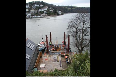
The planning permission stipulated that all building materials be delivered by water along the estuary rather than being hoisted down the cliff face from the access road above, where parked lorries could obstruct passing traffic. Accordingly, the contractor Midas Construction installed a temporary platform with a large crane in the water right next to the house and delivered all materials by barge from the Noss Marina on the other side of the estuary.
But two-thirds of the way through the contract, even this elaborate system became inadequate. It stood in the way of a new underwater sewer that was being built at the same time for the local water supplier, South West Water. ŌĆ£South West Water told us we would have to remove our platform for 10 to 12 weeks,ŌĆØ says Seymour. ŌĆ£But we had a fixed-price contract with penalty causes. So I had to go back to the planning committee, and they agreed to allow us four special deliveries from the road. In the event, we had six deliveries from the road, and the house took six months longer to build. It was an escalating-costs nightmare.ŌĆØ
Renewable energy from the estuary
As the client wanted the new house to be sustainable and eco-friendly, the architect and services engineer looked at various options of renewable energy, such as a ground-source heat pump, wind turbines and solar collectors. ŌĆ£In the end, we decided to extract heat from the river, and this seemed very appropriate,ŌĆØ says Seymour. ŌĆ£Sea water is pumped out of the estuary, heat is extracted from it by a heat exchanger, and then the water flows back into the estuary again.ŌĆØ A full gas-fired boiler has been installed as a back-up, but Seymour reckons it will only be used in emergencies. Finally, rainwater is also stored in another underground tank and used to flush toilets and water plants.
Project team
Architect Robert Seymour Associates structural engineer Chris Wright Associates services engineer DCL quantity surveyor Davis Langdon main contractor Midas Construction
Downloads
Section
Other, Size 0 kbFirst floor plan
Other, Size 0 kb







3 Readers' comments