How do you carry out a construction project more than a mile out to sea during one of the wettest, windiest summers on record? Well, Kier’s approach to the £3m Southend Pier Cultural Centre job was to build it somewhere else
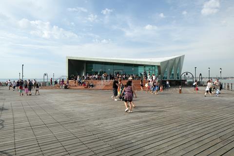
Southend Pier enjoys the accolade of being the longest pleasure pier in the world. The downside to this is that it makes it a very difficult place to construct a building. Most visitors take a small train to get to the end of the pier, which is 1.34 miles out in the Thames estuary. The experience is akin to being out at sea on a small boat, with strong winds, big waves and rain lashing in. “It can be quite nice on land but once you get to the end of the pier it can be windy and cold, which means it can be a dangerous place to work,” says Roy Francis, senior contracts manager for Kier Construction.
Francis should know. Kier has just completed the £3m Southend Cultural Centre at the end of the pier. As well as the weather, the project team had the not inconsiderable task of getting materials out to a site where the only land-based means of transport was a mini tourist train.
“All the materials had to be delivered by barge,” says Francis. “This was dependent on the tides and the wind so the pre-planning was crucial. You can’t just pick up the phone and order a length of two-by-two.”
Despite these challenges, the building was completed this summer just three weeks later than the target date. So how did Kier and the rest of the team, which included architects Sprunt and White Arkitekter and structural engineer Price & Myers, manage it?
Well, they hatched a plan that was very much in keeping with the spirit of the summer. Following the example of the Queen on her Jubilee and David Beckham with the Olympic torch, they sailed the building down the Thames.
Watch a video of the moment the 170-tonne structure was transported along the Thames Estuary and lifted onto the pier:
On dry land
The ambitious idea of prefabricating the whole building off site and lifting it into position from a barge made sense for a number of reasons. For a start, the centre is relatively small in size. The finished building also had to be raised 1.5m above the pier deck to cope with storm surges, which meant a truss was needed to support the base of the building. Tim Lucas, partner at Price & Myers, explains that this truss spreads the weight of the building around the pier piles and that the stiffness needed to spread these loads was about the same as that needed to support the base of the building while being transported and lifted into position.
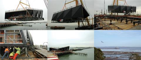
“It started to make the idea of lifting the building in one piece feasible,” he says. He adds that the unusual shape of the building, which has a hyperbolic paraboloid roof and walls made up of interlocking triangles, made for a stiffer structure.
Constructing the building off site meant that Kier could prepare the base of the pier in parallel to the main construction, thereby helping to reduce the length of time the programme took. The pier consists of cast iron piles and columns linked by cross-bracing, topped by a timber deck.
Conversations with a retired pier engineer, coupled with tests, revealed that the piles were up to the job but the tie-bracing was badly corroded and needed work. The columns were at different heights so capping beams had to be used to create a flat base.The building was constructed 20 miles upstream at the side of a dock in Tilbury.
It has a steel-trussed base and a steel frame. Two sides of the building and the roof were clad in plywood, which was protected by a weatherproof membrane, with the other two sides left open so a glass curtain wall could be installed after it was lowered into position by the crane.
According to Lucas, this was driven primarily by the need to keep the weight of the building down to 170 tonnes. “It was on a real diet as it had to be within the floating capacity of the crane,” he explains.
The services were also installed at Tilbury.
The big lift
The team had to wait for the right day to lift the building into place, as tide and weather had to be favourable. On 16 May, a 400-tonne sheer leg floating crane was used to lift the building from the dockside onto a flat bed barge. A tug was used to tow the barge out of the dock at high tide into the Thames, with the floating crane following. This fleet travelled down the Thames to Southend where it moored in deep water overnight ready for the big lift on the morning of 17 May.
The day dawned with flat, grey skies but at least it was dry and still. The team had a two-hour window on either side of the high tide to complete the whole operation. River traffic was slowed to minimise the risk of wash disrupting the delicate lift and at 8pm the crane, tug and barge were positioned by the side of the pier. The crane lifted the building clear of the barge, which was towed out of the way by the tug.
The crane was now free to move towards the part of the pier where the centre was to be placed. It lowered the building slowly, with workers helping to position it so that it engaged with guide pins on the pre-prepared deck. After a two hour-long operation, the building was in place.
Kier could now finish the centre. Work included installing the GRP cladding, the curtain walls on the north and south ends, service connections under the building, internal finishes, steps and ramps to accommodate the height difference between the building and pier deck, and applying a membrane to the roof by spraying it.
Unfortunately Kier had to do all this work during the worst British summer on record. “It couldn’t have been a worse year to do it,” says Francis. “It was windy and cold, and when the rain arrived it was horizontal.” External work was carried out using cherry pickers and aluminium towers, which required relatively calm conditions. “It would be OK on land but when you got out to the end of the pier the conditions would be too severe to do any external work,” says Francis.
The sprayed membrane also had to be applied in calm, dry conditions. Francis says this was constantly put off because of the weather, which meant it was completed relatively late. This, in turn, meant that water got into the building. Kier decided against installing the oak flooring because of the risk of damp causing it to curl, so a temporary carpet has been laid. The oak will be laid later this year when the team are sure that the building is completely dry.
It may not have been plain sailing, but to finish this project just three weeks late was an impressive achievement - marking another noteable chapter in the Thames’ eventful summer.
Project team
client Southend- on-Sea council
concept architect White Arkitekter
executive architect Sprunt
structural engineer Price & Myers
service engineers Atelier 10 and DGR Mechanical Services
QS Sweett Group
contractor Kier Construction
End of the pier review
Ike Ijeh gives his verdict on a building that takes the seaside promenade back to its Victorian roots. Photographs by Luke Hayes

Only the Victorians could have conceived something as audacious and quixotic as the pleasure pier. Aggrieved by the fact that extreme tidal ranges at many British seaside resorts often made it impossible to see the sea from the coast for much of the day, they simply extended wooden promenades out into the water so that nature could be constantly reminded that there was no escape from Victorian expansionary zeal.
The idea of “end of the pier” attractions, as popularised by the waterborne amusement arcades and funfairs built at piers like Blackpool and Brighton, came later. Initially pleasure piers served no other function than to look at the sea. Which is why the design concept behind Danish practice White Arkitekter’s new cultural centre at the end of Southend Pier, the longest in the world, marks a welcome return to form.
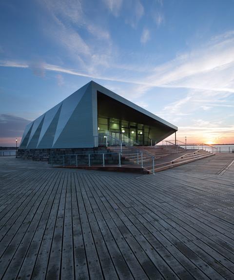
The building is a single-storey trapezium-like pavilion that resembles an angular, twisted funnel placed at the end of the pier. The south and north ends of the funnel are fully glazed, facing out to the sea and back towards the town respectively. The two side facades are more solid, faced with GRP cladding panels whose stitched, woven texture recalls the grooves of the pier’s timber decking and, according to project architect Fredrik Petersson of White Arkitekter, provides a lightweight, naturalistic counterfoil to the severe geometries of the pavilion. Petersson also reveals that while corten was initially considered for the cladding, it was eventually discarded when manufacturers were unable to provide required guarantees as to its durability against the sea’s salt water.
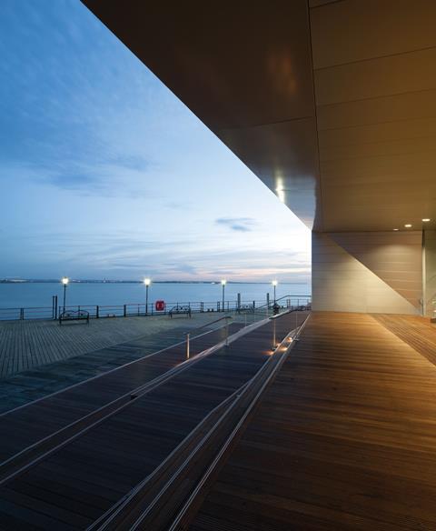
It is the sharp, uncompromising geometries that help to realise the core design concept of a building “sculpted by wind and wave”. The side walls of the pavilion are sloping and staggered as if centuries of erosion has warped the structure and left a series of serrated indents on its exposed, embattled skin. The roof swings sharply upwards from south to north and also from side to side, merging with the side walls to form a single, thrusting plane that wraps around the building like a giant mechanised wave. Such is the roof’s contorted exhibitionism that it appears to all effects to be a fifth elevation.
Although the swinging roof appears to assume the shape of a hyperbolic double-curve, it is actually comprised of a series of triangular planes that reoccur as both structural and aesthetic motifs across the building envelope. “The triangles help the eye to appreciate the shape of the building,” explains Petersson. “They reflect the composition of the steel structural space-frame within and they are also a visual device that enables the complex form and structure of the building to appear simpler.”
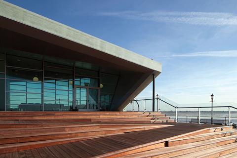
The entrance to the pavilion is placed at its southern side at the top of a shallow flight of steps and ramps that navigate a raised timber plinth. At this point the roof swoops beyond the glazed southern wall to form a dramatic, cantilevered enclosure in which the tables and chairs of an outside cafe have been placed. This looks out onto a decked clearing at the end of the pier which offers stunning views of the sea.
There is a vibrant sense of activity and animation here, just reward for those who have trudged the full length of the pier. However, the pavilion’s orientation means that after reaching the end of the pier, visitors must then navigate past the building before turning back and entering what appears to be its rear facade.
Also, the steep roof incline ascends from south to north, which means that the lower end of the funnel (the entrance) provides views looking out towards the sea while the higher end faces back onto the seafront. One might have expected the sea, rather than the town from which the visitor has just arrived, to form the climax to their journey, and as a result the building feels curiously lopsided.
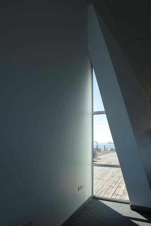
But as Petersson explains, there were other priorities at play: “We wanted the entrance to be south-facing so that both it and the cafe could benefit from a more sheltered and enclosed micro-climate relatively free from the wind and cold that would have to be dealt with elsewhere. We also liked the idea of a pier looking back onto the seaside as well as the sea; we felt it was important to look back as well as forward.”
Inside, the building provides flexible, multi-purpose space that could be used for a variety of events, ranging from music gigs to film showings. Petersson says that they deliberately rejected the “black box format” - blinds can be rolled over the glazing but the sloping ceiling still permits triangular slithers of light to seep through.
Indeed, it is this subtle detail that reveals the means by which the Cultural Centre pays homage to its Victorian predecessors:
its transparency.
Petersson talks of trying to “capture the original spirit of the pier” and of trying to create a building that “matches the drama of its scenery”. It is not the overburdened geometries that accomplish this - in many ways these are a distraction. What brings the pavilion to life and what gives it historic integrity is its naked, exposed and relentless transparency.
Its twin glazed openings plunge surging views right into the heart of the space within. When standing outside at either end they permit views right though the building. Even the staggered, glazed incisions cut into the side walls are aligned to provide continuous views out to the other side. Why all this effort? Because the pavilion has been conceived as a conduit to see the sea. Which, before the onset of casinos, funfairs and amusement arcades, was what the pleasure pier was all about.
Ike is ��ɫ����TV’s architectural correspondent
Photographs of the construction phase were supplied by Southend-on-Sea Council










No comments yet