When the architect of Walthamstow's bus station had to cut costs on the stunning roof, it needed the whole team to work together in order to reach the destination.
The streamlined design of Walthamstow's new bus station should feel familiar to anyone who regularly travels on the London Underground. In form, it takes inspiration from the best of the Art Deco stations on the Northern and Piccadilly lines. Passengers using the northern reaches of the Piccadilly line, for instance, will instantly recognise the similarity between the curved glass facade of the new bus station and the striking brick and glass drum of Arnos Grove station.
Charles Holden, the architect most closely associated with station designs in the 1920s and 30s, was a firm believer in form following function. The same design discipline applies at Walthamstow bus station, where multidisciplinary practice Burks Green designed the curve of the roof canopy to facilitate the movement of the buses in and out of the station. According to architect Doug Unkles, the wavy design of the canopy edge reflects the angle the buses take to turn into the bus stops (see "Not just a pretty place", page 8).
The building perfectly fitted the brief from client London Bus Services, which wanted a functional transport interchange that would also be an attractive focal point for a rundown part of town. The roof makes an important contribution to the elegant design, forming a canopy that appears to float over a glass roundel and a series of stand-alone brick pods, which house toilets, a ticket office and the controller's office.
Although the roof looks expensive, the budget dictated that intense value-engineering took place during its design. Unkles said this was only possible through the collaborative effort of everyone involved in the project.
Burks Green is a multidisciplinary practice that employs architects, civil and structural engineers.
The project team moved their desks around so they could sit in the same area of the office. "It increases communication between the different disciplines and our architects understand the aspirations of the engineers," says Unkles. He also encouraged contractors to become part of the team. "The closer they get to the team, the more they understand the process. It really helps," he says.
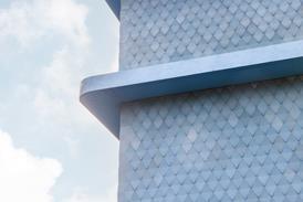
The team approach ensured roofing costs were kept to a minimum. The approach was to only spend money in areas where it mattered, such as the smooth aluminium soffit, which is visible to passengers on the concourse below. "Wherever possible we used standard materials to keep the costs down," says Unkles. The colour coated aluminium soffit is made up of standard cladding panels 25 to 30 mm thick. The narrow depth was specified for a reason. "If it was any thicker the edges of the panels would have been difficult to conceal," says Unkles.
The aluminium detail where the panels reach the periphery of the canopy is the only part of the soffit that is non-standard. "It was really worth spending the extra money to get that pristine finish," says Unkles. He's undoubtedly right: the eaves detail is elegant, tapering to a smooth bullnose edge. It's also highly visible from every angle since it runs right round the periphery of the canopy. The detail helps give the building a lighter touch, which is important as the roof profile has to be deep to house the plethora of services required for the bus stops. Each needs lighting, PA equipment, and signposting to be installed in the roof.
The architect managed to save money by specifying cheaper materials in areas hidden from view. For example, a cheap "crinkly tin" roof finish was specified for the top of the canopy because nobody would ever see it.
Burks Green paid particular attention to the way the canopy was lit, and was also prepared to invest more in this crucial area. It wanted the canopy to glow softly at night to reinforce the impression that it was gently floating above the concourse. On a more prosaic level, it was also important to provide enough light for passengers travelling on a wet winter night. "We wanted a good balance of light," says Unkles, who consulted M&E contractor Robert West on the lighting scheme. "We needed a strong element of reflective light from the canopy, so we had high-intensity floor lights shining upwards, and lower intensity downlighting in the canopy itself." The roof really comes to life at night, when concealed blue-filtered lighting generates bars of electric blue light across the soffit.
However, electric lighting is only switched on at night. During the day, rooflights at the centre of the soffit help to illuminate the deep-plan building. "It was an environmental concern," says Unkles. "We didn't want to artificially light it during the day."
As Unkles says, bus stations traditionally have an image as unpleasant places, and his practice therefore aspired to a light and attractive building. Burks Green has certainly done that, and also given itself a decent chance of winning contracts to refurbish the adjacent train and tube stations. Unkles is hopeful: "It will be the final piece in the civic jigsaw."
Not just a pretty place
All the interesting design and specifications at Walthamstow bus station exist for functional as well as aesthetic reasons. The shape of the appealing wavy roof is derived from the movement of the buses, as it follows the angle at which the buses come in to set down and pick up their passengers. “We analysed the turning circles and then reflected this in the architecture,” says Doug Unkles. Thanks to Burks Green’s experience as a civil engineer, the transport expertise was available in house.The form of the glazed roundel which gives the bus station its impressive public face is also derived from the building’s function. The glazing of the two-storey structure provides a lightwell for the escalators bringing passengers up from the Tube. And the curve means that buses can easily pull in and out of the bus station. Unkles says that in transport interchanges, the circulation routes of the buses are as important in determining design as passenger movements.
The controller’s pod at the other end of the concourse is also designed to aid its function in the bus station. As the controller has to keep an eye on all the buses, the walls are angled to enable him to see all six bus stops at the same time.
Roofing and Transport Specifier
- 1
- 2
- 3
- 4
- 5
 Currently reading
Get on board
- 6
- 7










No comments yet