Edward CullinanŌĆÖs mixed-use Hillside Hub completes the overhaul of a north-west London estate that John Major once avoided for fear of being shot. Dan Stewart finds it a reformed character
During the nineties, Harlesden was one of LondonŌĆÖs least-loved satellite towns ŌĆō a symbol of urban deprivation with high crime levels and low life expectancies. At its centre was the notorious Stonebridge estate, a dispossessed wasteland littered with brutalist tower blocks that was considered so dangerous that in 1995 prime minister John Major cancelled a speech there for fear of being shot.
More than a decade later, Stonebridge estate has become an unlikely symbol of successful urban regeneration. Where once stood oppressive tower blocks, there are now smaller scale housing units, and crime in Brent is now 8% lower than in London as a whole. The children of Stonebridge no longer play among the detritus of burned-out cars, but in the Stirling prize-nominated
Fawood childrenŌĆÖs centre, designed by Will Alsop (for more on the surrounding architecture, see the box below).
Much of this has been achieved by the Stonebridge Housing Action Trust, which was set up in 1994 to help clean up the area and rebuild 1,775 homes. The trustŌĆÖs final architectural commission before it wound itself up in 2006 was for a mixed-use development next to AlsopŌĆÖs childrenŌĆÖs centre that would provide a focal point for the community and link the street with the reshaped estate. Hillside Hub, designed by Edward Cullinan Architects, is that building.
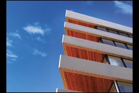
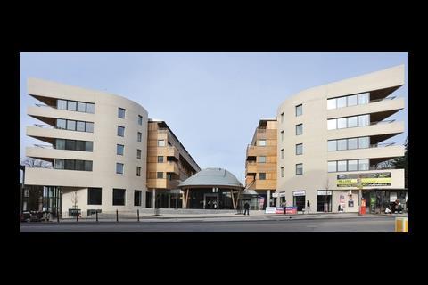
The building opens up to the road, its two white-brick residential wings or ŌĆ£prowsŌĆØ frame a dramatic zinc ŌĆ£helmetŌĆØ at its centre, which covers a community centre. The housing units are laid out over the top four floors behind each prow. A primary care trust (PCT), which has its own entrance, is tucked beneath the homes on the western side.
The completion of Hillside Hub in autumn 2008 heralded the start of a new era for Stonebridge.
It wasnŌĆÖt an easy brief. In addition to 55 mixed-tenure housing units with full parking provision, the community centre and the PCT, the client, Hillside Housing Trust, wanted the structure to include enough retail space to fit a supermarket ŌĆō a tall order for a 4,900m2 site that could not go higher than six storeys.
The client originally envisaged the PCT and community centre as separate buildings, but the architect suggested an alternative plan. ŌĆ£We wanted to see what would happen if we put it together as a single block,ŌĆØ says Roddy Langmuir, the Edward Cullinan partner in charge of the scheme. ŌĆ£It was as much to do with footfall as anything else. We knew there would be three times as many people going into the PCT as there would be going into the community centre, so why not put them together?ŌĆØ
As a result, the hub is a single unit ŌĆō a ŌĆ£little piece of the cityŌĆØ, is how Langmuir describes it ŌĆō and an ingeniously organised one. The money the PCT pays to rent the space helps finance the community facilities, and the shopping units built into the brick prow serve the needs of the residents. It is a self-sustaining organism.
The PCT and the community centre are connected by a single stairway, and the lobby of the health centre opens up to the community centre at first-floor level, providing a visual link between the two. A cafe on the south-west corner of the building will act as a hub between the two facilities, says Langmuir. ŌĆ£ItŌĆÖs a great way of forcing people to bump into each other.ŌĆØ Unfortunately, it is difficult to judge the success of this endeavour as neither the cafe nor the PCT are yet open when ║├╔½Ž╚╔·TV visits.
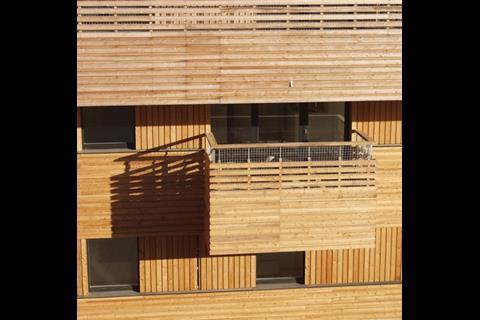
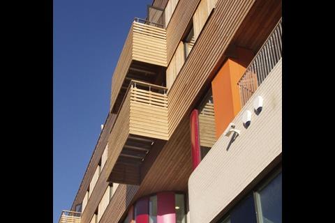
The interior may make up a unified network of spaces, but the exterior has the opposite effect ŌĆō Edward Cullinan has used a bricolage of materials, colours and styles to give each element its own identity. The housing section is clad in timber and the PCT is built of brick, with brightly coloured aluminium panels dotted around its facade ŌĆō a playful tip of the hat to AlsopŌĆÖs neighbouring scheme and a welcome contrast with the plain white facade.
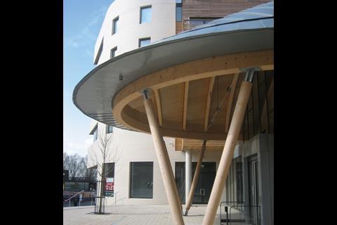
The strongest statement is the zinc-clad humpbacked roof of the community centre, a self-consciously brazen structure that draws your attention and welcomes you in. Locals refer to it as the Armadillo or the Helmet, a reliable sign that it has already become a focal point for the development.
Although the metallic structure adds visual theatrics to the scheme, it risks overwhelming the more subtle timber-wrapped residential sections, not to mention the fact that residents whose balconies face it have no relief from its metal skin ŌĆō although happily its presence is felt less by the residential units than they are by passers-by on the ground.
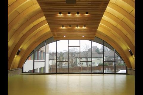
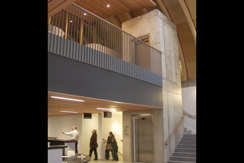
The inside of the dome-like structure lacks drama. A first-floor mezzanine greets you rather too abruptly, and takes away some of the impact of the vaulted roof. The intention was to keep the community facilities united, although the residential blocks were kept independent from one another by building their entrances at the tips of the white-brick prows facing the road. It might, though, have benefited from a central reception to bind the hub together. Inside the residential blocks, the apartments are laid out on opposite sides of long, blank corridors. ItŌĆÖs far from luxurious and occasionally feels less than homely, but the decision to indent each apartmentŌĆÖs doorway into a shallow recess painted in day-glo colours ensures each has a sense of identity.
Getting there
Hillside Hub was delivered as a design-and-build project and David Cawston, the project architect, has nothing but praise for contractor Rydon Construction, to which the architect was novated. Although the project had a fairly humble budget of ┬Ż17.8m, any value-engineering was kept invisible and it has been built exactly to the original design.
Cawston cites the treatment of the materials to show that Rydon was as committed as the architect to the quality of the building. ŌĆ£One of the easiest ways to cut costs would have been to use cheaper timber, but we selected this Siberian larch especially because it doesnŌĆÖt stain. Cheaper wood would weather quite badly and stain the brick.ŌĆØ
Likewise, the architectŌĆÖs choice of brick proved difficult. Cawston explains that the EBM Versailles brick used was extremely non-porous, so it took a long time for the mortar to set. ŌĆ£We had complaints from the brickies, as they could only lay about three layers a day,ŌĆØ he says. ŌĆ£The weight would squeeze the mortar out otherwise.ŌĆØ
Pride of place
ItŌĆÖs striking that the other architectural attractions in the area ŌĆō AlsopŌĆÖs nursery and a pavilion by Eger Architects ŌĆō are both clad in a semi-industrial mesh. This is to ward off graffiti, and also acts as a shield to keep those inside safe and those outside out. Appropriate to the Stonebridge estate of old, perhaps.
In contrast, CullinanŌĆÖs building is disarmingly frank, an open invitation to the surrounding community. The white brick walls on the buildingŌĆÖs prows are a blank canvas for aspiring vandals ŌĆō the architects had to prove to the council that paint could be easily washed off ŌĆō but to date they remain pristine. This is not a building that demands respect for itself, but quietly and with honesty, it seems to have earned it.
Taking over the estate
Innovative architecture has flourished in the Stonebridge area, with AlsopŌĆÖs childrenŌĆÖs centre followed by an ingenious mesh-clad football pavilion designed by Camberwell-based Eger Architects, which sits on a nearby recreation ground. A site in front of AlsopŌĆÖs building had been earmarked for a development designed by Witherford Watson Mann, the winner of an EU housing competition for architects under the age of 40. Although progress on the project has slowed during the recession, the intention is still to build something adventurous there. Project architect Christopher Watson says: ŌĆ£WeŌĆÖre waiting for the client to decide how to take it forward. It is one of the key sites for the regeneration of the area.ŌĆØ Aspirations continue for the future as well ŌĆō just up the road in nearby Harlesden, the council is shortly to search for an architect to design the ┬Ż5m Roundwood youth centre.
Project team
Architect Edward Cullinan Architects
Client The Hyde Group with Rydon Construction
Contractor Rydon Construction
QS Calford Seaden
Structural engineer Fife Belcher
M&E engineer MLM
Landscape architect Whitelaw Turkington
Downloads
Elevation
Other, Size 0 kb
Postscript
Hillside Hub was a runner-up for Housing Project of the Year at the ║├╔½Ž╚╔·TV Awards.
Original print headline: Where prime ministers feared to tread







No comments yet