Read about the winner and shortlisted entries for this yearÔÇÖs International Project of the Year award
Winner: The Twist
Entered by AKT II / Bjarke Ingels Group

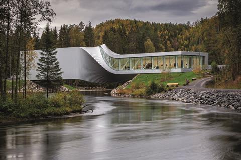
A gallery, a sculpture and a bridge all in one ÔÇô and part of the Kistefos contemporary art museum and sculpture park 65km north-west of Oslo, Norway ÔÇô The Twist is an 87m-long structure that torques over the River Randselva, creating a sculptural, twisting bridge that allows the two embankments on different levels to meet. The project team worked closely with fabricators to understand the supply and installation costs from an early stage to ensure the scheme would develop in line with budget, site and fabrication constraints.
It was clear from the outset that the construction costs and extent of temporary works could have been much greater had they not been assessed hand-in-hand with the main structure. Such investigations proved fruitful, with the final geometry of the structure allowing less steel to be used in its construction than would otherwise have been the case. The resulting museum has a double-height column-free gallery space, which twists to create a meandering and winding exhibition space internally. Since opening, the building has significantly increased visitor numbers for Kistefos. The success of the building is a function of the design quality and how it amplifies the relationship between the bridge, the river and the landscape.

Runners-up
Comcast Technology Center
Entered by Foster + Partners
Awarded a Platinum LEED certification, Comcast Technology Center in Philadelphia brings together a mixture of uses ÔÇô workspace, retail, hotel, film studio and green space ÔÇô to create a new model for the design of tall buildings. Featuring Silicon Valley-style loft spaces that are designed to encourage technological innovation and collaborative working, it integrates works of art with public spaces and the building fabric.
More than 80% of those who work in the building arrive through tunnels connected directly to PhiladelphiaÔÇÖs public transport system, a feature that is a vital element of the projectÔÇÖs sustainable agenda. The building also uses an active chilled beam system (at the time of its design, the largest in North America), which reduces energy loads and creates a healthier working environment.
The typical floorplate has been designed to optimise and control light levels through efficient glazing with high light transmittance and an automated blind system. Daylight penetrates into the interior spaces through triple-height sky gardens which form the social heart of the workplace, housing key spaces that include the town hall, food market and fitness centre. The building also features systems to ensure water efficiency with green roofs, waterless urinals and high-performance cooling towers.
Below street level, a sheltered subterranean connection passing through the centre of the building, lined with shops, works of art and seating areas, links the new building with the existing Comcast Center as well as with the cityÔÇÖs subway system.
Kita Aoyama
Entered by Conran and Partners
This residential project, comprising 15 apartments across seven storeys, is located in the upmarket Aoyama district of Tokyo. The design takes its inspiration from a woodblock print ÔÇô Cushion Pine at Aoyama ÔÇô by the Japanese artist Katsushika Hokusai, part of the Thirty-six Views of Mount Fuji series created by Hokusai when the area was a green landscape occupied by Samurai warriors.
The fair-faced concrete and stone building takes the shape of a ziggurat that emulates the form of the hillside where the cushion pine grows, represented in this scheme by dense indigenous planting. Located at the junction of a series of narrow streets, a key challenge for the scheme was to respect the form and height of neighbouring buildings. The stepped form achieves this, allowing sunlight to penetrate through to street level. The structureÔÇÖs recessive massing means that pedestrians are aware only of the first three storeys, allowing it to be sensitive to its immediate built context, while offering a unique addition to the location. It is a design born out of a continuing collaboration with landscape architect Tatsuya Hiraga.
The project also recognises the customs and values of Japanese culture and privacy, offering spacious apartments with circulation routes and distinct zoning to ensure the formal separation of guest reception spaces from private spaces such as bedrooms and bathrooms.









No comments yet