Three architecture students give his honest opinion on the new £100m metallic tower
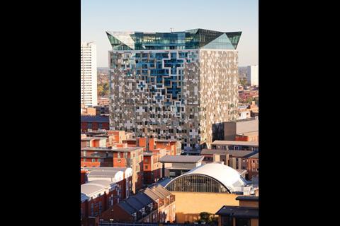
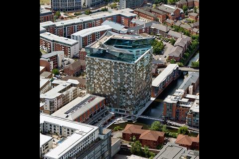
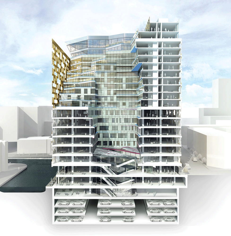
Make Architect’s £100m Cube in Birmingham is a 23 storey tower - its striking metallic skin inspired by the city’s Jewellery Quarter. The mixed-use building, containing residential, commercial, retail and leisure facilities also has a regeneration agenda.
(For more on the project read our full report published earlier in ∫√…´œ»…˙TV).
Amie Taylor’s verdict:
The most recent attempt of urban renewal in Birmingham has resulted in Make’s Cube which has taken inspiration from the city’s jewellery quarter and this is apparent in some instances.
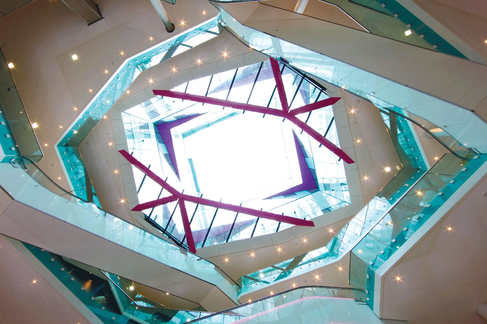
The interior boasts the elegance and geometries often attributed to the industry; from the exterior the glass ‘crown’ that sits on top is reminiscent of a precious gem. However, the building as a whole seems somewhat disjointed.
The metallic skin is not as elegant as one might expect and simply emphasises the mass of the building that seems to tower over and bewilder the surroundings. The architects defend its imposing nature, as this was supposedly influenced by the hard industry of Birmingham, yet the architectural language of the building does not seem to convey this clearly.
Perhaps a more obvious attempt at representing the engineering industry would have been better suited – for example, through better use of materials and structure. Alternatively, a more ornate, less voluminous design may have been favoured based on the contextual interests of the project. Nevertheless, the architects have certainly provided an iconic landmark for the city, but for the right reasons I cannot be certain.
Impressive, intriguing, seemingly intelligent, imposing… ugly, Allen
Craig Allen’s verdict:
Impressive, intriguing, seemingly intelligent, imposing… ugly. Birmingham’s latest fling at identity seems typical of the perennial bridesmaid. Threatened with a crisis of identity amongst several competing English cities, the Cube’s emergence is akin to the ‘old maid’ making do with a feline and anthropomorphic projections of a long-since absent lover.
Whilst Shuttleworth spews sound bites of the ‘vertical city’ and the suitably vacant roof terrace offers views over what has frequently been titled ‘Britain’s ugliest city’, my sympathy goes out to the majority who will never encounter the exclusive upper levels of this giant thing, but must endure the new pimple in the landscape for the foreseeable future.
Having said that, viewing the behemoth from afar seems preferable to closer perusal. Bland mediocrity seems to belch from the building’s component parts. What seems like an obvious boon to noughties real-estate ambitions is now exposed as commonplace make-do rubble familiar to rushed airport expansion, clad in a gilded envelope, itself clad in wafer thin cladding ostensibly passed through a ham-slicing machine.
First impressions of the Cube certainly suggest a marmite-like effect of its distinctive style. It isn’t difficult to find this building somewhat repulsive, yet there is some pleasing and nice aspect to the project. The building clearly appears to harbor monumental aspirations. Whether it will become a monument to the dangers and flaws of early 21st century British architecture, or a welcome success in multi-functional design is to be seen.
Hannah Thomas’ verdict:
This project both inspires and outrages, Thomas
This building has the making of a modern construction icon for Birmingham. It’s ostentatious and eye catching appearance clearly purvey that the production of a landmark is the concept driving the project. It was not designed to subtlety complement its surroundings, rather its sheer size and magnitude dwarfs and somewhat belittles its context and begs for attention and recognition.
The focus on creating an icon however cannot detract from the fact that this project has encompassed its goal of producing a practical multiuse complex. The innovative use of materials shapes and technology, such as the fully automated car park, make the project fit for purpose and lend it a futuristic efficiency that renders its commercial units attractive to prospective users.
In an attempt to merge the building with its surroundings or at least have a feasible contextual concept, the city’s industrial past is reflected in the metal cladding and overall structure, this tenuous link with the city’s vernacular is unfortunately not enough to justify the imposing presence of this mammoth structure.
This project both inspires and outrages, its cost and garishness may mean it stands arrogant and resented by the local clientele. Alternatively, providing it produces the urban regeneration and thriving atmosphere it promises.
Craig Allen is an architecture student at the . Amie Taylor and Hannah Thomas are studying architecture and .
Source
Email nargess@me.com if you wish to take part in First Impressions.







No comments yet