Our new student panel discuss the Rogers Stirk Harbour and Candy & Candy designed Knightsbridge luxury residential building
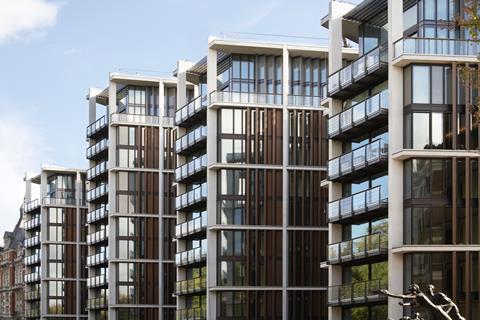
This is One Hyde Park, the much anticipated luxury apartment building set in the very heart of Knightsbridge, London. Designed by Rogers Stirk Harbour with interior design by Candy & Candy, the building offers super luxury living with views over Hyde Park and beyond.
Lim Pao Yeeãs verdict:
Simplicity of form. Lightweight and transparent construction. ãForm follows functionã. Significant consideration of the local context.
One Hyde Park portrays itself as an unmitigated rehearsal of modernist architecture with its expressive repetition of vertical lines, principal materials of white concrete frame, glass and copper construction and also its various design decisions invested to derive formal rules from the existing surroundings. At first glance, the pleasant rhythm, proportions and neutral colours appeal to the users.
The key discussion to One Hyde Park is perhaps its relationship between its contextual design and its prime location in Knightsbridge, West London. The building is orientated in such a way that its south faces the bustling city life of Knightsbridge whereas the north side overlooks the lush greenery of Hyde Park thus offering the occupants the best of both worlds.
The four linked series of pavilions seem to fit into the site so effortlessly with its utilisation of transparency throughout the building as the perfect medium to maximise visual connections between Knightsbridge and Hyde Park.
Its design is rather archetypical of any other modernist construction since the 1960s and there seems to be a discernible lack of poetry to it, Lim Pao Yee
I think the project is a huge success when it comes to incorporating the new building into the site - it complements and enhances the rich textures of the existing local architecture and solves existing problems on site through design.
The choice of colours, reddish and off-white, echo the existing materials of stone and brick. The dynamic roofline consisting of historical turrets, gables & chimney stacks of the adjacent Mandarin Oriental Hotel is furthermore highlighted by the differing heights of the pavilions. It is refreshing to see that the design has taken many careful considerations to incorporate the essence of the existing site into its planning.
However, with it being boasted as the most expensive flat in the world, one would have expected something more iconic in terms of architectural design, especially coming from renowned architects Rogers Stirk Harbour+Partners. Currently, its design is rather archetypical of any other modernist construction since the 1960s and there seems to be a discernible lack of poetry to it.
Also, it is rather sad to see that a generous design that puts in so much effort to include the local context does not encourage a healthy social life within- the circulation within the building is designed in such a way that the residents do not have to have connection with the general public. It is a repudiate to the architectãs own philosophy of creating high quality public spaces which the divisions between social, racial, physical and economic borders should be eliminated.
After all, does it all strip down to merely the project aspiring to be an epitome of extravagance and superficiality ã a reflection of a Dubaian lifestyle saturated with five star hotel services and ostentatious art? It is inevitable for one to wonder- is it worth it?
Peter van Aalstãs verdict:
Being located in Knightsbridge London, this building is both fashionable and within a prime location, bordering on one side with the trendy bustle of the west end of London and on the other with the tranquillity of Hyde Park and views over the Serpentine ã this last point somewhat of a rarity within central London.
It could be argued that for the price tag of these residences this structure could or should provide a much more significant design statement, Peter van Aalst
My first impression is that the building does not portray the image that lies behind these facades where there lies 80 multimillion pound residences.
It could be argued that for the price tag of these residences this structure could or should provide a much more significant design statement. However within the confines of the area, the use of aged red iron and white framed structures reflect the typical red brick and white window casements of the surrounding buildings.
The staggered heights of each modern tower also reflecting the elevations of these traditional structures, in plan the tapering of the blocks helps to optimise the natural light and views available.
These combined features allow the development to sit comfortably within its surrounds whilst still making an obvious statement to a contemporary London.
Lim Pao Yee and Peter van Aalst are architecture students at Nottingham Trent University
Source
To join the student panel email nargess@me.com.








No comments yet