Two architecture students comment on the unusual scheme featuring different shades of copper cladding
About the scheme
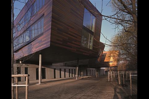
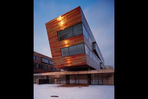
Architect Atelier KAAMA has designed this residential development in Prague featuring three floating rhomboidal masses clad in copper panels. The copper cladding uses a random combination of three different shades of brown which represent different stages in the natural patination of the material that occurs over time in the external environment. The idea being that as the weathering continues naturally with age, the copper elements will change shade at a different rates.
Matthew Mounceyãs verdict
As a young architecture student, I am always on the look-out for projects that recognise the potential for mature materials (that is to say materials that have been used for centuries) to be re-invented. This residential scheme by Atelier KAAMA recognises this notion beautifully; the development provides a series of large structures that have been clad in copper at various stages of its natural patination process.
This allows for a clear-cut and modern revival of a material often considered outdated; bright golds and metallic oranges gleam in the sunlight, providing a crisp and hard-lined finish to a development well-deserved of such a dramatic scheme. With age, the patination process of the copper will continue, and one can only imagine the beauty and drama the cladding will provide as the building matures. Who said ageing couldnãt be graceful?
With age, the patination process of the copper will continue, and one can only imagine the beauty and drama the cladding will provide as the building matures, Matthew Mouncey
Edward Atkinsãs verdict
I love the use of copper in any building, the way the material weathers over time helps the building integrate itself firmly into its surroundings giving it the look of having been there longer than it may actually have been. This residential development has taken this to a new level, with three different shades, each at a different stage of the aging process, cladding the entire building.
Whilst I commend the unique and inspired way in which the building has been clad, I am not sure on the overall design of the development. The masses forming the large cantilevers give the impression they are a little too menacing. These are dominated by large windows opening the project up, which for a large scale residential building is not always the most practical in terms of privacy. Iãm also unsure as to whether the rhomboidal shape will allow the developments function to be exploited to its full potential.
Matthew Mouncey and Edward Atkins are architecture students at .
Source
If you would like to take part in our First Impressions email nargess@me.com.









No comments yet