Hans van Heeswijk Architects has used pioneering techniques in structural glass to build a new entrance to Amsterdam’s Van Gogh Museum, connecting the opposing architectural styles of the two main buildings and increasing capacity for the swelling hordes of art lovers
Extending museums can be a tricky business. By their nature, museums are designed as complete works of art in themselves; civic as well as architectural statements that capture a particular vision and moment in time and do not easily lend themselves to future accretion by a new set of architectural principles.
There are plenty of examples that illustrate how architects have grappled with this challenge over time. Some, such as Foster’s interweaving of his seminal Great Hall into the grand classical confines of the British Museum, attempt a radical reworking of the original format. Others, such as RSHP’s World Conservation and Exhibition Centre next door, seek a more passive and deferential tone, externally at least.
Like London, Amsterdam is a major international art hub and also has a set of renowned historic museums that have received bold, contemporary updates. Up until recently the most prominent was the extension to Stedelijk Museum which, two years ago, provocatively appended its red brick Victorian wing with an extraordinary seamless white fibre-glass structure nicknamed “the bathtub” by quizzical locals.
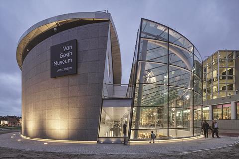
And right next to the Stedelijk, Amsterdam’s newest museum extension opened earlier this autumn. A £14.5m entrance designed by Dutch practice Hans van Heeswijk Architecten has been added to the world-famous Van Gogh Museum. But, unlike most museum extension projects, the practice realised a concept design originally devised by this part of the museum’s initial architect back in 1999, celebrated Japanese architect Kisho Kurokawa.
But it is not just the belated fruition of a historic concept that makes this project unique. Van Heeswijk has placed its stamp on the building by turning it into a milestone in the development of glass technology.
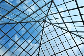
Not only is the majority of the building structure glass but it is also the largest glass structure in the Netherlands, formed primarily by load-bearing glass beams and mullions. At 12m long, some of these are the longest structural glass elements that have ever been built in the country.
Reconciling the past
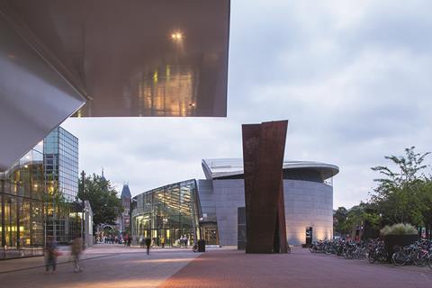
Apart from the new entrance wing, the Van Gogh Museum now comprises two other principal architectural elements. The oldest is the main building, a freestanding orthogonal brick block, designed by Gerrit Rietveld, that dates from 1973 and houses the priceless permanent collection.
Next came Kurokawa’s Exhibition block of 1999, a half-elliptical stone structure topped with an inclined semi-circular roof and whose stark geometric expressiveness teems with post-modernism. Both blocks were separate but linked underground with no dedicated entrance for the Kurokawa building and the entrance to the 1973 building forming the principal access for both wings.
And herein lay the museum’s problems and the source of the brief for the new building: its entrance was too small and the exhibition wing’s truncated access and circulation meant that it didn’t function properly.
“When the museum opened in 1973 it had 400,000 to 500,000 visitors every year,” explains practice founder Hans van Heeswijk. “By 1990 it had 1 million visitors and throughout the 1990s it had a total of 16m visitors. This meant that the old building was handling numbers far in excess of what it had been designed for and it began to function less and less efficiently with long queues and insufficient space. Today the museum has 2 million visitors per year.”
A generous 30 million guilders donation (£11m in 1993 prices) in the mid-1990s was given on the proviso that a new temporary exhibition wing be built to relieve congestion and this is where the Kurokawa block came in. But ultimately, by adding more space without addressing the fundamental access and entrance issues, it merely exacerbated the problems.
For van Heeswijk, the solution came in the unrealised element of the original design. “Kurokawa designed a half elliptical building but left the other half as a sunken pool built above the underground link. The new building assumes the same footprint as the pond and inverts the arched geometry of the steel roof next door with a sunken glass roof instead.”
A touch of glass
Although Kurokawa designed the original concept for the extension, van Heeswijk applied a key change. “The original architects specified a steel structure building but we wanted something lighter and as transparent as possible so we changed this to glass. There is a small amount of steel left in the new building but the overwhelming amount of the structural work is performed by glass.”
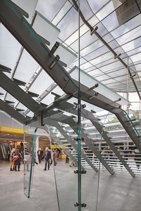
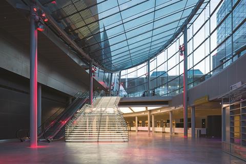
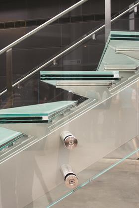
This is indeed one of the most striking aspects of the new entrance building. It provides a sprawling, single volume entrance space, entirely encased in glass. Vertical glass fins line the curved external walls and soar to the full double height of the space. Vast 12m-long glass beams support the inclined curve of the roof. The staircase that leads visitors down to the entrance floor is built entirely from structural glass. And even the glazing on the curved walls is curved rather than facetted, with the largest single panel measuring a stupendous 3.6m x 1.8m.
“This is a structure that simply would have been impossible without recent advancements and innovations in glass technology,” says van Heeswijk. In 2003 ovens could harden 6m-long glass elements, in 2014 when we were specifying this building, it was 12m; today it is 16m.”
Van Heeswijk also reveals that faceting was originally specified for the curved external walls but “advancements in flat isolated glass technology meant that the glass could be curved to deliver the multiple radiuses required to create the exact shape we needed for the elliptical footprint”.
He also reveals that “to make the foyer as transparent as possible, low ion glass that was 50% more transparent than conventional glazing was used”.
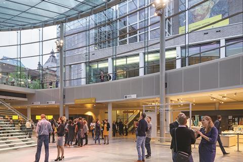
The new entrance building now replaces the entrance on the 1973 building to form the main access point for the entire museum, both permanent collection and contemporary exhibitions. The floor of the entrance hall is placed on the level formerly occupied by the underground link which means that the foyer is a primarily sunken void linked to ground level by the majestic sweep of glass steps.
Van Heeswijk maintains that the new hall has already revolutionised the way in which the museum is used. “As well as providing the new entrance space and increasing capacity, it can be closed off for special events and performances. It enables the museum to be used in a much more flexible way.”
Van Heeswijk has explored similar themes of transparency, circulation and partially sunken voids at MORE, the Museum for Dutch Modern Realism, which also completed earlier this year in Gorssel, eastern Holland. But in its profile, its consolidation of not one but two existing buildings and its pioneering use of glass technology, the Van Gogh Museum represents an altogether more significant milestone.
“Every public building needs a large, flexible open hall,” concludes Van Heeswijk. “The only difference here is that this entrance had to be neutral in order to relate to the opposing architectural styles on either side.”
The entrance hall is therefore an exercise in consolidation but it is delivered with a structural and spatial drama that delivers an identity all of its own. The huge technological effort allocated to the glazing pays off, for with its cage of glazing admitting copious amount of daylight, it has the feel and atmosphere of an external public space, one that celebrates rather than impoverishes the underground connection between the two wings for the first time.
Project team
Client Van Gogh Museum Foundation
Main Contractor Bouwbedrijf van der Spek
Delivery/executive architect Hans van Heeswijk Architecten
Concept architect Kisho Kurokawa
Structural engineer Arcadis Nederland
M&E engineer Deerns Raadgevende Ingenieurs
Glass contractor Octatube






No comments yet