Herzog and de Meuron’s much-delayed extension of the Tate Modern saw the architect handed the rare opportunity of returning to a project having worked on the original. Ike Ijeh visits the Switch House ahead of its opening next month to find out if it’s a happy reunion
Extensions hold a curious significance for cultural institutions. With a school or an office block, “extension” is often a demeaning term, a convenient yet submissive adjunct to the primary work of architecture. But with a museum or art gallery as well as (curiously) airports, an extension often proudly asserts itself as a distinct architectural object that provides a host of new opportunities to reconstruct the relationship with its patrons and the public.
Crucially, such extensions also provide a three-dimensional advertisement for how well an often long-established cultural institution can grasp contemporary themes and culture, considerations that are central to maintaining the cultural relevance and contemporary immediacy that is seen as a central tenet of art.
Add world-leading architects and revered heritage to this heady mix and cultural extensions display a high capacity for instant notoriety and occasional controversy. This is a formula that has been dramatically displayed on a host of high-profile museum developments worldwide, ranging from the National Gallery’s incendiary 1982 Sainsbury Wing competition to the opening of Snøhetta’s new extension to Mario Botta’s postmodern San Francisco Museum of Modern Art earlier this spring.
One of the most hotly anticipated extensions of recent times is undoubtedly Herzog and de Meuron’s soon-to-open extension to London’s Tate Modern. The significance of, and interest surrounding, this scheme has been bolstered by a number of factors. First, a delayed construction programme has meant that the extension’s distinctive profile has already been a familiar feature on London’s skyline for a number of years.
But even more intriguingly, the extended block has been designed by the same architect who completed the phenomenally successful conversion of the former Bankside Power Station into the Tate Modern back in 2000. It thus represents a rare opportunity to see an architect return to an original project after a substantial amount of time and offer a new and evolved interpretation of both site and architecture.
The successive work of Richard Gilbert Scott at London’s Guildhall in 1974 and 1999 provides another rare example of this fascinating process, but the Tate Modern extension is conceived on a far grander scale and on a much more prominent site.
According to Nicholas Serota, Tate Modern’s erudite director, the extension was required because, quite literally, the world’s most popular modern art gallery became a victim of its own success. “We’d always planned to expand but the initial idea was to do so by around 2025 or 2030,” he says. “But the sheer number of visitors we received since opening made this impossible. The Tate Modern generally admits 5 million people a year but this is two-and-a-half times the capacity it was designed for.”
An international competition for a new extension was convened in 2005, which Herzog & de Meuron went on to win, a circumstance that Serota stresses was purely on the merits of their design proposal rather than their initial involvement in the Bankside site’s original redevelopment.
“It was clear to us that in the 10 years between their proposal for the original conversion and the design for the new extension, their design style, terminology and language had developed immensely. This was clear to us through some of the landmark projects they had developed in the intervening period, perhaps most notably in the Beijing National Stadium. But it was also present in their approach to the site and the new relationship they sought to maintain with the original fabric.”
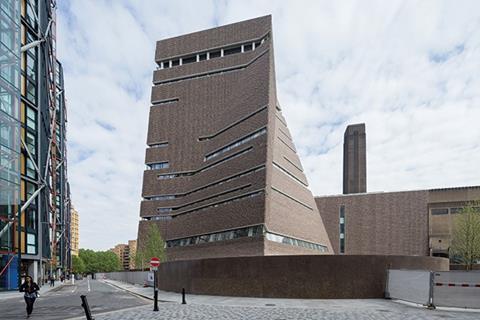
It is now this new approach and relationship that are dramatically on display on the Tate’s dramatic new extension, known as the Switch House. The name comes from the former electricity substation that once occupied one of the three rectilinear strips that comprised the power station. The first strip, known as the Boiler House, faces the river and includes the Tate’s famous chimney. The second middle strip is the Turbine Hall which straddles the back of the Boiler House. The Switch House is the third layer on the other side of the Turbine Hall and right at the back of the building.
The eastern half of the old Switch House has been retained and, intriguingly, still operates as a substation for the surrounding area. The western half has been demolished and the new extension has been built in its place.
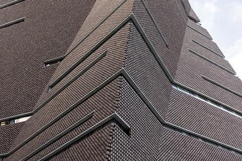
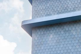
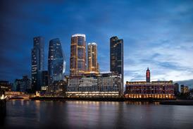
The new Switch House cuts an extraordinary figure on the Bankside townscape. Ten storeys of sloping brick planes twist and gyrate to form a folded, tapering ziggurat that blooms from the back wall of the Turbine Hall like a giant clay cyst. A series of randomly spaced horizontal lines are cut into the surface which is itself composed of a remarkable lattice of perforated, dimpled brickwork.
Despite its highly choreographed profile, the massing and shape of the new extension is one that Jacques Herzog explains grew directly from the original power station buildings and its surroundings. “It’s a very intuitive idea; the shape is informed by various geometries and restrictions on the site such as street lines and protected viewing corridors in order to create something specific and unique that is rooted in its context.
“We wanted the new and old to work together but for the new to be distinct. But we didn’t want this distinction expressed through warped surfaces, we developed a series of straight and inclined planes. Subsequently, these form a reinterpretation of the geometry of the power station. That is a series of rectilinear layers, here we have introduced a series of stacked polygonal squares that conform to the same geometry but are arranged in a different manner.”
The theme of reinterpretation is also present in the structure’s remarkable, pockmarked brickwork skin, as Pierre de Meuron explains. “We wanted something translucent, like a fabric, veil or knitwear. It was important to us to use a diverse and traditional London material but to offer a new perspective on it in the same way as the building itself will offer a new perspective on the art within.”
Brick was not the original choice; early designs for the extension reveal the ziggurat form sheathed in glass, a decision which de Meuron reveals was abandoned for a number of reasons. “The challenge we set ourselves was to create one building. Yes, it would have different atmospheres but it was very important that everything was expressed as the same organism.
“Also, fundamentally the glass would have been stupid. Yes the pyramid’s stacked and staggered form would have allowed us to shuffle and shift the geometries. But once inside it would have required a number of distinct structural frames to support the glass which would have inhibited the freedom and unity of the interior, a shift from our single organism concept.”
The Switch House is a stunning visual gesture that succeeds in achieving what so many works of accretion in architecture strive but fail to do. Its brickwork, rightly, shows reverence for the historic neighbour from which it springs, even encroaching hungrily along the wall of the adjacent retained substation like creeping ivy. But by transmuting the brickwork into an extraordinary dimpled veil and by morphing the geometry into an abstract simile of the original, the new extension has created a dynamic new identity entirely of its own.
Also, the ziggurat form is endearingly wilful and energetic, a playful punchline to the orthogonal sobriety of the power station. It also provides a useful lesson in townscape integration to its neighbours, a discordant scrum of mid and high-rises that includes Rogers Stirk Harbour + Partners’ Neo Bankside, Allies & Morrison’s Blue Fin ��ɫ����TV and the sprouting stump of Ian Simpson’s One Bankside. In their selfish and overblown pursuit of the individualistic architectural object, not one of these buildings displays the volumetric unity or contextual empathy of the Switch House and they thereby ensure that despite their larger scale, it is the Tate Modern’s extension that retains the visual focus of the local skyline.
While externally it is brickwork and geometry that convey the “single organism” concept, internally, spatial orientation is the tool used to realise it. The internal section of the Switch House is divided into three: five levels of gallery at the base, four levels of learning and members’ facilities above that, and two levels consisting of public restaurant and viewing gallery at the top. Three of the gallery levels connect directly into the original gallery, including a precipitous new high-level bridge the straddles the Turbine Hall.
The galleries themselves are lofty, cavernous spaces that generally maintain relatively low levels of natural light in order to facilitate the film, video and performance focus of the new wing or what Serota calls “a wider repertoire of spaces from which to show art.”
But being brutally honest, beyond the timber floors that add a welcome touch of warmth and the occasional glass window that provides a view into the Turbine Hall, gallery spaces in pretty much any major art gallery in the world today are the same ubiquitous white boxes that are largely indivisible from each other.
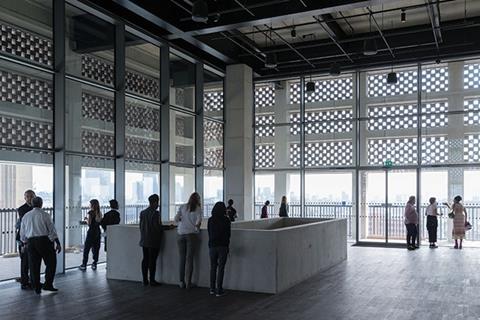
The base of the Switch House also provides a new southerly entrance to the gallery which, for the first time, will enable the gallery to be used as a north-south public route between Southwark and the City. In terms of public realm and local connectivity this will be of great benefit; despite Gilbert Scott’s best efforts, the unwieldly scale of the building has rendered it something of an obstructive lump with regard to pedestrian routes. And, as one would expect, the generous public viewing gallery, which provides a full-perimeter external terrace, provides spectacular views out over London.
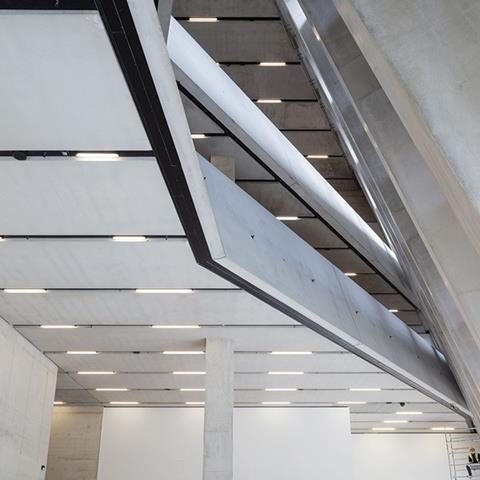
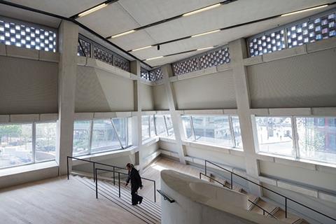
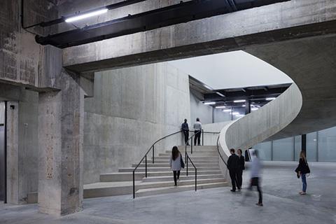
But what is arguably of greater architectural interest than any of these elements are the foyer and circulation spaces that navigate between the galleries. These are conceived as a sumptuous sequence of concrete stairs and lobbies all cast within a cavernous concrete void that seeks to recreate the sculptural drama of the exterior. This is achieved through rows of inclined concrete columns exposed like ribs against exterior walls and openings cut into floors to reveal plunging vistas above and below.
The effect is to carve several individual spaces within the overall whole, a process which de Meuron whimsically refers to as “nibbling”. The drawback is that the sense of the overriding pyramidal form that drives so much of the external impact is largely lost in the interior. But in its place an intriguing sequence of furrowed spaces utilise spontaneity and surprise to enliven the gallery’s spatial experience.
Serota describes the new gallery as a “civic but not a pompous building”. And de Meuron too returns to the theme of the building’s context when attempting to summarise its impact. “It’s very much a product of London’s dynamic and diverse townscape. There is no other city like it in Europe, there are so many cities within one and each one has its own distinct energy and scale. This building is our response to that energy and dynamism that characterises London.”
Project Team
Architect Herzog & de Meuron
Client Tate
Contractor Mace
Structural engineer Ramboll
M&E engineer Max Fordham
Q&S Aecom
Landscape architect VOGT






No comments yet