Porters Edge, in south-east London, has managed to integrate the high street and housing to rejuvenate an industrial warehouse. What challenges did Maccreanor Lavington face?
If any aspect of urban development is generally considered to have had a corrosive impact on the fabric of our towns and cities over the past three decades, it is the large retail shed. Occasionally forming part of the equally maligned out-of-town shopping centre, these boxes are often said to represent all that is wrong with unchecked sprawl.
Yet the giant retail shed remains popular with retailers and large swathes of the public. Parking is easy and the sites can usually be easily accessed by road, while the stores offer customers a vast range of merchandise under one roof and give retailers the opportunity to make a significant brand impact. They also provide more efficient servicing, loading and logistics arrangements.
A prime site overlooking the dock of Canada Water and is centred on a vast 100,000ft² Decathlon sports store, the largest in the UK.
The holy grail of 21st-century retail would be to find a building typology that offers these benefits but in a way that encourages mixed rather than mono-cultural uses, does not suppress the vibrancy, intimacy and animation of the high street and can also be accommodated in a dense town-centre setting. Such a model has proved elusive. Until now.
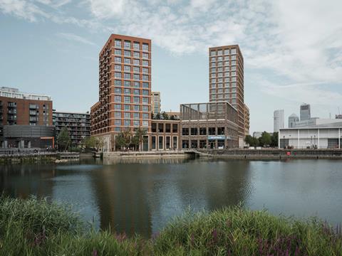
Porters Edge is a new mixed-use development in south London’s Canada Water, designed by architect Maccreanor Lavington. It occupies a prime site overlooking the dock of Canada Water and is centred on a vast 100,000ft² Decathlon sports store, the largest in the UK. The outlet replaces an earlier store that was firmly of the anonymous box variety.
Shedload of flats
So far, so conventional. But what is different about Porters Edge is that 234 flats have been incorporated into the same building. A number of townhouse units directly abut the store on the ground floor and the remainder are arranged into three residential blocks that rise above it, one of which reaches a height of 17 storeys.
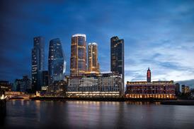
The scheme is all the more significant because it marks the first stage in the multibillion-pound regeneration of Canada Water. Porters Edge has been developed by Sellar Property, as a consequence of its continuing relationship with Southwark council since the construction of the Shard.
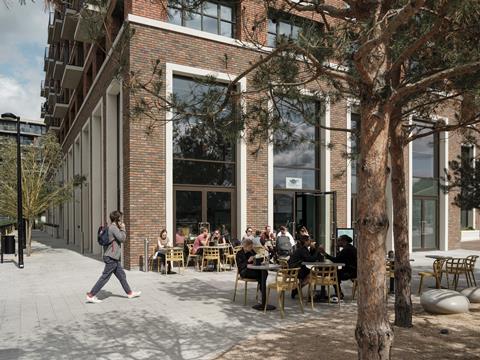
The site sits opposite British Land’s £3.3bn mixed-use scheme that aims to install 3,000 homes and 3 million ft² of workspace, retail, leisure and entertainment on 53 acres over the next 15 years. So far, only the masterplan has planning approval but, because Porters Edge is on an adjacent site and harbours similar use and density aspirations, it provides an intriguing glimpse of how this former backwater might be transformed into a vibrant urban district.
So, how do you build 234 residential units above a sports store? And as if that wasn’t challenging enough, how do you do so when that store sits over the Tube’s Jubilee line and an underground Victorian dry dock that had to be preserved? And to top everything, how do you do so when the retailer insisted on continuing to trade throughout the works?
Keeping the doors open
Maccreanor Lavington associate director Gavin Finnan describes the challenge in this way: “Mixed use is normally lots of housing with limited retail slotted in. This was the opposite. We wanted to take the big-box retail model and redefine it as a series of urban blocks. We also had to achieve this while ensuring the continuity of trade that was essential to the scheme’s commercial viability.”
This continuity was secured by the opportunities offered by the configuration of the site. Previously Decathlon occupied two warehouses on the same site, which presented obvious logistical challenges for a retailer.
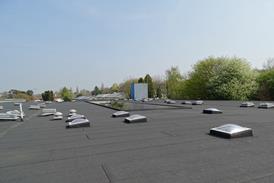
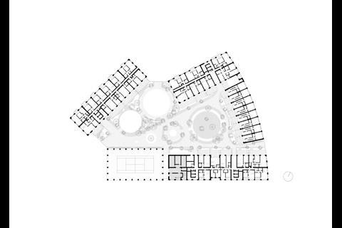
The roof of the store then becomes a landscaped garden courtyard that separates the taller blocks that encircle it
Most of the larger block was retained and, now unoccupied, is earmarked for removal for the future second commercial phase of the scheme. The smaller block was demolished in its entirety, with the new store and housing being built over its former footprint. And because that footprint represented an inefficient use of the space and was surrounded by car parks and service areas, the new building is able to provide much bigger premises by occupying most of the site up to its boundary.
While the building was being constructed the retailer remained in its retained warehouse. Once it was completed, Decathlon simply switched premises one weekend.
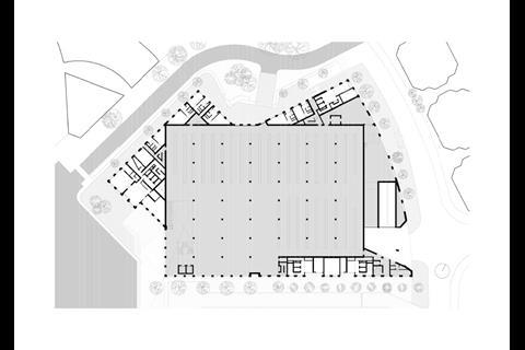
The plan of the new building is determined by the large retail volume at its base. “Retailers have very specific requirements,” says Finnan. “They wanted a rectangular plan based on a defined structural grid with a standard set of specifications that related to aspects like floor-to-ceiling heights and service arrangements. We took these as our starting point.”
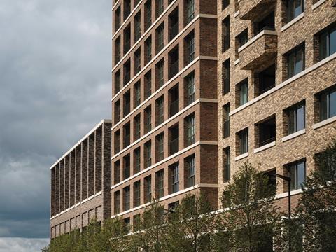
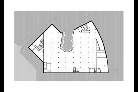
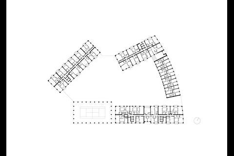
While a vast rectangular box works well as a sports store, expressing it externally as such may have led to the anonymised mediocrity the architect was trying to avoid. So, the retail volume is cleverly concealed by a series of more obliquely aligned, humanly scaled secondary volumes that contain residential units and form the base of the residential blocks that rise above the sports store. A basement car park is set beneath the building.
The two storeys of retail space are surrounded by four storeys of residential accommodation. The roof of the store then becomes a landscaped garden courtyard that separates the taller blocks that encircle it. Each block springs from the shared base of the store; above the roof they become individual structures, helping to break down the mass of the store.
What’s up dock?
Another design feature that helps in this regard is the building’s placement beside the dock. Because of the store’s rectilinear form being camouflaged by the asymmetrical extrusions around it, only the corner tip of the store is exposed externally and this forms its entrance. This helps to reduce the mass of the building into more bite-size chunks and, ingeniously, to transform the public face of a vast store into the more human dimensions of what is in effect a large vertical shopfront overlooking the dock.
A palette of four tones is generally used: grey for the store and a combination of buff yellows, reds and browns on the individual blocks, again effective in breaking down the mass of the building.
The placement of a semi-enclosed sports pitch above this corner entrance, enclosed by a tall open colonnade and open to both customers and – after store hours – residents, also helps to craft a gentler impact on the local townscape and, in particular, forms a handsome centrepiece for the view across the dock.
Maccreanor Lavington’s preoccupation with brickwork is well known and this building too is clad entirely in brickwork. A palette of four tones is generally used: grey for the store and a combination of buff yellows, reds and browns on the individual blocks, again effective in breaking down the mass of the building.
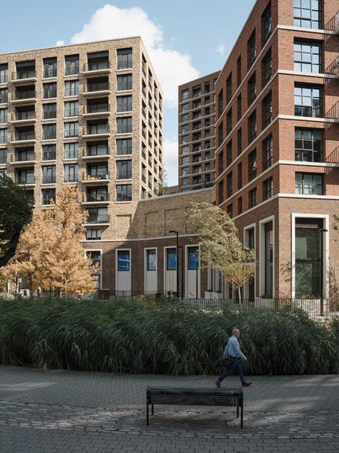
The local historic warehouse typology presents an obvious precedent for the building and the facades are a series of large rectangular glazed openings set within deep brick reveals and punched into the brickwork surface – channelling a sleek waterfront residential theme. While some maisonettes are accessed directly from the raised courtyard, all flats can be accessed from communal ground-floor entrances that lead to cores extending the full height of each block.
Providing what is three mid to high-rise buildings above a store came with its set of structural challenges, particularly as the requirement to conceal the dominance of the box meant none of the residential blocks above are oriented on the same structural grid.
Finnan refers to a “complex series of transfer beams and slabs” set into the roof of the store, some of which is visible on the exposed soffits of the shop floor. A similar arrangement is found below the basement to help span the Jubilee line tunnels below and accommodate the Victorian dry dock.
Contending with leakage
There is one key advantage to the retailer on this site being a sports store rather than, say, a supermarket. Finnan explains: “Because much of a sports store’s merchandise is naturally outdoor, they weren’t too concerned about drainage from the flats above passing through the store’s ceiling void, as any accidental leakage wouldn’t necessarily ruin the stock.
“But when we’ve explored this model for supermarkets, drainage through the ceiling zone is strictly prohibited as any leakage would have an obvious catastrophic impact on perishable goods. In that kind of scenario, we might place a car park above the store rather than below it because the car park could act as the ‘transfer’ zone which redirects drainage away from the shop floor underneath.”
As he suggests, Maccreanor Lavington is now exploring how the solution devised for Porters Edge could be applied to other retail or industrial boxes in Southwark. Nearby Old Kent Road, for instance, has an uninspiring procession of the structures and the residential-above-retail arrangement could transform its public realm and character.
>> READ: Maccreanor Lavington OK’d for south London towers
For Finnan, the design concept has much wider implications than simply fitting retail and residential on the same site. “It’s about town‑centre densification, which is now very much on the agenda. Town centres can’t be defined by a sea of retail sheds. But if these could be delivered in a more responsible and sensitive way, they might have a role to play.
“It doesn’t always have to be a sports store either. High streets have a historic tradition of a large anchor store and in the future this could accommodate a different retailer or even an industrial occupier.”
So, Porters Edge could have a revolutionary impact on how we arrange the centres of our towns and cities. If large-scale retail boxes can be delivered within a template that also provides a mix of uses and is principally centred on housing, then, perhaps for the first time, large-scale retail need not threaten the high street but could revitalise it. If we want to save the high street and if we want truly mixed and animated town centres, Porters Edge might be the future of shopping.
Project team
- Architect: Maccreanor Lavington
- Main contractor: Ardmore
- Client: Sellar/Notting Hill Genesis
- Structural engineer: WSP
- MEP engineer: MLM
- Quantity surveyor: Aecom
- Landscape architect: Vogt/HTA









No comments yet