A pioneering scheme in Norfolk shows how care homes can be adapted to the complex needs of people with dementia
Britain’s population, like those of most Western countries is aging. Today there are around 10 million people over the age of 65 living in the UK, by 2050 this is expected to almost double to 19 million.
These stark statistics obviously have profound social and economic consequences and have already prompted strategic responses from both central government and the construction industry, as reflected in the influential HAPPI (Housing our Ageing Population: Panel for Innovation) reports of 2009 and 2012.
But buried beneath this startling demographic shift is a considerably more disturbing pattern. In 2006 just over 26 million people worldwide were diagnosed with dementia. Today this has risen to 36 million, a figure that is expected to more than triple to 115 million by 2050 with the developing world bearing the brunt of incidences. However, according to the Alzheimer’s Society, in the UK alone, the 815,827 living with dementia today will balloon to over two million by 2051 if current trends continue.
The medical explanation for these extraordinary spikes is a subject of hotly contested debate. What isn’t are the consequences, one of which will be the requirement to build more residential care
homes specifically designed for people living with dementia. One of the most groundbreaking recent examples of this type of housing and a possible sign of things to come is a new care home that has opened near Great Yarmouth in Norfolk.
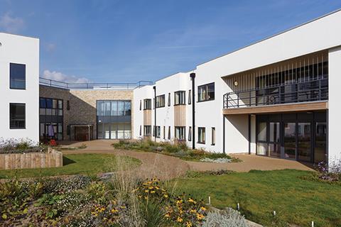
Lydia Eva Court is a £6.9m care home in Gorleston just south of Great Yarmouth. The 88-bed facility has been purpose-built for people living with various stages of dementia and offers state-of-the-art accommodation based on pioneering research into the condition.
The home has been built by NPS Group’s Barron and Smith Architects for NorseCare, one of the largest residential care home providers in East Anglia. Stirling University’s Dementia Services Development Centre (DSDC), world renowned experts and researchers on dementia care, also provided specialist design input.
Residents not patients
Lydia Eva Court’s design outlook is summed up by NorseCare’s Richard Smith when he points out that its occupants are “residents and not patients”. An overarching ambition of the new facility’s design is to help residents live as “independently as possible” and this has been achieved by two principal strategies.
First, by creating an intimate and domesticated care environment the design has sought to effectively dismantle the traditional institutional character of care homes. This extends to the inclusion of amenities as diverse as a hair salon, fitness room, multi-purpose space, cafe and extensive landscaped gardens.
And secondly, despite the benign outward domesticity of the facility, the design has discreetly crafted a highly specialised and sophisticated built environment whose every physical aspect, from the position of door handles to the pattern of flooring, has been specifically designed to suit the complex cognitive needs and limitations of the people with dementia who use them.
Concept
Alan Dunsmore, associate architect at Barron and Smith Architects, describes the design concept for the Lydia Eva Centre as “three villas in the landscape”. Accordingly the plan features three two-storey blocks radiating obliquely from a central spine, with the extending “fingers” nestling among landscaped communal gardens to the rear and the spine facing the residential street to the front. The bedrooms are located within the “fingers”, the spine contains the front entrance as well as communal areas such as the cafe, hair salon and multi-purpose room.
Each “finger” is split into two accommodation “clusters” each containing no more than 15 resident rooms. As Dunsmore explains, both the “cluster” and “finger” arrangements are key architectural responses to the dementia condition.
He says: “With dementia, familiarisation and intimacy are very important. By breaking down the bulk of the building into these three radiating wings, residents never see the building in its entirety; they only see part of it which creates a more accessible scale. Also the clusters were important to diminish the institutional feel of the home and create a more intimate sense of community with neighbours and surroundings residents may more easily recognise.”
All residents at Lydia Eva were moved from existing homes in the surrounding Great Yarmouth area, a potentially disruptive process which the cluster arrangement also helped mitigate by enabling former neighbours to stay together.
Materials
Externally, there are two treatments for the elevations. The entrance facade facing the street is mostly brickwork while the “finger” blocks that face the gardens to the rear are finished in through-coloured white render. According to Dunsmore the brickwork provides a more “formal, public” face to the front of the building while the render to the rear presents “softer facades more suited to the gardens and able to optimise the sunlight.”
The brickwork is a luscious, textured, chalky pale beige, similar to London stock but more irregular in its depth and pigmentation. The front elevations in particular are successful, the rich brickwork and streamlined massing providing an elegant and crisply sculpted envelope.
Windows and proportions are handled particularly well, with the elevation closest to the street dissolving into projecting vertical facades whose twinned windows and paired downpipes cleverly ape the scale and configuration of the houses opposite.
The rear elevations too present an appropriately softer aspect to the richly planted garden, with the facades again broken down into vertical “terrace-house” like volumes to temper scale and massing. The whitewashed walls in particular are heavily reminiscent of local seafront architecture.
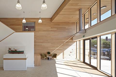
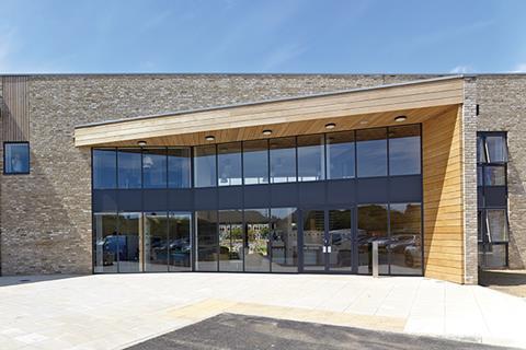
But the most dramatic aspect of the exterior is undoubtedly the entrance. Here a two-storey oak-trimmed canopy protrudes from the wall at a splayed angle, encasing double-height glazing that allows direct views into the interior and out through to the garden beyond. The oak panelling extends through the glass directly into the entrance foyer, linking the exterior to the interior.
Creating the right environment
However, charming as the exteriors are, it is the interiors with their unique physiological remit that hold the real interest. The catalogue of customised features the accommodation has achieved in order to provide a safe and suitable environment for its residents makes for a truly fascinating insight into the huge physical and psychological impact our built environment has on us all, regardless of whether we are unfortunate enough to suffer from dementia or not.
The first clue is in the foyer. “If a white door is set against a white wall then many dementia sufferers will simply ignore it” explains Dunsmore, “no colour contrast means no recognition so they just won’t register it as a door. So accordingly, throughout the building, all the doors to areas inaccessible to residents, such as plant or administration are painted white against a white wall, while the doors they’re supposed to use are painted a bold, distinctive colour.”
Doors from the foyer lead into the “clusters” and herein lie the next clues. Sensors which staff can use to open these doors are discreetly concealed below adjacent handrails to remove them from residents’ line of sight and minimise any chance of residents trying to operate them.
Within the “clusters” and the rooms themselves evidence of dementia suitable design is manifest. Because many people with dementia find it difficult to negotiate stairs they become a safety hazard. So at
Lydia Eva residents must use lifts instead. Lifts often have a different floor finish to other floor areas but here as Dunsmore explains, this was impossible.
“If there was a break in the flooring pattern in the lift, many residents wouldn’t use it because they wouldn’t see a lift, they’d see a hole. So we had to ensure that the same carpet used in the corridors extends into the lifts, which meant getting ��ɫ����TV Regulations dispensation to have the lifts carpeted.”
But as Dunsmore elaborates, it is not only lifts where breaks in flooring pattern can prove problematic. “There are no blue rugs or carpets anywhere in the building. Dementia can sometimes affect sight and there have been cases were dementia sufferers have mistaken blue rugs for ponds and have taken great pains to walk around them in rooms, sometimes injuring themselves in the process.”
Another lift-related design feature that required ��ɫ����TV Regulations dispensation concerned mirrors. There have been incidents of people with extreme dementia being gravely alarmed when unable to recognise themselves in mirrors. Or even worse, they might think another person is in the room with them and become unduly anxious or afraid, in some cases lashing out at the mirror and injuring themselves in the process. Consequently, there are no mirrors in any of the lifts and all mirrors in bathrooms are removable.
Sensory stimulation is also a key part of the design. Dunsmore reveals that the clusters are laid out like a “wandering loop” with their facilities, which include TV rooms, kitchen, dining hall, quiet room as well as the bedrooms, accessible from a broad circuitous central corridor designed to encourage residents to walk, explore and engage.
One of the subtlest aspects of this principle is the large windows aligned to the end of several corridors or to where a corridor turns a corner. These often have a chair strategically placed next to them and are subsequently popular spots for residents to sit and look at the outside world.
“We wanted the building to create an environment that provides sensory stimulation” explains Smith, “the landscaped gardens are a great example of that, people-watching is another. If residents want to sit here all day and stare out of the window that’s fine, we’re not about imposing a lifestyle, we want them to live their lives as they see fit.”
Memory triggers

Memory loss is one of the most debilitating consequences of dementia and again the design takes great pains to accommodate this. For those who might no longer be able to associate words with meaning, signs are often accompanied by an illustration depicting what is being described, such as an image of a plate with food for the dining hall.
It is also not enough to ensure that doors to residents’ rooms are painted in a bold and distinctive colour; doors that resemble typical front doors to houses, complete with panelling and numbers, have been selected to help residents associate them with doors they may recognise from their past.
Equally, instead of door handles being above locks in the conventional manner, here the arrangement is reversed so that the lock is not obscured by the handle. This ensures residents do not forget where it is.
One of the most poignant aspects of the design are the recessed “memory boxes” beside the entrance to each residents room. These are filled with sentimental trinkets from residents’ past lives, such as photographs or jewellery, to help trigger their memory.
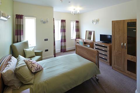
Finally, the design of the rooms themselves makes concessions for the dementia condition. Cupboard and drawer doors are often glass fronted to ensure that residents do not forget what is inside them. Andin each room the door to the en-suite bathroom is visible from the bed. This is to avoid a resident waking in the night and forgetting where the bathroom is.
For Dunsmore, designing to such a high level of dementia-based specification proved to be challenging but ultimately satisfying process. “We had to thoroughly understand the condition and use that knowledge to cater for everything within the design process. Every time we made a decision that worked in building and architectural terms we had to then rigorously assess it from a dementia perspective.
“This sometimes counter-intuitive to the conventional way things are normally done, such as when a subcontractor suggested there could be cost-savings made from using standard internal doors for the residents’ rooms rather than house front doors. From an architectural perspective these were some of the hardest things to get our heads around. But ultimately it proved to be satisfying process because we knew that by the times things had been agreed, all the potential pitfalls had been considered.”
And this is what indeed makes Lydia Eva such a fascinating study. It may be a pioneering care home intricately designed to suit the requirements of the dementia condition. But it also offers wider lessons that demonstrate the innate power of architecture to affect our everyday lives. Designing for dementia, even to the level of specification and sophistication achieved at Lydia Eva, provides an acute example of the relationship with our physical environment that affects us all.
Project Team
- Architect Barron and Smith Architects
- Client NorseCare
- Main contractor R G Carter
- Interior designers Barron and Smith Interiors
- Project management NPS Property Consultants








No comments yet