The images distract attention from the proceedings and, some say, from the truth of what this controversial tall building is really all about. At the outset, English Heritage, the main objector to the 187 m high project, criticised the 147 "seductive" images submitted by architect Kohn Pedersen Fox.
EH said it had "serious reservations about the accuracy of the rendering", and contended that "the true impact of the building had been under-presented".
The allegations of deliberate distortion have since been dropped, though without the public apology demanded last week by the tower's developer. The irony is that despite EH's misgivings, the debate has been played out almost entirely using KPF's alluring set of images. Lawyers from both sides of the inquiry continually pause to flash computerised representations across the flat-screen monitors that litter the hall, in order to prove or disprove key points.
It is clear that the fate of the proposed £300m tower hinges on these machine-produced pictures, the most ever assembled to aid the analysis of a planning application. So the question is: how reliable are they?
London-based firm Smoothe, a specialist in computer-aided design, is frank about the deceptiveness of the medium, especially when used as a marketing tool. "Normally we are asked for smiley faces, crisp sky and bright sunshine," says director Matt Fairman. "You try to show a project in its best light, so you think about the weather and the time of day. You might remove a tree or a lamp-post. To figure out the best angle, you might take an unreal position."
He says these types of shot, typically demanded by architects and developers to help promote a project, are exercises in artistry rather than honest depictions of how a building will eventually look. He adds, however, that for marketing images, "we will always tag it an artistic impression".
Fairman says this kind of airbrushed reality is less evident when shots are prepared for planning applications. But he admits that at £4000 an image, clients will often try to double up marketing and planning pictures to cut costs.
With Heron Tower, EH's objection has meant that the 147 images include less poetic shots of the block under wintry grey clouds – a nod towards a grittier, more honest reality that remains very much an exception.
Sometimes in planning applications you find the top two floors of a building miraculously disappear
Gordon Chard, Westminster City Council
"We view visualisations from architects and developers with caution," says Gordon Chard, head of development planning services for Westminster City Council. "Sometimes you'll be going through a planning application and you find the top two floors of a building will miraculously disappear. You have to stop and say 'hang on – that's not right'."
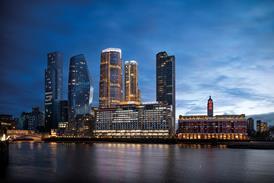
There is a set of tricks practised by designers that planners need to be alert to. ��ɫ����TVs in sensitive spots are regularly rendered to make them sink inconspicuously into the background, and spatial depth is often compressed to make a building and its neighbours sit together more neatly. The daytime shot of the transparent building invariably has sepia sunlight pouring through when, in reality, Venetian blinds and the clutter of office furniture make such mesmerising effects impossible. The night-time shot can undergo similar visual "enhancement", making pug-ugly blocks look romantic as they glow lantern-like in the darkness.
With such enthusiastic sleight-of-mouse, it is hardly surprising that the building that eventually gets built looks nothing like the computer renderings. "We can be shown a glamorous shot," says Chard, "then after it has been approved, it is costed and things are pared down – the materials are changed and the building loses its gloss and glamour. You can approve one building, then over a period of time it changes into another. It can be a problem."
When the cladding started to appear on Foster & Partners' Greater London Authority building earlier this summer, critics immediately pointed out the discrepancy between the velveteen steel and glass of the visualisations, and the disappointingly drab finished product. "How has the gossamer skin become the everyday curtain walling of an everyday office block?" wrote the Evening Standard's Rowan Moore, pointing out that earlier renderings had promised a transparent building but reflections on the glass and "humdrum venetian blinds" meant that Londoners would not, after all, be able to gaze in and watch their political masters at work.
Jon Hey, an associate at Smoothe who worked on the original images, explains the unfortunate metamorphosis. "Designs change, they evolve, and our problem was fixing one at a certain point so that we could get on with the work. You don't want to scrap the Photoshop work because it is so labour intensive and difficult to manage."
Another problem is that logic-based computer programs will always give a building an impossible sense of perfection. "Some materials, especially metal and glass, are hard to depict this way," says Peter Rees, city planning officer for the Corporation of London. "Architects go on about transparency when glass is actually reflective, and metal doesn't usually sparkle against a blue sky, it is more like a lump against a grey backdrop."
To produce a more realistic image, designers need to paint over and degrade the spotless machine-made surfaces. Unsurprisingly, perhaps, architects and developers are often reluctant to spend the extra money and time on a process that deliberately muddies their vision, even if that process gets closer to an honest depiction.
But not just architects and developers have exploited the technology. Even English Heritage has been guilty of manipulating images to its advantage. During last week's instalment of the Heron Tower inquiry, a computer-generated montage by EH that was published in the Evening Standard was held up for criticism. The scene was a skyline of proposed city skyscrapers dwarfing St Paul's Cathedral, with a "poorly rendered" Heron Tower in the centre. When asked if it accurately conveyed the building, Philip Davies, EH's regional director for London, admitted that it was a "crude attempt" and, in effect, a denigration of the high-rise's architectural integrity.
Planners’ safeguard? The certified view


