ŌĆ” they might look a little like this Madrid clinic, by local practice Estudio Entresitio
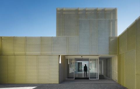
Ahealth centre in Madrid, Spain, has taken a unique approach to standardised design and urban context. The facility is one of three buildings on three sites in the city constructed for public health body Ayuntamiento de Madrid. The only differences between them are the external cladding and the colour of the ceramic finishes applied to courtyards.
CMS Usera is a 1,900m2, ┬Ż1.3m preventative care health centre by local practice Estudio Entresitio. It is a rectangular, squat, one-storey building in a commercial neighbourhood.
On plan, its grid-like square layout is broken into a sequence of 14 internal courtyards and a further series of orthogonal recesses and projections that punctuate the building edge. This angular articulation continues on the roof, which is defined by a number of squat towers that create a distinctively modular, geometric silhouette.
The building is clad in perforated gold-coloured panels and, as the internal courtyards are the principal source of natural light, no windows were applied to the exterior. This unusual measure, coupled with the uniform metallic cladding and the rigidly modular form, creates an ambiguous character, at once abstract and industrial. Both contrast with the more familiar urban typology of neighbouring buildings.
Left and above: the design is an extraordinary combination of high concept and modular utilitarianism Right: the building saves its glazing for the internal courtyards
The two other health centres have identical plans, elevations and massing, but the first project, UMS San Blas, has concrete external walls. The third, UMS Villaverde, is clad
in opaque glazing in response to its residential context. Initially, a concrete finish had been earmarked for CMS Usera but this was altered to the metal owing to difficulties with the quality of finish during construction.

Together, the centres provide a rare example of customised architecture. Standardisation of materials and services is common but, away from the commercial sector, the repetition of the same architectural concept on a relatively large scale and on entirely independent sites is unusual.
Although the architects claim that the first building was designed in response to its site, its replication wilfully defies the conventions of contextual design. In its place the centres offer an unapologetically individualistic brand of ŌĆ£motifŌĆØ architecture, an instantly recognisable form clad in a customised external skin.










No comments yet