Two architecture students from Nottingham Trent and an RCA graduate architect give their verdict on the newest CCNY building

About the scheme
These are images of the City College of New York’s Bernard and Anne Spitzer School of Architecture, Urban Design and Landscape Architecture, designed by Rafael Viñoly Architects. The existing 1950s five-storey, modernist glass-block building was gut-renovated, preserving only the structure of reinforced concrete columns and floor slabs.
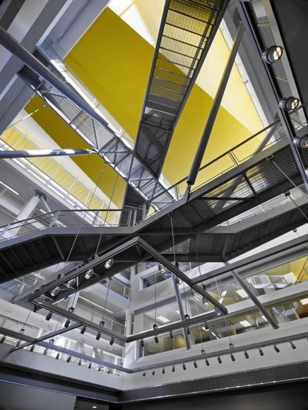
Main features in the 135,000ft² building include a central atrium which allows daylight to illuminate the building from the roof down, and an intersecting series of steel staircases and pedestrian bridges. Partial mezzanine levels inserted above the studio floors accommodate the faculty offices, which overlook the open-plan design studios through interior glazing. The building also includes an exhibition space, rooftop open-air amphitheatre, a model shop and an architectural library.
Pradumn Pamidighantam’s verdict
Gutted, the preserved structure of the building can be seen throughout the design as the whole building speaks with a clear voice.
The 50s modernist values have been preserved well within this scheme, and the preserved structure has informed the design in many ways, for example, through the purity of the design.
Not being phased with the task at hand, Viñoly has created a light and airy building with studios benefitting from clever ordering of spaces. The central element prompts me to think of Hogwarts with its criss-crossing staircases proving to be a be hub of interaction for people.
Those living in New York or any other large city, will know that space is always at a premium. Viñoly continues this creation of spaces in the most unlikely of places by placing an auditorium on the roof of the college, open to the city’s skyline.
Viñoly’s choice of colours and materials has been careful and precise with the splash of yellow bringing life and warmth to the modern ‘white box’. The introduction of the metal industrial staircases and the glass together starts to create a transparency and an interaction to the building which can be said is lacking in many other buildings that we see so often.
Viñoly truly has given a new lease of life, to what was a poorly maintained, glassmodernist box.
Thomas Greenall’s verdict
Crucially, this isn’t new construction; rather, it’s a totally overhauled version of a glass-block building that was built in the late 1950’s. Interestingly, Viñoly’s firm chose to forgo the opportunity for new build in favour of ‘gut-renovation’, preserving just the structural elements.
Originally conceived as a library, decades of evolving academic and administrative programmes had transformed the building into a fractured collection of generally inadequate spaces housing administrative functions for the college as a whole.
At first impression, Viñoly’s touch seems light and considered – even respectful to the modernist ideals of the original building. But in fact this touch is far reaching. A thoughtful and thoroughly considered masterplan for the site included the relocation of the library’s facilities into other parts of the city-wide campus, inserting the various administrative and management programmes where actually appropriate.
The new design layout displays a trademark of Viñoly’s institutional and educational projects, promoting interaction and fluidity of movement through innovative design solutions. His trademark, in this instance, is manifest as a unique system of intersecting steel walkways and staircases, facilitating circulation throughout the building and establishing a connectivity and slightness between floors.
This re-imagining of the building’s circulation system animates the main atrium space, on top of which sits Viñoly’s most successful addition – a new open-air amphitheatre, encouraging a form of rooftop activity that le Corbusier himself would have been proud of.
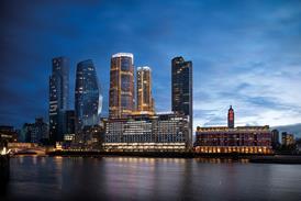
Viñoly has always professed that his buildings are based on ideas that are relevant to the specifics of both programme and context. Whilst, London might find this hard to believe given his much-maligned ‘Walkie-Talkie’ scheme for the City, internationally this dogma has resulted in projects that benefit from a unique interpretation of the brief rather than a predetermined solution based on a specific architectural vocabulary. An admirable example to set for the many architecture student that will study here.
Clarissa Wenborn’s verdict: The bright cheerful colours of the building appear to promote an informal and open atmosphere that seems to be well suited to the design of this education facility.
The buildings central atrium, with its intersecting bridges and staircases, promotes a sense of interactivity, establishing a connection between levels and spaces.
To further emphasise an informal tone, the faculty offices overlook the open plan studios, achieving a dynamic use of levels that reinforce the interconnected feeling.
Although this approach may not be entirely common within older institutes, I believe that Viñoly’s design approach is well suited to a learning environment.
Postscript
Pradumn Pamidighantam and Clarissa Wenborn are BArch (Hons) Architecture students about to start their final year at Nottingham Trent University. Thomas Greenall is a graduate architect from the Royal College of Art.
If you're a student or a recent graduate and would like to take part in the First Impressions series email nargess.shahmanesh@ubm.com.
For the latest jobs in architecture visit .


No comments yet