Another ŌĆÖFirst ImpressionŌĆÖ panellist, this time Michelle Sweeney, graduate from the School of Architecture at the University of Manchester, on five new schemes
Coop Himmelb(l)auŌĆÖs LA school
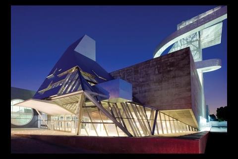
About the scheme: This is Austrian architect Coop Himmelb(l)auŌĆÖs ┬Ż115m High School #9 in Los Angeles. The visual and performing arts school in downtown LA has a 1,000-seat theatre and seven school buildings for its 1,800 pupils. Among the design flourishes are a pyramid of glass and steel at the schoolŌĆÖs entrance and a looping walkway spirals down from an elevated classroom at the summit of a small tower.
Michelle SweeneyŌĆÖs verdict: The spiralling walkways seem to reach for the sky, a metaphor maybe for itŌĆÖs aspiring students. However, the component forms of the entrance seem at odds with one another which results in an uncomfortable whole. I canŌĆÖt say I like this building but it is certainly different and will surely inspire people using it day to day.
Carlos GaraicoaŌĆÖs ŌĆ£conceptualŌĆØ cultural centre in West Yorkshire
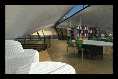
About the scheme: This is the design by Cuban artist Carlos Garaicoa for a ŌĆÖconceptualŌĆÖ cultural centre for a West Yorkshire town. The scheme is part of The Castleford Project, which is being run by Wakefield council and Channel 4. It incorporate CastlefordŌĆÖs Roman ruins, a library, a meeting space, and an observatory.
Michelle SweeneyŌĆÖs verdict: Televising the regeneration of this area in Yorkshire is a great idea for getting local people to visit the cultural centre once it has been built. Making the whole development process accessible on such a wide public scale should hopefully excite people and encourage an interest in the project.
Heneghan Peng Architects and Adams Kara TaylorŌĆÖs River Lea crossing
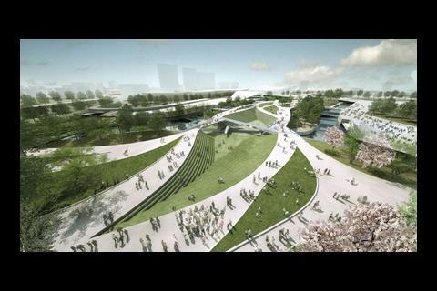
About the scheme: This is the winning design for the central footbridge at the Olympic park. The River Lea crossing, designed by Heneghan Peng Architects and Adams Kara Taylor, will link the Olympic stadium with the handball arena and aquatics centre.
Michelle SweeneyŌĆÖs verdict: The paths remind me of the undulating flow of a river, finding a path to their destination around whatever obstacles lie in the way. In this case, the ŌĆśobstaclesŌĆÖ are grass verges and structured landscaping. The seemingly random flow of the paths and structured landscaping combine well to provide natural spaces of movement and rest. This unity of structured modernity and organic ideals will provide a beautiful and timeless urban space.
Delugan Meissl designed new Porsche Museum in Stuttgart
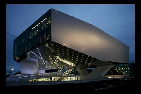
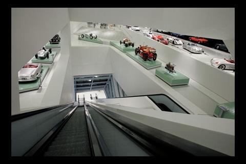
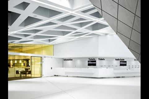
About the scheme: This is the new Porsche Museum. Designed by Viennese architect Delugan Meissl, it is located in the suburb of Zuffenhausen, home to the sportscar maker for over 50 years. Around 80 cars are on display in the 5,600m┬▓ exhibition space, ranging from the legendary wheel hub motor of the Lohner-Porsche, the worldŌĆÖs first hybrid automobile built in 1900, to the latest generation of its most successful model, the Porsche 911.
The building is designed entirely in white with its exhibition area resting on only three single supports so as to appear to be hovering. The exhibition concept was developed by local architect HG Merz. The firm deliberately dispensed with the idea of a staged theme world with show effects and instead let the sportscars speak for themselves.
Michelle SweeneyŌĆÖs verdict: Streamline, sleek, shiny and at the forefront of design. The building needs to represent the ideals of itŌĆÖs product and does exactly that. The understated prowess achieved by the manufacturers has obviously been a inspiration for the architects in their design.
Throughout, the scheme has strongly executed lines and clean, uncluttered surfaces. This is not only a building to showcase exhibits but is a tribute to the Porsche ideals, both inside and out.
Zaha Hadid ArchitectsŌĆÖ ŌĆÖdiamond grasshopperŌĆÖ
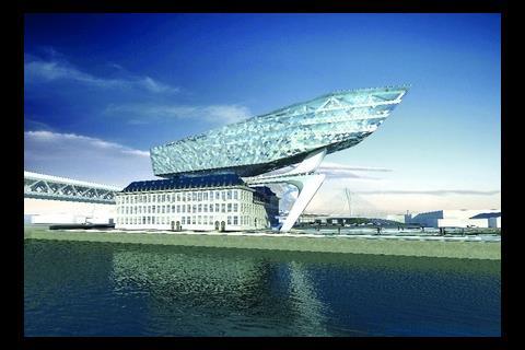
About the scheme: This is Zaha Hadid ArchitectsŌĆÖ images of the ŌĆÖdiamond grasshopperŌĆÖ, an extension to a refurbished fire station in Antwerp, which will house the port authority headquarters. The practice will design both the free-standing extension and the refurbishment of the fire station.
Michelle SweeneyŌĆÖs verdict: At first I loved the work of Zaha Hadid Architects ŌĆō projects a student dreams of being involved in, something wild and outrageous, a statement installation of vast proportion but now I always feel somewhat unnerved by it. I like the idea that building and itŌĆÖs inhabitants have a impact on each other, that they become part of the same character. But the projects of ZH appear too confident and complete to take this on.
Postscript
Michelle Sweeney currently works at London-based architect .
Would you like to be part of the graduate First Impressions panel? Then email Nargess at nargess.shahmanesh@ubm.com.
Sign up to receive the Student ║├╔½Ž╚╔·TVletter at .







No comments yet