Students from the Royal College of Art and Nottingham Trent University comment on the Netherlands scheme
About the scheme:
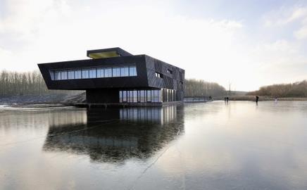
Architect Drost + van Veen has designed an education centre for the Oostvaarderplassen, a nature reserve in Almere, in the Netherlands. The firm has used cross-laminated timber panels to create a 7m cantilever for the imposing building. The 215m² centre is situated over a dyke and timber was chosen for the main structural elements because of its lightweight and environmental characteristics. The use of Finnforest Merk’s Leno panels, which are prefabricated, helped to minimise disruption and kept construction time to a minimum. The timber has been left untreated on the interior of the building, with the warm aesthetic of the wood providing the decorative finish.
Igor Barteczko’s verdict:
It produces a confusing second impression which inspired me to see it as a bunker or fortress, in a brutal and overpowering way, compared to the soft surrounding nature. It attempts to forcefully blend into the surrounding natural environment which looks obvious.
The form imposes a noisy and overpowering presence, as if taken from manmade inner city and dropped into a balanced and peaceful living habitat. As if the transition between what is imposed onto this location and the location itself lacks a unifying gradient.
Perhaps this is a matter of individual taste or just a matter of accident. And in nature accidents do occur all the time. But again, this building remains too controlled to be considered natural.
If I was a fish swimming by in the lake or a deer which has just come out of the nearby forest to drink water from the lake I would be cautious and perhaps discouraged, as I would notice lines that are too straight, form that is too sharp and tones that are too heavy.
On the other hand, if I was a person visiting this place I would find a unique sense of space and perhaps this would appeal to me more. I would not go there to educate myself on wildlife and nature, but to experience a unique architectural installation which is contrasting nature and perhaps by that it would be possible to distinguish between the two contrasts.
Therefore was the intention of the designer to bring out the nature of this location through an alien device?
Either way, this building provokes a series of questions concerning the choices designers sometimes make when putting nature and personal taste onto a priority list. Which one comes first? The building provokes me to believe that it was not only fabricated off-site but also designed in an office – far away from the habitat onto which it was dropped.
I personally think that this education centre does its job but neglects to take into account the existing life within this habitat and could have done better.
Adam Smith’s verdict:
This building’s quirky but simple form allows for surface texture and materiality to come to the fore.
The prefabricated timber and insulation panels are appropriate for the scale of building and are a highly sustainable solution.
The architects’ sectional sketches of the building nestled in the landscape are fairly seductive.
The plans on the other hand appear to have a few too many acute angles: one feels that they could have used more subtle tectonic decisions, and still achieved the asymetric feel they were looking for
Postscript
Igor Barteczko is a final year architecture student at and Adam Smith is an architecture student at the in London.
For the latest jobs in construction and architecture worldwide and career tips visit .


No comments yet