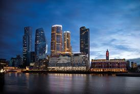
Approaching the Imperial War Museum North across Salford Quay, it immediately becomes obvious what all the fuss is about. This is quite simply the most sculptural landmark building to be seen in Britain in modern times.
The building creates a glittering gatepost to Salford Quay, and perfectly balances Michael Wilford and Partners' Lowry Centre, which stands opposite. It is built on the same monumental scale as the Lowry – it rises to 55 m – and is made up of similar silvery curvaceous forms. But whereas the aesthetic of the Lowry is a combination of sculptural and architectural forms, the war museum seems to be pure abstract sculpture writ large.
This is the building in which Libeskind discovered the curve. Viewed from the quay, the building comprises three vast, thick, double-curving dishes of silvery metal that crash into each other. The first dish is concave, curving slightly upwards, the larger one adjoining it is convex, tilting slightly downwards, and the third shoots straight up to a dramatic peak in the sky.
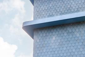
All three dishes have sharp edges and smooth surfaces and are clad in aluminium – standing-seam aluminium for the roof surfaces and flat panels laid at crazy angles for the thick edges. The vertical dish has slatted panels making it partly translucent.
No vertical flues or vents interrupt the smooth curving surfaces of the dishes – the plant rooms are ventilated through flush grilles. A few windows and external doors are inconspicuously fitted into a black-rendered undercroft and in a horizontal strip that finishes flush with aluminium cladding panels.
These sculptural forms on such a monumental scale are quite spectacular, and the effect is doubled by the reflection of the tower in the water of the quay. But it is the combination of curving and flat surfaces at varying angles that transforms the scene into something truly magical. It is as if the building were purpose-designed for the soft northern daylight, which creates a mesmerising kaleidoscope of subtle and constantly shifting shades as it plays across the silvery metal surfaces.
What cannot be divined from the architectural forms of the building is Libeskind's underlying storyline, which helped him win an international design competition for the project. "Before I presented my scheme to the client, I thought of Homer's Iliad," he recalls. "This is the text about the origins of conflict in the West. It's all about blood and the shattering of the world."
Libeskind's rationale of world conflict, translated into built form, begins with a globe representing the world, which is broken into shards – the dish shapes – or "traces of history". Three of these shards are then brought together again to form the "fractured landscape" that is the building.
The largest dish, which Libeskind names the Earth Shard, contains the main museum gallery. The smaller, concave dish – the Water Shard – contains the restaurant. And the vertical translucent dish – the Air Shard – contains the museum entrance and leads up to a high-level platform, from where, in Libeskind's words, "you look down on the city spread out helpless in front of you". The earth, water and air metaphors represent the three realms in which wars are fought, by armies, navies and air forces.
It is questionable how much Libeskind's abstruse storyline adds to the visitor's appreciation of the building. For a start, there is no hint of violence or destruction in the sleek, curving forms of the three interpenetrating shards. And in contrast to the architect's gloomy interpretation of world conflict, the smooth, gleaming structure evokes a sense of uplift and optimism.
Such an interpretation is deliberate on the part of Libeskind, whose explanations turn out to be more ambiguous than they first seem. "It is not a didactic building," he says. "People should see it in different ways; it's about their own interpretation."
Before taking up architecture, Libeskind had a glittering career as an international virtuoso pianist. He knows instinctively that, just like music, buildings require "an emotional response through the senses" rather than a purely intellectual one. "Theories, and ideas, come last."
Though it is at present an empty shell awaiting fitting out, the interiors of the building elicit an even richer sensory response. A narrow entrance leads into the air shard, which is more of a civil engineering tower than a habitable building. It is open to the elements through its slatted casing, and contains little more than a criss-cross structure of tubular steel and a lift going up to the high-level viewing platform.
But nothing is ever so straightforward in Libeskind's architecture. The four enclosing walls of the air shard are aligned by just 4º off the vertical, each one sloping in a different direction. The slope on the walls is too subtle to be noticeable to the naked eye. Instead a weird optical illusion takes place, with the lift shaft, which is truly plumb, and the existing buildings in the background appearing to be on the verge of collapse. This is a favourite Libeskind trick, used to great effect in the Jewish Museum, and never fails to produce a sense of disorientation.
The main gallery of the museum is a huge clear-span hall within the earth shard. It is the ultimate black-box museum space that is devoid of windows and entirely reliant on artificial lighting, sounds and special effects. The ceiling curves down on all sides from a shallow apex of 20 m, and all the walls slope outwards. The intention is to project historic films and photographs of wars across all vertical and horizontal surfaces so as to convey the chaos of global conflict. As a side-effect, walls, floors and ceilings will be visually dissolved, adding to the visitors' sense of distortion.
A highly original architectural feature adds to this – not only do ceiling and walls slope, but the floor does too. The concrete slab is one more shard of the globe from which the three external shells are derived. From a "north pole" near the centre of the gallery hall, the floor slopes down in all directions. The slope is very slight, but being a spherical curve, it increases in gradient as it approaches the perimeter walls. And since all enclosing surfaces, including the floor, will be awash in photographic projections, the slope will be barely visible.
The amazing effect of the sloping floor is that it is sensed not through the eyes but through the feet. What more unexpected and discomforting an architectural device could there be?
The Imperial War Museum North is one of the first of a new generation of post-lottery cultural buildings. After being turned down on a lottery application, the museum gathered funding from the site owner, Peel Holdings (£12.5m), the European Regional Development Fund (£8.9m), English Partnerships (£2.7m), Trafford council (£2.8m) and a public appeal. An unfortunate by-product was that the budget was slashed from £40m to £28m.
Libeskind puts on a brave front about the cutbacks. "It's come out a much rawer building," he says. "But I never regretted the cutbacks – that's just part of reality. They meant dramatic changes to the materials and landscaping we wanted to use, but not to concept or spaces."
Cost-saving changes have included specifying conventional rectilinear windows rather than angular ones. But not all the changes have been for the worse. On the air shard, for instance, the cladding was changed from opaque to slatted.
But this only adds a translucent, inside-outside quality that was lacking in the original design.
Being an ex-showman, Libeskind knows all about flattering his audience. "I loved building in Manchester," he gushes. "The people on site, the industry, the public – it was a fantastic experience." Given the enthusiastic reception it has given to the Lowry, the Manchester public will no doubt respond similarly to Libeskind's building when the Queen opens it to the public next June.
Learning curves
The Imperial War Museum North in Salford has been a fiendishly difficult building to construct. In the design by the Berlin-based Studio Daniel Libeskind, the walls zig-zag crazily in plan, and all the roofs, ceilings and even the floor of the main museum gallery have double curvatures. At the same time, the architect demanded precision construction with minimal tolerances. Only modern computer-aided design made it possible to build. As the shell-and-core contract awarded to Sir Robert McAlpine reaches completion, the contractor’s project manager, Andy Robinson, remains enthusiastic about the building. “We were appointed in July 1999, on the first stage of a two-stage contract,” he relates. “This gave us a six-month preconstruction period that allowed everybody to get their heads around it. We were also able to procure 90% of the works packages by value in that period.” Setting out the highly irregular forms was the main problem. McAlpine’s in-house land surveyor laid down a system of horizontal and vertical co-ordinates across the site, which were adopted as a common language by all consultants and subcontractors. The subcontractors were then required to do their own setting out and, as an additional verification, Robinson asked all of them to commission checks by independent consultants. When it came to physical construction, McAlpine’s philosophy was to get the steel frame correct in the first place, so that cladding and other secondary elements would slot into place relatively easily. As the external and internal envelopes were installed, the challenge was to make things fit at the points where different elements come together, recalls Robinson. “Every corner was a one-off,” he says. “A solution to one corner may not work in another.” Another challenge occurred in the double-curved floor slab to the main gallery. “The reinforced concrete slab was laid with tolerances of +/- 15 mm, but the floor surface had to be laid with much finer tolerances. The architect wanted a cement screed, but this would have been too heavy, and a granolithic finish would have required joints, which he didn’t want. In the end, we used asphalt with a bauxite aggregate that would pick up the photographic images to be projected on it. The architect accepted joints, as long as they followed the contours of the globe.” At the end of the shell-and-core contract, the mutual admiration pact between architect and builders still holds, despite cost savings of £12m to keep the project within budget. “The architect always gave a fair hearing to a supplier or subcontractor,” says Robinson. “More often than not, we came up with a solution that satisfied all of us.” As for Daniel Libeskind himself, he says: “When the construction team first came to Berlin to look at the Jewish Museum, they said they didn’t have the craftsmanship available in Manchester. But if the architect speaks directly to the workers on site, and if you can convince them that they are doing something special, they get the idea and put extra effort into doing it.”Downloads
First-floor plan
Other, Size 0 kb
Credits
client Imperial War Museum architect Studio Daniel Libeskind project manager Gardiner & Theobald Management Services structural engineer Arup services engineer Connell Mott MacDonald quantity surveyor Turner & Townsend contract administration architect Leach Rhodes Walker exhibition designer Real Studios main contractor Sir Robert McAlpine fit-out construction manager Interior


