With its extraordinary sculptural forms, this £30m luxury housing development is certainly a match for Foster and Partners' Albion Riverside and Richard Rogers Partnership's Montevetro. But its 255 apartments are London, let alone on the Battersea riverfront, but in the small regional city of 's-Hertogenbosch in the Netherlands. Although Armada was developed by Dutch housebuilder Credo Integrale, part of the Wessels group, it can claim one vital British connection: it was designed by architect Tony McGuirk of ��ɫ����TV Design Partnership in London. The British influence has clearly done nothing to alienate local people. In January, it was voted by the Dutch public as the most loved building erected in the Netherlands in the past three years.
Armada is the eye-catching centrepiece of one of Holland's most ambitious urban regeneration schemes. Named Paleiskwartier, or Palace Quarter, it is developed by a public–private partnership that includes the council and the Wessels corporation. The whole regeneration scheme was masterplanned by the Dutch Urban Design consultant, Khandekar, which also oversaw the limited design competition for Armada.
The competition brief drawn up by Khandekar was relatively prescriptive. As it lies within half a mile of the historic city centre, the whole Palace Quarter was planned by Khandekar on the lines of traditional cityscape with high-density, mixed-use buildings on a rectilinear street grid. But when it came to the Armada centrepiece, Shyam Khandekar, the masterplanner's senior partner, wanted a contrasting change of forms, style and atmosphere. The brief called for apartment buildings designed "as houses that contrast in a delicate way with the perimeter blocks around the park and will continue to radiate warmth and quality over the years." It also stipulated pairs of free-standing blocks that would break with the format of square doughnut-shaped blocks enclosing communal courtyards that make up the rest of the regeneration scheme.
McGuirk's scheme captures the lively spirit of the competition brief with aplomb.
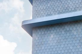
The sculptural blocks, curvilinear on one side and angular on the other, have a spirited, dancing character quite unlike the stolid, four-square doughnut blocks alongside them. The stainless-steel facades belly outwards before swooping up and over the roof in one continuous curve. Their edges also project beyond the flank walls on either side like giant elephant ears. At the same time, these stainless-steel shells, all smooth, curving and shiny, are punctuated by square windows and even more so by slender balconies that project outward like open flaps. The other sides of the blocks are quite different, being mainly composed out of flat vertical walls arranged in angular configurations on plan.
Also unrestrained is the rich mix of materials and colours. As well as the silvery stainless steel of the curved facades, there is two-tone brickwork arranged in wave patterns, natural cedar boarding, white render to the lift towers, white painted brickwork behind the access decks and large expanses of clear-glazing. In fact, whole walls are made up of sloping panels of clear glass, though these are not external walls to the flats but transparent screens to their access decks. Near the main entrances rise stair towers encased in steel grilles. These have been painted a different colour – turquoise, green, red and purple – for each block so as to be instantly recognisable as an identification mark – dubbed by McGuirk its "urban doorpost".
The most compelling aspects of Armada's strikingly complex forms are the steel breastplates, which proudly bulge and gleam and are best viewed from the south. Unfortunately, the main approach route is from the north, from where the appearance is a more uncomfortable conglomeration of polygonal shapes and contrasting materials, with the clear-glazed window walls to the access decks adding a slight frigidity.
The dramatic appearance of the blocks was inspired, so McGuirk explains, by environmental and social considerations as much as by aesthetic ones. On the environmental side, McGuirk noted that the site, in its typically flat Dutch setting, was buffeted by prevailing south-westerly winds. Accordingly, he moulded each building like a single house, rather than a block of flats, by curving the smooth south facades up and over the roof so as to channel wind flows across them with as little turbulence as possible. Likewise, the protruding elephant ears on either side reduce wind eddies at each corner.
They sold so fast we had to build them quicker than we had planned
Joop van der Veer
On the same south side, the generously sized balconies serve as sun terraces. The blocks have been carefully orientated and positioned so that the terraces, living rooms and principal bedrooms on the same side all enjoy maximum sunshine and long views across town to the Countryside.
As for the social aspect of the design, this relates to the communal access to the flats. In contrast to the conventional arrangement of flats opening off internal lift lobbies, the lifts open out on to outside access decks. These are intended by McGuirk as proverbial streets in the sky, or semi-private verandahs with enough space and daylight for residents to socialise with their neighbours. The concept was introduced at the Park Hill council housing estate in Sheffield in the 1960s, where they were so windy that the reality did not live up to the theory.
At Armada, McGuirk has made his streets in the sky more amenable to neighbourliness by adding two new elements. Instead of opening directly off the communal access deck, the front door of each flat is reached by a short linking bridge, which adds a buffer zone of defensible space. Added to that, the access decks are sheltered from the wind, but not the daylight, by window walls of clear glazing on the outside. "We wanted them light and airy," explains McGuirk, "and the window walls turn them into wintergardens and social areas." Admittedly, the window walls include large gaps for ventilation, which leave the access decks more than a little breezy in winter. On the brighter side, they enable pot plants to be cultivated on the decks and offer splendid views of the whole complex including the communal gardens and water basin below, turning the whole complex into what McGuirk calls a "vertical garden city".
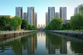
The water basin stretches for 400 m all along the east side of Armada. Though it could be mistaken for a disused canal basin, it has been newly created as the Palace Quarter's central landscape amenity. It also conceals two more practical functions. It covers two levels of basement car parking, successfully ridding the ground level of deserts of parked cars. It also serves as a natural heat sink, from which the district heating system can draw off heat in winter and coolness in summer.
A more accessible social amenity is made up of the communal landscape gardens surrounding each block. The communal gardens reach right up to the sun terraces of the ground-floor flats, which are no larger than those on upper floors.
As for the flats themselves, they are, to say the least, spacious, ranging in floor area from 110 m2 to 200 m2 for the penthouse maisonettes, and stretching through each block from front to back. According to the developer, residents are typically well-to-do couples, either professional 30-somethings or 50-something empty-nesters. With few children to cater for, living, dining and kitchen areas have been amalgamated into a palatial open-plan hall with south-facing windows. Beyond it stretches the sun terrace as a generous outdoor room.
Predictably, building Armada was not cheap. Joop van der Veer, Credo Integrale's project manager, reckons unit construction costs amounted to £1000-£1070/m2 (excluding car parking) – up to one-third higher than the cost of the Palace Quarter's perimeter blocks. He also reports that the design-and-build contractor, De Bonth van Hulten, balked at the more unconventional elements, such as the double-curved stainless-steel cladding, which had to be fully profiled in assembly drawings.
Given that Dutch housebuilders are famous for building to budgets quite a bit lower than in Britain, it is remarkable that Armada escaped without being value-engineered out of existence. Though BDP was novated to the design-and-build contractor, McGuirk attests that the completed product matches the ambitious competition design. To his surprise, the contractor even raised the specification on certain components, such as supplying windows and chunky balcony handrails in tropical hardwood.
No longer the wrong side of the tracks
One of Europe’s most ambitious, dynamic and architecturally distinguished urban regeneration schemes is unfolding in the regional Dutch city of ‘s-Hertogenbosch. Within 15 years of the first tentative ideas being mooted, a total of 275,000 m2 of mixed-used accommodation, including 710 dwellings, a secondary school and a giant regional law court, has already been completed. The regenerated area has been named Paleiskwartier, or Palace Quarter, in honour of the huge palace of justice.The area had been a rundown industrial estate in need of redevelopment. Although it lay within half a mile of the city’s prosperous centre, it had been blighted by the most basic of shortcomings. It was literally on the wrong side of the tracks: it adjoined the main intercity railway station, but had no direct entrance.
The key to unlocking the planning dilemma came in 1989 when the Dutch railways planned to add an extra line, which required the station to be enlarged. The council saw the opportunity to add an entrance on the blighted west side, and called in urban designer Khandekar to supervise the creation of a transport interchange and plan the redevelopment of some 10 ha on the west side.
The extended station, completed in 1997, directly links areas on both sides of the station for the first time. There is an attractive public concourse, which is lined with shops, and bridges up and over the platforms.
While the station was being extended, Khandekar drew up urban design principles for the regeneration area. As Shyam Khandekar, the senior partner, explains: “This was 15 years ago, and one of the main problems then was that developers wanted a business park of free-standing office buildings set in car parking. We had to convince them that something totally different was needed for urban regeneration. We argued that, since it was part of a historic city centre, the regeneration area should have a fine-grained texture with limited but well-defined public spaces, and mixed-use, high-density development, with cars tucked out of the way underground.”
Khandekar, backed by the regeneration consortium, also insisted on high-quality architectural design. As in Armada, a limited architectural competition is set up for each block, to which star architects from all over Europe are invited. To date, commissions have been won by Ralph Erskine of Stockholm, ��ɫ����TV Design Partnership and MacCormac Jamieson Prichard of London, and Herman Hertzberger of Amsterdam, among others.
Despite Khandekar’s unconventional approach, one of Holland’s most dynamic developers and entrepreneurs, Volker Wessels, accepted the practice’s design principles with enthusiasm. A public–private regeneration consortium was formed with its equity shared equally between Wessels’ corporation, the council, a national development bank and one other backer. Wessels’ self-appointed role as project champion was demonstrated when one of the original interested parties, the giant ING Bank, prevaricated over signing the deal. Wessels then stepped in and temporarily took over ING’s equity stake until another partner could be found in the shape of a company pension fund.
What has been built on the ground corresponds closely to Khandekar’s vision of a high-density city centre. Starting from a new civic square opening off the new station entrance, it spreads out in a compact rectilinear grid of narrow, tree-lined streets and buildings built right up to the pavement. Each building takes the shape of a hollow square that occupies a full city block and encloses a communal courtyard. At the heart of the area, the regular urban format switches to a select few free-standing architectural landmarks. These comprise an elliptical tower clad in green composite stone and occupied by ING Bank, and the 12 sculptural blocks of the Armada housing development.
The scheme has also lived up to Khandekar’s vision of mixed use. The first phase is predominantly speculative office buildings.
But early in its development, the council persuaded the regional law courts, which had been spread unsatisfactorily through several buildings, to centralise its operations on the site. The result is an imposing brick-clad doughnut-shaped block – the palace of justice – that fronts the main square and gives the whole scheme “a feeling of class”, as Khandekar puts it. And far from being an impenetrable fortress, a well-used pedestrian route runs diagonally through it. Also fitting in among the office buildings of the first phase are a secondary school and some private housing.
The second phase, which lies a few minutes walk from the railway station, is currently under development. It includes five more doughnut-shaped blocks fronting the railway line. These all combine offices on the railway side and private housing on the opposite side facing Armada. The central courtyards are shared by both occupier groups, as well as a school and a few social amenities.
The fact that so many buildings of such mixed use have been designed and built in just 15 years is a sign of the Palace Quarter’s success as a regeneration scheme. And despite being brand new, it has a remarkably pleasant feel, with a compact, truly urban layout, high-quality hard landscaping and distinguished buildings that exhibit varied design and facing materials without being tiresome show-offs. The one vital difference from a traditional city centre, other than all the buildings being new, is that it is much friendlier to pedestrians than to cars and vans. And that is where the narrow roads and the invisible layer of underground car parking prove their worth.
Project team
Development consortium
‘s-Hertogenbosch council
NIB Capital Bank
Royal Volker Wessels group
Stork company pension fund
Development agent
Credo Integrale Planontwikkeling
Masterplanner
Khandekar
Downloads
The Palace Quarter
Other, Size 0 kb
Credits
housing developer Credo Integrale Planontwikkeling architect ��ɫ����TV Design Partnership masterplanner Khandekar local architect Van Drunen Bouwkundig Adviesburo structural engineer Aveco de Bondt landscape architect Van Empelen van Aalderen main contractor De Bonth van Hulten–Bouwgroep Moonen joint venture










No comments yet