Welcome to Ken Livingstone's mayoral palace, the new Greater London Authority headquarters, which will be opened by the Queen on 23 July and formally named City Hall. Its designer is Britain's leading signature architect and most commercially successful practice, Foster and Partners.
Ken Shuttleworth, the Foster director in charge of the project, describes the 18,000 m2 building as "a 21st-century icon". Not just a futuristic architectural landmark, it is revolutionary in its organisation, location, procurement method, architectural form and technology – all of which are seamlessly integrated.
But revolutionary buildings cannot escape controversy, and City Hall has no shortage of detractors. The criticism can be put down partly to a reaction to the building's outlandish appearance, although this could well switch to affection once it becomes familiar. Underlying its appearance are more serious gambles. Just how usable will the daring spiral ramp be? Will the slanting window frames cause dizziness? And how can the building be stretched to fit in an expanding bureaucracy?
The revolutionary nature of City Hall starts with the organisation it is built to house. The GLA came into being in 2000 as the UK's first city government to be run by a directly elected mayor, with the 25 elected assembly members serving as little more than a debating society for his proposals. Yet the building has not actually been developed by the authority itself, or even by central government, but by a commercial developer on an elaborate 25-year develop-and-lease-back contract. The development manager, the CIT Group, has kept an iron grip on user requirements, cost and delivery, with the happy result that the shell and core was handed over in April, 10 days early, within the £43m budget. The contrast with the escalating fiascos of the Scottish parliament (£295m and rising), the Welsh assembly (£34m and under review) and Portcullis House (£250m) – all three directly developed by the new government organisations – speaks for itself.
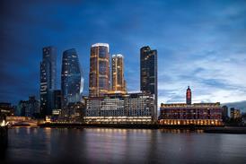
Even the location was provided by CIT: City Hall sits on the flagship plot of its 5.5 ha office-development site on the South Bank, known as More London. Whereas the old County Hall of the former London County Council stood diagonally across the river from the Palace of Westminster, City Hall stands directly opposite the Tower of London, the capital's oldest surviving seat of government and, in Shuttleworth's words, "an 11th-century icon".
Foster has responded to this mould-breaking client, procurement process and site with a mould-breaking architectural design. For starters, there is no trace of that traditional badge of a government assembly chamber – hardwood panelling and fittings. Modern glass, steel, aluminium, and yellow-painted plasterboard are the dominant materials. The overall forms are voluptuously curvilinear – a lopsidedly mutant hemisphere on the outside and the baroque spiral ramp on the inside. Closer in, the elements comprise dizzily slanting window frames, raking columns and suspension rods, and a criss-cross tubular-steel frame that rises up between the ramp and the riverfront curtain wall.
The quasi-spherical GLA building is the first of a new generation of Foster buildings that are entirely rounded or double-curved. Such buildings have been made possible only by the rapidly escalating design and modelling power of computers. In this sense, City Hall is Foster's answer to Frank Gehry's Guggenheim Museum in Bilbao. But whereas Gehry used computer power to fuse architecture and abstract sculpture, Foster has harnessed it in the interests of rational, functional design. The curvilinear forms, which look so freakish to the visitor, turn out, in Shuttleworth's explanation, to have been logically generated by two overriding design principles: the transparency of the democratic process and sustainability of the planet's resources.
In the interests of democratic transparency, the main assembly debating space is not an enclosed chamber but the flat floor of the eight-storey atrium. The building's occupants and the public at large are intended to circulate through the building by means of the spiral ramp, which curls its way directly along and over the debating arena, separated by nothing more substantial than waist-height glass balustrading. The device is a more elaborate and daring sequel to the spiral ramp in the dome Foster created above Germany's Reichstag building in 1999. It is, in Shuttleworth's words, theatre in the round – or to be more precise, eight times in the round. Only one full assembly debate a month will be staged, but the benches are dismountable and the plan is to exploit this arena and its spectacular viewing ramp for variety of public events.
Transparency also comes courtesy of a frameless, clear-glazed window wall that separates the atrium and its spiral ramp and arena from the river. Although the debating arena is located on the first floor and therefore not visible from the riverside walk directly in front, the spectacle of the assembly debate is displayed at a distance to the world at large on the north bank.
Two other grand public arenas are included, one internal and one external. The entire top floor is a great airy civic hall, dubbed "London's Living Room", and graced by mesmerising views of the river, the City and south London. Alongside the building, a sunken oval amphitheatre capable of seating 1000 people has been created out of great rough-hewn slabs of charcoal-grey Irish limestone.
When it comes to sustainability, services engineer Arup reckons the building will run on just one-quarter the prime energy of a conventional air-conditioned office building. A pair of 120 m deep boreholes provide cooling, and triple-glazed windows in the office areas come with a hatch below the sill which occupants can open to supply fresh air and simultaneously shut down the mechanical air-conditioning in that area.
Much more than that, the goal of economising on energy and building materials has directly generated the building's bizarre shape. "The building shape is basically a sphere, which provides the smallest and most economical envelope for a given floor area," explains Shuttleworth. "But we have tilted the sphere towards the sun to provide shading."
All 10 floors of the building are perfect circles in plan, and these diminish in diameter the higher up they are. The clever bit is that each floor is displaced slightly southwards beyond the floor below, providing overhangs that shade the south side and a grand, smoothly curved window wall facing the river.
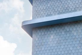
The real design challenge was how to detail the ferociously complex double-curving geometry within the property developer's tight budget of £43m, or £2400/m2. Foster has managed this by resolving the entire quasi-spherical envelope into relatively cheap flat cladding panels and straight frames. The trick here is that all the panels are trapezoids, with sides that vary in angle according to their location on the facade. In total there are 650 different panel sizes, a feat that was only made feasible by feeding Foster's computer-aided design directly into the computer-aided manufacturing process of the cladding supplier, Schmidlin.
The tightness of the budget is evident elsewhere in the building's detailing. The glass balustrading to the ramp, for instance, is clamped into place by white-painted steel plates that vary in width according to spiral's constantly changing radius of curvature and expose their stainless-steel bolt heads, an effect that is basic and matter-of-fact rather than elegant and refined.
Externally, the lopsided form of the building can be appear unnervingly off-balance when viewed from certain angles. Also, the cladding has been specified in a sludge-grey that mirrors the most depressing of overcast London skies – silver would have been better matched the glass and metal vocabulary.
When it comes to how the building will be used by its occupants, other questions arise. Will the public be banned by council jobsworths from using the ramp during events, for fear of causing distractions or dropping things from above? Will the beautiful curvilinear spaces and clear-glazed partitions be allowed to silt up with local authority fittings and notices? And how will the authority bureaucracy expand once it has fully occupied the building?
City Hall has been designed for the symbolism and public spectacle favoured by media-conscious politicians rather than the flexible office space preferred by local authority functionaries. With its iconic lopsided hemispherical form and eight-storey public spiral, the building has to a dazzling degree the attributes for public spectacle that engage the public itself. It is now up to GLA staff to manage the building so as to achieve these aspirations.
Downloads
��ɫ����TV elements
Other, Size 0 kbPlan and section
Other, Size 0 kb
Credits
developer and project manager CIT Group tenant Greater London Authority architect Foster and Partners structural, services, facade and acoustics engineer Arup landscape architect Townshends Landscape Architects quantity surveyor Davis Langdon & Everest construction manager Mace










No comments yet