This year, for the first time, the ║├╔½Ž╚╔·TV Awards included the ║├╔½Ž╚╔·TV Project of the Year, for the best completed scheme. Martin Spring reviews the five runners-up and the winner, ArsenalŌĆÖs Emirates Stadium
For 13 years, the ║├╔½Ž╚╔·TV Awards have celebrated the industryŌĆÖs top architects, contractors, housebuilders, consultants and individuals. This week, a new award was introduced that celebrates the actual products of the industry. It was the ║├╔½Ž╚╔·TV Project of the Year award, sponsored by Sch├╝co.
The ║├╔½Ž╚╔·TV Project of the Year award is much more than an architectural award. Like ║├╔½Ž╚╔·TV magazine itself, it covers the contributions of all sectors of the industry. The winning project had not only to demonstrate an outstanding contribution to the built environment but be an exemplar of good construction practice. In the event, the six shortlisted entries that the judges selected and visited certainly matched these ambitions. As Robin Nicholson, chairman of the judges, says: ŌĆ£We were very impressed with the overall quality and range of entries.ŌĆØ
To judge this award, eight leading figures of all disciplines in the building industry were brought together. As well as Edward Cullinan ArchitectsŌĆÖ Nicholson, on the consultancy side were Rab Bennetts of architect Bennetts Associates, Hanif Kara of structural Adams Kara Taylor and Rob Smith of cost consultant Davis Langdon. On the contractor side, John Spanswick of Bovis, and Geoff Irvine of specialist brickwork contractor Irvine Whitlock did the honours. Nigel Webb of British Land stood up for developers and clients, and Bob White represented the Constructing Excellence forum.
Over the next five pages we review the six shortlisted projects, starting, of course, with the winning entry: the Emirates Stadium.
The winner: Emirates Stadium, north London
Client:Arsenal Football Club
Architect: HOK Sport Architecture
Structural and services engineer: Buro Happold
Quantity surveyor: AYH
Design-and-build contractor: Sir Robert McAlpine
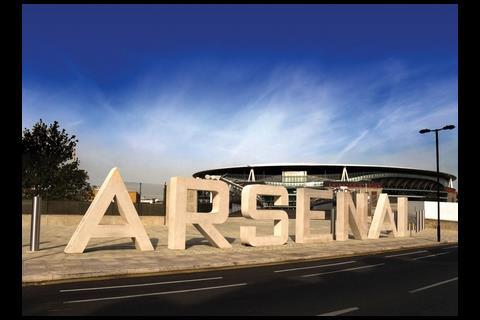
ArsenalŌĆÖs Emirates Stadium in north London swept the board with all eight judges giving it top rating among the shortlisted schemes.
ŌĆ£It was the project that most integrated design and construction,ŌĆØ said chairman of the judges Robin Nicholson. ŌĆ£It came with severe planning constraints, but it was still designed and built with the minimum of fuss. We felt it to be fit for purpose, whereas some other stands appear too grand.ŌĆØ
The judges added: ŌĆ£The whole process was an example of how important teamwork should be to a project, with everyone from the client to the contractor and subcontractors coming together and working successfully to ensure the project was completed on time and under budget. The way that this team tackled design changes should be a lesson to the industry.ŌĆØ
The ┬Ż275m project included not just a 60,000-seat stadium but a new waste-handling station and council depot to replace those formerly occupying the site. Despite its scale and complexity, with up to 1,300 construction workers involved, design-and-build contractor Sir Robert McAlpine completed the building last July, two weeks ahead of programme and below the guaranteed maximum price. The contrast with the troubled execution of Wembley stadium and the future challenge of the Olympic sports facilities were high in the judgesŌĆÖ minds.
Fast-track construction involved demolishing the old waste-handling station while carrying out groundworks for the stadium. Months later, the stadium roof was constructed by prefabricating each of the two 204m long primary steel trusses in two halves. They were then lifted into place by crawler cranes and bolted together at their midpoints.
With its low roof line insisted on by Islington planners, the stadium is tucked away on its site next to the railway lines. It is only when visitors turn the final street corner that they are confronted with a vast gleaming drum beneath a clean-cut disk like a flying saucer.
Inside the stadium, the roof canopies slope down towards the pitch. As well as keeping the roofline low, this gives the huge stadium bowl a remarkable intimacy. This should ensure that the stadium remains a hit with its spectators for decades to come.
The Savill Garden visitor centre, Windsor Park
Client: The Crown Estate
: Ridge
Architect: Glen Howells Architects
Roof structural engineer: Buro Happold
Main contractor: Verry Construction
Carpentry specialist: The Green Oak Company
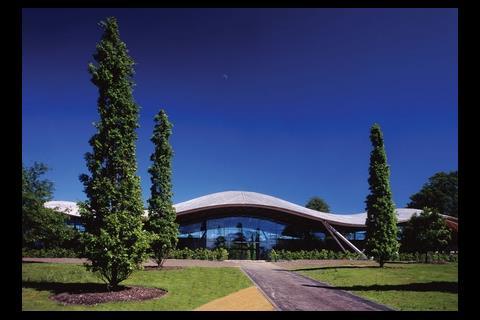
This exquisite visitor centre with its undulating timber gridshell roof was highly commended by the judges. It struck them as a totally logical, elegant and organised solution to the clientŌĆÖs needs, with excellent sustainability credentials.
The 200m2 visitor centre has been distilled by Glen Howells Architects down to little more than an undulating timber roof that hovers above a wrap-around window wall. The clear-glazed wall is in effect a huge shop window, not for the visitor centre itself but for the mature gardens beyond.
The gridshell roof is a much larger reworking of the award-winning gridshell at the Weald & Downland Museum in West Sussex, as both were designed by structural engineer Buro Happold and constructed by Green Oak Carpentry Company. It is basically a grid of cheap, narrow sections of larch, though with some very clever touches to create the elegant curvaceous form with remarkably wide spans.
The sustainability of the roof lies in the larch timber having been locally grown on Windsor Great Park by the client, the Crown Estate. As Glen Howells puts it: ŌĆ£The building was literally grown in the park ... We wanted it to be almost a piece of garden furniture.ŌĆØ
Robin Nicholson, who as director of Edward Cullinan Architects had helped design the Weald & Downland building, felt an avuncular pride about the new visitor centre. ŌĆ£ItŌĆÖs a glorious building,ŌĆØ he says. ŌĆ£It is clever how the kitchens, toilets and storage are tucked out of sight beneath an earth bank.ŌĆØ
Scottish Natural Heritage headquarters, Inverness
Client: Scottish Natural Heritage
Architect: Keppie Design
Project manager: Turner & Townsend
Structural engineer: Waterman Group
Services : DSSR
Sustainability consultants: URS, BRE
Developer & contractor: Robertson Group
In its new headquarters building in Inverness, Scottish Natural Heritage has impressively proved its credentials as the guardian of all things green. The ┬Ż12m building achieved a BREEAM ŌĆ£excellentŌĆØ rating for sustainability with a score of 84% ŌĆō the highest ever recorded for an office building ŌĆō and a carbon rating of just 7.12kg/m2. ItŌĆÖs not surprising that it went away with the Sustainable ║├╔½Ž╚╔·TV of the Year award at ║├╔½Ž╚╔·TVŌĆÖs Sustainability awards in November.
At the same time, the building embraces the Scottish Highlands in which it is set, though without impinging on it. It recycles a brownfield site at the edge of Inverness with the mountains, valley, woods, sea and sky all spread out around it.
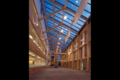
Large windows present the staff with the spectacular views as well as admitting natural light and ventilation. A large, airy atrium comes as a bonus, as it serves variously as reception area, circulation route and exhibition space, while its added height draws ventilation through the building. Exposed concrete floor slabs stabilise internal temperatures without the need for active cooling. Locally grown larch was used for cladding and slate was recycled from the building demolished on the site.
Nicholson may have found the external forms to be ungainly in places, but on the whole the judges were impressed by the sensitive way the building fitted into the landscape, the internal atrium and the attractive working environment.
National Assembly for Wales
Client: National Assembly for Wales
Architect: Richard Rogers Partnership
Structural engineer: Arup
Services engineer: BDSP Partnership
Quantity surveyor: Northcroft
Design-and-build contractor: Taylor Woodrow Construction
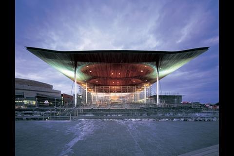
The judges were well aware that the Welsh Assembly project had been very nearly aborted by the sacking of its architect, Richard Rogers Partnership, and its eventual subordination to Taylor Woodrow as a design-and-build contractor on a fixed-price contract. Yet, even though the constrained procurement led to one of the debating chambers being omitted, the judges were impressed with the end product.
Unlike the Stirling prize-winning Scottish Parliament ║├╔½Ž╚╔·TV, the Welsh Assembly is all about transparency. From the outside, all that is visible is a large public concourse surrounded by clear-glazed window walls beneath a wavy timber roof.
The three-storey building is curiously upside-down in its configuration. Whereas the public occupies the concourse on the upper level, the assembly members must busy themselves down on the lowest floor. Their main debating chamber is a compact bottle-shaped space, which is remarkably intimate.
Despite being a grand, showcase building, it attained an excellent BREEAM certification and the highest-ever score achieved in Wales. Natural materials, including timber, slate and stone, were chosen for their durability as well as their architectural effect. A wood-chip boiler is partly fed by 500 tonnes of timber that drift into Cardiff Bay each year.
Nicholson noted that the building had become ŌĆ£extremely popularŌĆØ, and related well to Cardiff Bay, which it faces head on.
Edinburgh City Council headquarters
Client: Edinburgh council
Developer: Morley Fund Management
Architect: ║├╔½Ž╚╔·TV Design Partnership
Structural engineer: Beattie Watkinson
Services engineer: Cundall
Cost consultant: Locus Cost Management
Design-and-build contractor: Miller Construction
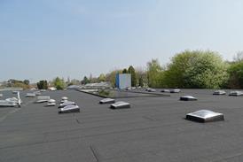
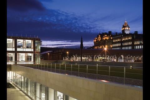
This large office building manages to fit some 1,800 council staff into a World Heritage site in Edinburgh city centre barely a stoneŌĆÖs throw from the council membersŌĆÖ debating chambers on the Royal Mile. By rising no higher than five storeys and stepping down its sloping site, the building does not intrude on key vistas across the valley. Flat roofs also keep the building low, and architect and engineer ║├╔½Ž╚╔·TV Design Partnership turned these to advantage by turfing them over as roof gardens for the occupants.
The building is arranged as an E-shaped plan with two atriums tucked between the three projecting wings. The open-plan office interiors are 14m wide with lashings of daylight and views admitted through floor-to-ceiling glazing. The internal environment is controlled by a combination of displacement ventilation, chilled beams and opening windows.
The building was privately developed, and a design-and-build contract was awarded to Miller Construction, provided it shave ┬Ż10.4m off the ┬Ż55m price. The building attained a ŌĆ£very goodŌĆØ BREEAM rating, and even managed an ŌĆ£excellentŌĆØ rating on the standards of 2002, when it was designed.
In addition, the principles of sustainable construction were reinforced by 74 mandatory key performance indicators built into the contract. The KPIs were set at standards far higher than ║├╔½Ž╚╔·TV Regulations and traditional construction practices.
ŌĆ£I like this building because it copes with a really difficult site and the green roofs are spectacular when you look down on them from Calton Hill,ŌĆØ said Nicholson.
Operations ║├╔½Ž╚╔·TV, Farnborough Airport
Client: TAG Farnborough Airport
Architect: Reid Architecture
Structural & services engineer: Buro Happold
Quantity surveyor: Cyril Sweett
Landscape architect: Lovejoy
: TAG Construction
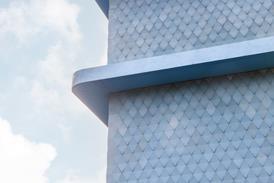
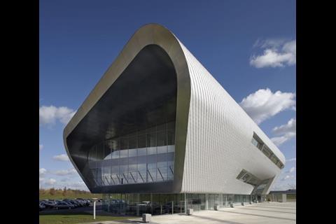
This seductively sleek airport terminal at Farnborough, Hampshire, takes the appropriate shape of a pair of wings hovering close to the runway. The high-tech, aerodynamic effect is enhanced by its cladding in shiny aluminium shingles and by its front and back walls rolling over seamlessly on to the roof. The interlocking system of aluminium shingles was devised to cope with the curvature and to require little maintenance.
Its sumptuous appearance is suited both to its client, TAG, and its business-class passengers. Even so, the 5,000m2 building was constructed for just ┬Ż9.6m, a full ┬Ż2.4m less than the pre-tender estimate. Cost savings through value engineering were attributed to procurement by .
The judges did have some reservations about the configuration of the interior of the terminal, which doubles as a commercial conference centre and the airportŌĆÖs operations centre and gives grandstand views of the air displays. However, itŌĆÖs the curvaceous exterior that sticks in the mind.
Postscript
For more project images, log on to







1 Readers' comment