Murphy has good cause to be enthusiastic. He is working in one of the world's most up-to-date offices, a building designed to accommodate dynamic, interactive working methods with a full supporting cast of information technology equipment. As with other so-called offices of the future, it provides its users with a range of communal and individual work settings. The designer is the world's pre-eminent office architect, DEGW of London.
Where DEGW's building differs from other leading-edge office buildings, such as British Airways' new head office at Heathrow, is that it adopts a deep-plan form to provide a flexible internal layout and a stable, low-energy environment. Four atria, one forming an open spine to the building and the other three at right angles to it, give a novel configuration to the building that has been dubbed "the comb" by DEGW.
The older and now obsolete building has not been abandoned. It is being refurbished in the second phase of the Boots head office project. More than that, it has held extraordinary sway over the entire development. And well it might: completed in 1968, it was – like the new building – designed by the foremost office architect of the day, the American firm Skidmore Owings & Merrill. A seminal building, it introduced open-plan offices to Britain. And, in terms of pure architectural design, the long, low rectangular pavilion of glass and black-painted steel is a brooding modern classic in the Mies van der Rohe, less-is-more mode.
Despite its awesome visual elegance, the SOM building was primitive in terms of the working and environmental conditions it provided. Occupants were isolated in individual carrels bounded by shoulder-high screens, which were soon dubbed "pig-pens". They felt uncomfortable in a stuffy environment that was prone to overheating in sunlight.
In 1993, Boots called in DEGW to refurbish and extend the building. But before plans could be implemented, English Heritage spot-listed it grade II*. Remarkably, instead of killing off the project, listing had the opposite effect. Boots decided to proceed with the refurbishment and to build a large new office building at a discreet distance from the listed one.
Boots group directors also gave the project an ambitious organisational objective that went far beyond providing physical shelter for their staff. With a total budget of £52m, the head office project was intended to act as a catalyst for introducing dynamic, IT-assisted working methods to the company and pay for itself through higher productivity and, in the words of managing director Steve Russell, a "highly efficient and effective, inventive and energetic" service.
Perhaps as a result of its negative experience with the SOM building, Boots was wary of blundering into another office design revolution that might alienate staff all over again. Before the architect was let loose, extensive research and staff consultation were carried out to tailor the new system of working to company and staff needs. Once changes – including a planned reduction of paperwork by 70% – had been agreed, these were introduced gradually before the move took place.
The interior of the completed building offers sweeping vistas through open-plan spaces the size of football pitches and full of people at work. It has the buzz of the Lloyd's of London building, although not the oppressiveness. The four atria introduce a feeling of spaciousness and plenty of daylight, and perimeter windows look out on to the surrounding parkland. No desk is more than 9 m from the perimeter wall or an atrium.
The three floors are divided into 20 self-contained "neighbourhoods", which contain a mix of six types of work layout. These range from traditional fixed desks and small quiet rooms to temporary "touch-down desks" and meeting rooms. At the centre of each neighbourhood is a "hub" – a self-service coffee-bar-cum-office-equipment base – where staff can take breaks and hold impromptu meetings.
A staff café and restaurant occupy the long, off-centre atrium. To integrate the facilities into the workplace, café tables and the hub coffee bars incorporate cable management for plugging in laptops and mobile phones.
"It's like a breath of fresh air," says Steve Murphy. "It's a much brighter, more airy environment with lots of glass, so you don't feel shut off from the outside world. You can see people across desks, and because there's less clutter, it's easier to get round to visit them."
As for the management's stated desire to boost staff productivity, Murphy feels in no way threatened. "It's a convivial environment where you can hold informal meetings easily. This makes you quicker and more productive in your work and helps morale. The new environment also goes with the new electronic equipment, which allows you to access letters, faxes and telephone directories on your own terminal. What's really pleasing is the way people have accepted the new ways of working. I haven't yet heard one negative comment."
Malcolm Shooter of the information systems department also finds the building more relaxed and appreciates that "senior management are now one of us", thanks to the lack of cellular offices. But he adds: "When we need to concentrate hard, we should be able to take a portable computer into a small, private, quiet room. We haven't been issued with these yet."
However, as well as facilitating Boots' new procedures, DEGW's design for the new office and the refurbishment had to harmonise with the listed SOM building. Stephen Greenberg, DEGW's architectural director says: "It isn't possible to design a new building next to the SOM building without being influenced by its compelling logic."
This borrowed logic underpins both the interior and exterior design of the new building. Internally, walls, partitions, doors and ceilings are flush with minimal detailing, and brown, oak-veneered panels matching those in the old building are used as balustrading, although perforations and acoustic cores were added to deaden sound. Common features such as these meet the client's requirement that both buildings should be near-identical working environments, as well as saving money through bulk-buying of components.
The main aesthetic change is the colour. Whereas the decor of the SOM building was a restrained blend of buff and brown, DEGW's building introduces bright splashes of yellow, blue, turquoise and rusty red that add to the vibrancy of the huge floor plates but verge in places on the chaotic. The ubiquitous pale-blue metal desks contribute an incongruously Arctic feel.
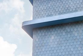
The building exterior is likewise influenced by its neighbour. It adopts a similar, long, low rectilinear form, modernist aesthetic and black colouring, but materials and facade modelling are quite different. Cladding is in charcoal-grey-stained terracotta tiles, while the two long facades are protected by outer layers of sun-screens – horizontal louvres facing south and vertical fins facing north. Like its neighbour, the DEGW office is a cold, sombre, even sinister building, although without SOM's masterly sense of proportion. Instead of being capped with a deep, black cornice of castellated steel, like the original, the new building culminates in what looks like a puny, silver-painted curtain rail.
The new Boots head office had the unique distinction of being officially listed on the day of completion, thanks to its illustrious neighbour. It may not be an aesthetic masterpiece to match the SOM building but it is a seminal work in a different sense. It has been painstakingly designed around its users, their working methods and their comfort requirements. As architecture is primarily a social art, this is a more important achievement that pure aesthetic virtuosity.
Cost commentary
Credits
Client Boots The Chemists Architect DEGW Structural Engineer Mott MacDonald Services Engineer Roger Preston & Partners Planning Supervisor Gleeds Construction Manager Mace Cost Manager Mace


