Feilden Clegg BradleyÔÇÖs Hive library in Worcester is a bold reinterpretation of the areaÔÇÖs pottery heritage while leaving no one in any doubt that itÔÇÖs ready for the age of the Kindle
Reports of the death of the library have been greatly exaggerated, it would appear. Amid grim foreboding about the imminent demise of this supposedly vulnerable and archaic institution in an era of funding cuts and digital media, libraries seem to be making something of an unexpected comeback.
Shepheard Epstein HunterÔÇÖs award-winning reworking of Enfield Town Library has delivered increased visitor numbers, particularly among the young; Haworth TompkinsÔÇÖ rejuvenation of the London Library on St JamesÔÇÖs Square has breathed new life and legibility into a revered, but previously disjointed, edifice; and CZWGÔÇÖs Canada Water ÔÇťsuper-libraryÔÇŁ opened late last year, complete with 40,000 new books and a theatre. New or refurbished libraries in Dalston, Deptford, Birmingham, Liverpool and Manchester are also restoring the libraryÔÇÖs 19th-century role as a stalwart beacon of municipal pride.
The latest addition to this illustrious roll call is nestled at the foot of the Malvern Hills in Worcester. Designed by Feilden Clegg Bradley Studios, the ┬ú38m Hive has been jointly developed by cityÔÇÖs council and the University of Worcester, making it the UKÔÇÖs first combined public and university library.
Like an increasing number of library projects, including Liverpool Central, Newcastle City and Oldham Libraries, the Hive is a PFI scheme. But its unique dual-ownership structure is an example of the kind of innovation that will be required to secure the 21st-century libraryÔÇÖs future.
Accordingly, the facility contains a ground-breaking, fully integrated set of joint services that is fully accessible to the public and students every day, for 90 hours a week. As well as the public lending library, the facility includes student reading rooms, a council services one-stop shop, a research centre, exhibition space, a cafe and a history centre that houses 26,000 records, including ShakespeareÔÇÖs marriage bonds. This precious lower-floor cargo is protected from the flood plain on which it lies by a ring of waterproof concrete.
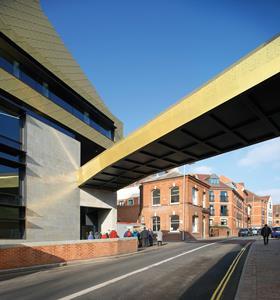
The HiveÔÇÖs pioneering ambitions do not stop at its facilities. Outside, a timeline is embedded into the paving in recognition of the history centre within, and a sophisticated public realm strategy, which includes a new bridge into the town centre, integrates the development into surrounding pedestrian routes.
The roof and cones are a reinterpretation of the pottery kilns that are a strong part of the local heritage
Andy Couling, Feilden Clegg Bradley
On the side overlooking the River Severn, the development is swathed by a luxuriantly landscaped plateau crammed with local flora such as willows, alder and black poplar. This flood plain garden acts as an ingenious green buffer to the periodically swelling body of water just yards away and the solemn profile of the majestic Malvern Hills beyond.
Defying convention
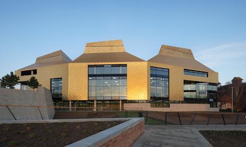
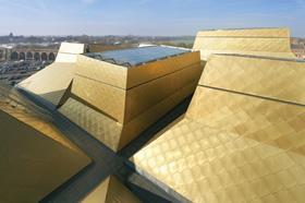
But it is not landscaping, procurement or even dual ownership that best symbolises the HiveÔÇÖs lust for library reinvention - it is its design. The building is conceived as a four-storey box surmounted by seven rectilinear cones. Although each cone springs from the same point at the base of the roof, each is a different height and breadth, with a pitched spout chamfered at varying angles.
If this were not enough to announce that this is a building determined to defy conventional library typology, its cladding provides the rousing encore. Above a ground-floor stone plinth anchored into the landscape, the entire block is audaciously sheathed in TECU gold-coloured copper-aluminium alloy. The panels are laid in a herringbone diagrid pattern that provides a scaly, reptilian skin.
ÔÇťWe wanted a 21st-century building with a bold architectural style that improved the local skyline,ÔÇŁ says Iain Paul, strategic design manager at Worcester council.
ÔÇťWorcesterÔÇÖs skyline is primarily medieval, Georgian or Victorian and, with the exception of the cathedral, and one or two other notable features, it has few distinctive landmarks. We wanted to give it a strong, modern beacon.ÔÇŁ
Andy Couling, partner at Feilden Clegg Bradley, goes on to explain the concept behind the cones and the distinctive roof. ÔÇťIt was about finding a physical expression that felt like it fitted in Worcester. The roof and cones are a reinterpretation of the pottery kilns that are a strong part of the local heritage. They also evoke the undulating ridgeline of the Malvern Hills.
ÔÇťThe individual cones break up the scale of the roof and extend the local urban grain by expanding and contracting like the surrounding roofscape. They also fill a gap and restore a firm edge to the city.ÔÇŁ
The coy insolence of the HiveÔÇÖs shimmering; jagged profile poking defiantly over the quaint, historic Worcester skyline, certainly makes for a provocative urban tableau and the buildingÔÇÖs sunlit glow is an unmistakable addition to the local townscape.
And while the allusion to the Malvern Hills may not be instantly apparent, the kilns from which the roof is inspired are more evident in the intricately cut and crafted cones.
Chimneys they may be, but within these portly, cupped lanterns beats the captivating, enigmatic soul of the building
The buildingÔÇÖs overall exterior is less convincing. While the surging cones exude a restless dynamism, the external walls below form a much simpler, less eventful palette of flat planes tightly wrapped around the building frame like an inflexible aluminium suit of armour. Only one elevation is angled to express the individual spread and profile of each cone above. By shrouding the remaining facades behind an impervious flat plane, the opportunity for tension and drama presented at the joint between each cone above is actively suppressed below.
The unsatisfactory result is that, externally, the Hive appears to be two buildings - cones and walls. The continuous level of eaves that runs between the two merely exacerbates this sense of geometric separation and slyly suggests that the cones could just as easily be sliced off and replaced by an unassuming flat roof. Of course, the uniform TECU cladding is intended to act as a unifying force. But in the absence of more convincing massing gestures it appears cosmetic and contrived, like a sequinned blanket flung over a car. Considered alone, therefore, the cones exhibit an esoteric, vernacular charm. But encumbered by the unresponsive slab beneath them, they and the building as a whole, appear clumsy and misshapen.
The one area where the solidity of the envelope is breached to replicate the voided animation of the roof performs little better. At one corner the building is cut away to leave a gaping feature entrance. While this is a positive urban response to the new entrance forecourt here, the act is wilfully undermined by the awkward proportions of the solitary storey that cantilevers over the recessed corner and the unperturbed march of the cones above it. The effect is both top-heavy and lop-sided and is uncomfortably reminiscent of a three-legged chair.
Soft boundaries
The inside tells a completely different story. Both Couling and Paul say that a core aim was to create a softer, inviting and more humane feel that was based on intimate spaces and simple orientation. This simple aim has been realised with enormous sensitivity and skill.
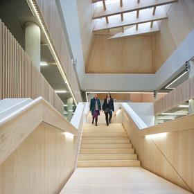
Upon entrance, the hard, defensive character of the exterior is stripped away and replaced by a warm palette of white or soft colours complemented by natural materials and bathed in daylight. The eye is instinctively drawn to the full-height atrium at the centre of the building, a soaring, spacious cavern framed by aswooping timber single-flight staircase to one side and overlooked by a staggered flank of ash-slatted balconies to the other.
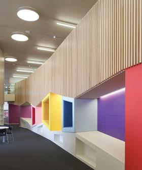
ÔÇťSoft boundariesÔÇŁ around the atrium and beyond enable spaces to flow into one another, with the community services zone crucially placed within easy visual distance of reading areas. Paul speaks of the ÔÇťaccidental encountersÔÇŁ that such a porous layout may encourage, key to building the functional adaptability, spatial intimacy and social integration this new model of library so desperately seeks. This sense of intimacy is further emphasised by the rich array of individual spaces carved into the largely open-plan floor space, ÔÇťrooms within roomsÔÇŁ as Paul describes them.
One of the most memorable of these is an office area in the council services one-stop shop. A void is cut into the ceiling, allowing views up through the building, and framed by intricately routed and lacquered MDF balconies designed to resemble the pottery that inspired the cones.
And it is these cones that once again become the crowning glory inside in the same way as they dominate the exterior. The underside of each cone is exposed to form a soaring, tapering, timber shaft that is crowned by cross-laminated timber lattice set beneath a glazed opening. Environmentally, the cones provide daylight, natural ventilation and shade and, along with the HiveÔÇÖs cooled slabs and treated rainwater, help the building achieve an impressive 50% improvement on Part L and an annual carbon footprint of only 12.2kg CO2/m2.
But, spatially, these giant funnels play an even more important role. With cool daylight flooding across their smooth, natural surfaces and washing the spaces below in an even, diffuse light, they enrich the library with an ethereal, almost spiritual sense of tranquillity and repose. Their scale and construction also provides a heavy, topographical texture to the interiors, as if affording a precious inverted glimpse into the engorged belly of the hills outside.
Glimpsed obliquely from virtually every corner of the building, but particularly prevalent on the top floor where their scale and proximity provide a thrilling sense of rebellious escape from the regimented stacks of bookshelves, they weave a distinct set of personalities and tone into different areas of the overall space. And yet the reassuring sense of enclosure they provide throughout is a far more subtle and effective unifying gesture internally than the uniform application of ostentatious cladding is externally.
Chimneys they may be, but within these portly, cupped lanterns beats the captivating, enigmatic soul of the building. Here, too, lies the opportunity - so poetically crystallised in glass and wood - to capture the sense of wonder, exploration and possibility that, even in an age of wi-fi and Kindles, remains the libraryÔÇÖs secret shield against the ruthless glare of the modern age.
PROJECT TEAM
Client: Worcester council / University of Worcester
Architect: Feilden Clegg Bradley Studios
Main contractor: Galliford Try
Environmental consultant: Max Fordham
Structural & civil engineer: Hyder Consulting
Landscape architect: Grant Associates
QS: Davis Langdon






No comments yet