When QS Jimmi Bradbury asked school pal and architect Niall McLaughlin to design him a home, the brief was pretty loose. What he came up with was this serene set of glass and wooden boxes ŌĆō but how tranquil would the relationship be once work began? Thomas Lane took a trip to Hertfordshire to find out.
What would a cost consultantŌĆÖs dream home look like? A neat brick house with double garage, driveway, pitched roof, Georgian style windows and a neo-classical portico? Okay, that was a cheap jibe at the expense of one of the industryŌĆÖs more straitlaced professions, but itŌĆÖs fair to say not many QSs would choose to live in an uncompromising, ultramodern set of glass and wooden boxes ŌĆō even one thatŌĆÖs bagged an RIBA award.
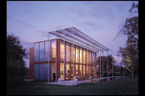
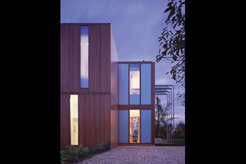
Yet this is exactly what QS Jimmi Bradbury, Cyril SweettŌĆÖs international development director, and his wife Liz have built in the Hertfordshire green belt. As I struggle to get out of BradburyŌĆÖs low slung coup├®, my first view is of an oversized, neatly panelled wooden cupboard complete with projecting hinges for the doors. Architect Niall McLaughlin later explains that the illusion is entirely deliberate. The house was conceived as a series of discrete, box-like elements, including a larger glass box. ŌĆ£We wanted the first box to be a piece of cabinetry, like a piece of old-fashioned panelling ŌĆō something that feels like itŌĆÖs been made by a joiner,ŌĆØ he says.
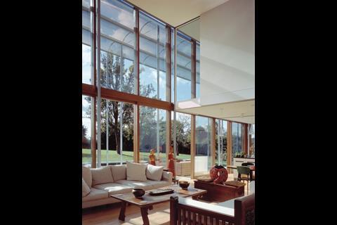
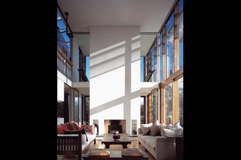
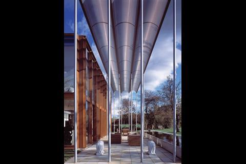
McLaughlin describes the cabinet as ŌĆ£the servant to the glass boxŌĆØ as it contains utilitarian spaces such as bathrooms and dressing rooms. The glass box itself, which is also divided into panels, contains the kitchen, bedrooms and a double-height living room that opens onto a paddock. A huge freestanding solar shade forms another element and next to this is a rectangular pond that separates the paddock from the patio and also reads as a separate entity.
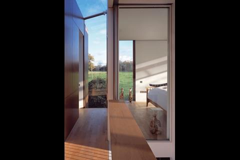
McLaughlin says he went to great lengths to make each element look independent of its neighbour. For example, there is a glass-framed gap between the timber and glass boxes, and the external timber cladding continues inside to emphasise the separation between the two. Sitting in the living room with the doors to the paddock open, the whole effect is beautiful, contemplative and peaceful, with ripples from the pond reflecting onto the walls.
What made Bradbury go for such a maverick, one-off building? ŌĆ£IŌĆÖve always had a passion for good architecture and I always said if I had an opportunity to realise this, I would,ŌĆØ he says. ŌĆ£We wanted to create something different and unique that would give us a sense of joy to live in.ŌĆØ
Bradbury worked for Cyril Sweett for 10 years before taking off to live in the Philippines and New York. When he came back to the UK and rejoined his old employer, he bought a 200-year-old house near Hatfield. ŌĆ£We looked at extending and refurbishing the house,ŌĆØ he says. ŌĆ£But itŌĆÖs never quite your own, itŌĆÖs always going to be someone elseŌĆÖs.ŌĆØ
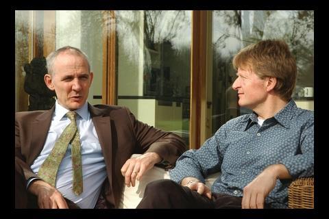
Despite the restrictions of the green belt location, Bradbury wanted to see if he could take down the existing property and fulfil his dream of building an ultramodern new home. At least the choice of designer was straightforward. McLaughlin is a well-known modern architect who has won numerous awards for his work, and happened to go to primary school with Bradbury in Dublin. When they both moved to London, McLaughlin used BradburyŌĆÖs QS skills and Bradbury got McLaughlin to overhaul his first flat. ŌĆ£I remember your business card was handwritten,ŌĆØ laughs Bradbury.
Bradbury says it was a ŌĆ£no-brainerŌĆØ commissioning McLaughlin to design the house. ŌĆ£When I decided to build my own house I wanted a signature architect, partly because I had worked with them, but also because I wanted someone who would do something different, so it had to be Niall,ŌĆØ he says. ŌĆ£I knew there would be a lot of challenges because signature architects are passionate about their work. Perhaps it isnŌĆÖt a good idea to use a friend but the tension did create a positive energy.ŌĆØ
BradburyŌĆÖs initial brief was reasonably loose, he explains. ŌĆ£We wanted it to work as a family home and represent our life overseas. We wanted it to be open and free flowing and include elements that pop up at you, such as the landscape. We wanted lots of light and glass and the building needed to relate to the site around it.ŌĆØ
The brief may have been loose, but McLaughlin clearly excels at turning vague aspirations into concrete form. ŌĆ£At the beginning you wanted options,ŌĆØ he smiles to Bradbury, ŌĆ£but I donŌĆÖt normally do options.ŌĆØ
He says the idea of the series of boxes came from local market gardens with their artlessly arranged, loose groupings of disparate buildings. McLaughlin says early versions of this idea had more ŌĆ£va va voomŌĆØ but became simpler as client and architect worked up the design. ŌĆ£It took a while to work out how simple the house could be,ŌĆØ says McLaughlin. ŌĆ£I would call it laconic simplicity, driven by Liz and JimŌĆÖs nature and personality.ŌĆØ He adds that the schemeŌĆÖs complexity came from getting these simple elements to work together.
Bradbury was advised that his chances of getting planning permission were slim because of the location. Some local people objected to the old house being knocked down but McLaughlin insists it had no particular architectural merit. One objector cited worries about the roads in the village being clogged up by architectural junkies coming from London to gawp at the place. Of course, that still might happen ŌĆō and probably should.
By a stroke of luck, a sympathetic planning officer was assigned to the case. McLaughlin argued that the building would not only be special but a local exemplar for low energy use, which clinched the deal. ŌĆ£Once they decided to go with it, they were very supportive; they werenŌĆÖt picking away at the edges,ŌĆØ he says.
This was just as well, because McLaughlin is uncompromising when it comes to detailing ). Unfortunately this had a tendency to ramp up the costs, particularly that panelled, timber box. ŌĆ£I did challenge the panels on the outside and suggest tongue-and-groove, which would have been cheaper,ŌĆØ says Bradbury.
Although McLaughlin persuaded Bradbury to go for the panelling, the architect recognises this was a leap of faith. ŌĆ£ItŌĆÖs very easy to talk about the panelling now but it was quite an investment of trust on their part,ŌĆØ says McLaughlin. ŌĆ£I couldnŌĆÖt say anything other than ŌĆśtrust meŌĆÖ when I said it would give the building a finer quality. It would have been so much cheaper to have simpler or no panelling, but you guys really stuck with that.ŌĆØ
McLaughlin was also insistent that the internal wall separating the wooden from the glass box had to have the same panelled treatment as the exterior. ŌĆ£I had to work hard to persuade Jimmi to use the timber on the inside so it reads as two boxes,ŌĆØ he says. ŌĆ£Jimmi said, ŌĆśWeŌĆÖll hold onto that for a while and letŌĆÖs see how we doŌĆÖ. It was a bit of a carrot to keep costs in check.ŌĆØ
In the end, Bradbury sanctioned the additional cost of panelling the internal wall. ŌĆ£There is one side of the equation, which is cost, and the other is value,ŌĆØ says Bradbury. ŌĆ£When I got my head around the value it would add to the building, this far exceeded the cost of it.ŌĆØ
Selecting the right contractor was essential if the original design intent was going to shine through. Bradbury used his professional experience and insisted on fully detailed drawings before going out to tender. ŌĆ£If you go out and design it as you go along, itŌĆÖs a recipe for disaster,ŌĆØ he says. ŌĆ£ItŌĆÖs not fair on the contractor ŌĆō we spend too little time on the design stage and hand it over to the contractor to sort out the problems.ŌĆØ
A Surrey-based contractor called Claremont impressed Bradbury and McLaughlin with its professional approach. The site agent was a carpenter by trade, which was just as well given the amount of joinery involved. ŌĆ£He would be on the phone five times a day saying, ŌĆśDo you want this screw to have five or seven turns?ŌĆÖŌĆØ says McLaughlin.
Now the house is finished, does Bradbury have any regrets? He says it was challenging being both client and QS. ŌĆ£On one side you are trying to create something unique and on the other you are managing costs and asking yourself, should we be spending this money?ŌĆØ ThatŌĆÖs a fair enough question given that the build came in at ┬Ż550,000. ŌĆ£There have been tensions and it has consumed huge chunks of our life making decisions, plus it becomes emotional as itŌĆÖs your own place. But I would encourage people to do it; I would certainly do it again.ŌĆØ
ItŌĆÖs the little things that count ŌĆ”
The basics of this home are straightforward: it has a steel frame, blockwork walls and concrete floor to boost thermal mass. The canopy at the front shades the south-facing glazed facade and the house has automatically controlled rooflights to help with cross ventilation in the summer.
But what makes this project is the exquisite detailing. For example, the panelling on the wooden box is beautifully proportioned and the wood has been protected so it keeps its polished furniture patina. Getting the panelling to work was difficult because McLaughlin wanted a slender frame around each panel, but they also had to take the weight of opening lights. These were part of the internal structure of the building but the panelling functioned as an external rainscreen, which meant a complex waterproofing detail was needed at the interface. In the end, McLaughlin brought in timber research organisation TRADA to review and refine the design.
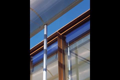
The glazed facade at the front of the building is timber framed with deep mullions that taper from the glass to a point, rather like the glazing bars on Georgian sash windows. ŌĆ£When I was young I spent a lot of time studying Georgian timber glazing,ŌĆØ says McLaughlin, adding that a lot of the detailing on the house was designed to pull the eye upwards, as in Georgian architecture.
This strongly vertical quality is apparent elsewhere ŌĆō for example, the solar shade is very tall with slender support columns. ŌĆ£We put a lot of work into this as we wanted it to feel as if it was on tippy-toes,ŌĆØ he says.
The attention to detail continues inside. McLaughlin is very proud of the slender stainless steel rods used for the balustrade on the stairs. The rods are located in the timber stairs with in-holes that had to be carefully measured and drilled to precision.
The upper balcony circulation space overlooking the double-height living room also had a balustrade with slender steel sections; this features a gap to allow space for a support column. The simple solution would have been to fix the balustrade to the column but McLaughlin wanted a distinct gap between the two elements.
This required invisible structural gymnastics so the balustrade would still be strong enough to support the weight of someone leaning against it.
Elsewhere, the house has neat details that make it more practical to live in. It has two bedrooms at either end separated by the double-height living space. Each bedroom has glass panels so people can look from one end of the house to the other. ŌĆ£I am always very keen on the long view so the house is open all the way along its length,ŌĆØ says McLaughlin.
Timber screens have been carefully hidden in the solid part of the bedroom wall and can be pulled across to provide privacy. Surprisingly, McLaughlin has no idea how he managed to get this to work. ŌĆ£When you detail a building itŌĆÖs hugely complicated and takes four to five months,ŌĆØ he says. ŌĆ£When you come back later and have a look, youŌĆÖve forgotten how you did it.ŌĆØ
Downloads
Ground floor plan
Image, Size 0 kb
Postscript
For the latest QS jobs visit .





2 Readers' comments