In June 1993, the Tate Gallery opened a ┬Ż3.5m purpose-built gallery in St Ives, Cornwall, dedicated to the modern artistic movement that has formed there. The 1730 m2 building is squeezed along a steep narrow slope site overlooking the resortŌĆÖs largest beach, with the main galleries placed two floors above the entrance.
Designed by Evans and Shalev Architects, the building was developed for the Tate Gallery by Cornwall County Council. Jenkins and Potter was structural engineer, Max Fordham & Partners was services engineer, Monk Dunstone Associates was quantity surveyor and Dudley Coles (now part of Kier Group) was main contractor.
Fitness for purpose
CornwallŌĆÖs prime tourist attraction
Right from its opening six years ago, the Tate Gallery St Ives proved itself a blazing success. Last year, it attracted some 200 000 visitors, nearly three times the number estimated in the development brief. The gallery is now CornwallŌĆÖs most popular admission-charging tourist attraction, with at least half of the visitors coming from overseas, according to gallery staff.
The building copes adequately with three times more visitors than it was designed for, says gallery co-ordinator Dick Perkins. This is partly thanks to a network of CCTV cameras that help protect the exhibits.
ŌĆØWe are busiest on wet days in August when we get 2000 visitors in,ŌĆØ says Perkins. ŌĆ£The main pinch-point is at the main entrance, where people queue in the wet and get demoralised.ŌĆØ To ease congestion, the original ticket desk in the entrance lobby has been replaced by a ticket booth placed behind a glazed screen in the adjoining room.
Appropriate display of artworks
The gallery was designed by Evans and Shalev ŌĆ£to show works of art in the surroundings in which they were createdŌĆØ. It has achieved this by introducing into the galleries the clear daylight of St Ives that inspired the artists, by placing windows at key locations to provide glimpses of the surroundings, and by laying out the galleries in an unpredictable sequence that echoes the higgledy-piggledy townscape. The galleries vary in size, shape and lighting effects to provide a range of settings for exhibiting paintings, ceramics and sculptures of different sizes.
The building also serves as a backdrop and inspiration for the creation of new works of art commissioned from contemporary artists, the greatest being Patrick HeronŌĆÖs vivid stained glass window that makes up an entire wall of the first gallery.
Circulation problems
The downside of the unpredictable sequence of galleries is that it confuses visitors. The confusion starts well before they reach the gallery. Car parking and signage in the town are inadequate. Next, passers-by find little to entice them inside the building, as neither the main entrance nor the galleryŌĆÖs contents are visible. Once inside, visitors must climb two flights of stairs before reaching the information desk and main galleries. Finally, a rooftop exit has been closed off to improve security, forcing them to retrace their steps back down through three floors to the front entrance.
ŌĆ£One-third of visitors ask where the toilet is, another third ask where the shop is and the last third ask the way out,ŌĆØ says Perkins, only half-joking.
Cramped back-of-house
The galleryŌĆÖs success as a visitor attraction has been achieved at the expense of the back-of-house facilities. Goods arrivals, goods lift, storage, workshops, kitchen, offices and staff amenities are all severely cramped, and the narrow site provides no obvious space for expansion. In particular, the tiny goods lift limits the galleryŌĆÖs ability to exhibit large artworks.
Future improvements planned
After six years of operation, the Tate Gallery and building owner Cornwall County Council are embarking on a feasibility study for improvements that would help the gallery cope with its visitor numbers.
A few original features have still to be installed, such as retractable blinds in the large rotunda gallery, which would prevent daylight from discolouring paintings outside visiting hours. Practical improvements under review include automatic doors that would make circulation easier for disabled people. Other council properties in the area are being considered for off-site storage and offices.
The most dramatic improvement under consideration is a glass roof that could be slung over the sunken courtyard and possibly the adjacent roof terrace, transforming them into an all-weather sculpture court. Another sculpture court is mooted for the open-air rotunda at the front of the building, where it would advertise the gallery to passers-by.
Delight Glorious site, glorious architecture
Publicity officer Ina Cole claims, not surprisingly, that ŌĆ£most people adore the buildingŌĆØ. This adoration is reflected in numerous architectural awards and citations, including being nominated first of ŌĆ£the 50 best buildings of the 1990sŌĆØ by the Independent last October.
What particularly impresses visitors is the way the building exploits the views afforded by its glorious site and synchronises them with the paintings that they inspired. What appears to be a contorted and confusing layout of galleries on three floors has, in fact, been carefully contrived by Evans and Shalev to reveal key views with maximum drama.
After climbing through two floors of internal galleries and staircases, visitors reach the information desk behind which is a single square window. No larger than a Ben Nicholson painting, the window frames a view of the sea, with the horizon running along the centreline and exhibiting the same blend of nature and abstraction as in local artist NicholsonŌĆÖs work. ŌĆ£This square view gets commented on on an hourly basis,ŌĆØ says Cole.
An even more delicious surprise is revealed two rooms further on. After passing through a rectangular gallery dimly lit by small, high-level windows, visitors burst into the grand circular gallery in the rotunda and are confronted by the huge, frameless concave window wall that gives a wide unimpeded vista of the beach, the sea and the granite rocks beyond.
The top floor also offers superb views of the townŌĆÖs rooftops, as seen from the restaurant, and of the entire beach and sea, as viewed from the adjoining terrace. Unfortunately, the view of the town from the rooftop restaurant is partly obscured by a heavy wooden window transom located at eye-level of people seated at the tables. The restaurant is the room where visitors tend to congregate and linger, and what may seem like a minor irritant has elicited more visitor complaints than any other aspect of the building. As gallery co-ordinator Perkins says: ŌĆ£Not everyone might like the art, but they all like the view.ŌĆØ
║├╔½Ž╚╔·TV blends with townscape
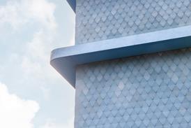
The building exterior blends with the traditional, fine-grained townscape of St Ives, yet retains its own identity, with no hint of pastiche. The bold architectural statement ŌĆō befitting the townŌĆÖs main visitor attraction and employer ŌĆō is provided by the rotunda over the main entrance, which echoes the old gas holder replaced by the gallery, but is otherwise an alien form in St Ives. The blending has been achieved by breaking up the large building mass into relatively small forms whose windows echo those of the surrounding buildings. Cladding is an off-white marble spatter-dash similar to the whitewashed roughcast of traditional walls.
Comfort Suitable environment for people and exhibits
As a condition of the government indemnity its artworks, the galleryŌĆÖs interiors must be kept at a constant temperature of 21┬║C and a humidity level of 55%. The gallery spaces benefit from air-conditioning that combines heating, cooling, humidification and dehumidification. Gallery co-ordinator Perkins has no serious complaints about the air-conditioning, either concerning exhibits or visitors.
Staff are not so lucky: their cramped offices and kitchen are overcrowded and get unbearably stuffy on hot summer days. For visitors to the restaurant on the rooftop terrace, there is no overhead protection from rain or strong sunlight, even though it is protected from winds by a glazed screen.
The building introduces ample daylighting and external views into the galleries while suppressing daylight intensity to just one-thousandth that of a bright sky. Daylight is screened by blinds and laminated ultraviolet filters integrated into the glazing. The large rotunda gallery glories in a wide expanse of frameless window wall, but daylight here is suppressed by the roof projecting over the rotunda.
Maintainability
Robust materials for durability
Robust, carefully detailed external finishes are standing up well, with little maintenance, to storms sweeping straight off the Atlantic. The cladding of marble spatter-dash on concrete blockwork glistens as if it had been newly painted. Paving on the steps and ramps is made of chunky reconstituted stone slabs manufactured by Blanc de Bierge, with skirtings in the same material to prevent scuffing on the white walls. External metalwork has been kept to a minimum and, where unavoidable, specified as top-quality stainless steel to resist the corrosive saline atmosphere. Copings with deep overhangs have helped prevent unsightly weathering streaks.
Grass was originally used in the sunken courtyard on the second floor, but was churned up by visitors and received too little daylight. It has been replaced by gravel.
New finishes improve maintenance
Since completion, various extra finishes have been imperceptibly added to external components to reduce maintenance. A smooth, white, rubberised paint has been applied to the coping stones to resist algae and seagull droppings. A liquid silicone coating has been applied to the reconstituted stone pavings to prevent chewing-gum sticking. And a liquid Teflon coating has been applied to the external face of the high frameless glazing to the rotunda. The glass can now be effectively cleaned using nothing more sophisticated than a squeegee sponge attached to the end of a very long pole, as the water washes clean off the non-stick finish. Previously, either expensive access equipment was needed or unsightly streaks were left on the glass.
Hard-wearing internal materials
Internal finishes are standing up to intensive wear and tear from triple the number of visitors envisaged in the brief.
The floors are finished in natural slate tiles and a rubber sheeting that was manufactured by Freudenberg of Germany and is thicker, softer and quieter than linoleum. Both materials are easy to clean and resistant to constant sand abrasion, claims gallery co-ordinator Perkins. But because of the unpredicted intensity of usage, the rubber flooring on the staircases had to be replaced five years early, at a cost of ┬Ż2500.
The one internal component that has totally succumbed to wear and tear was the limed and varnished oak handrail to the stairs. Once the original varnish wore through, it was difficult to match the tone of the liming, so the entire handrail was eventually replaced by plastic-coated steel.


