Chosen as a ļ√…ęŌ»…ķTV ‚Äėblunder‚Äô more times than any other building, Sea Containers House has undergone an extensive salvage operation by TP Bennett. So, how successful is it?
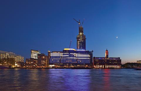
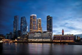
Few modern office blocks in London have quite as chequered a history as Sea Containers House on the South Bank. Originally designed to be a luxury hotel, the economic woes of the mid to late seventies meant that by the time it opened in 1978 its function had already switched to more commercially viable offices.
Named after the global shipping conglomerate that was its chief tenant for several decades, its design incorporated heavy nautical references inspired by both its occupier and location. Warren Platner, designer of the famous Windows on the World restaurant that once stood at the top of New York’s World Trade Centre, was the original architect and his work at Sea Containers displayed many of the kitsch maritime flourishes present at his iconic Manhattan restaurant.
These included porthole windows; prow entrances; figurehead-like signage; and, most peculiarly, a surreal series of ribbed, golden spheres perched precariously on the roof. None of these obscured the fact that with its 14 storeys of angular bulk and overbearing scale, Sea Containers was and still is more cargo ship than ocean liner.
While some of Platner’s more garish excesses might have enjoyed enhanced design credibility on a luxury hotel, they always seemed strangely incongruous on an office block. Which is why the latest chapter in Sea Containers’ chequered evolution offers a final ironic twist.
After a period of several years where the building stood unoccupied, it has now been extensively refurbished by architects TP Bennett and part of it has been converted back into a hotel. The 359-bed Mondrian Hotel is part of the exclusive Morgans Hotel Group which also owns the Sanderson and St Martins Lane hotels in central London as well as some equally fashionable resorts in the United States and Turkey. The hotel occupies the lower three storeys of the building.
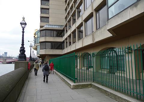
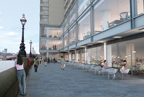
While TP Bennett completed the shell and core, celebrated designer Tom Dixon designed the interiors. These include an entrance lobby, basement spa, roof-top bar as well as extensive ground floor bars and restaurants, many of which, crucially, animate the formerly blank river frontage.
The remaining bulk of Sea Containers House comprises 350,000ft² of refurbished offices with TP Bennett responsible for internal fit-out as well as shell and core. Some 226,000ft² of these new offices have been leased to US advertising giant Ogilvy & Mather and includes a reconfigured top two storeys complete with roof terraces.
As well as the refurbished offices, an 80,000ft² nine-storey annexe office block has also been built to the rear of the existing block, linked to the latter by a full height bridge enclosure. This is now occupied by sports brand Puma and shared workspace hub WeWork.
By its nature, refurbishment always deals with unknown quantities. But the convoluted nature of Sea Containers House’s disjointed mix and evolution presented a series of particularly acute design challenges before its radical refurbishment could take place.
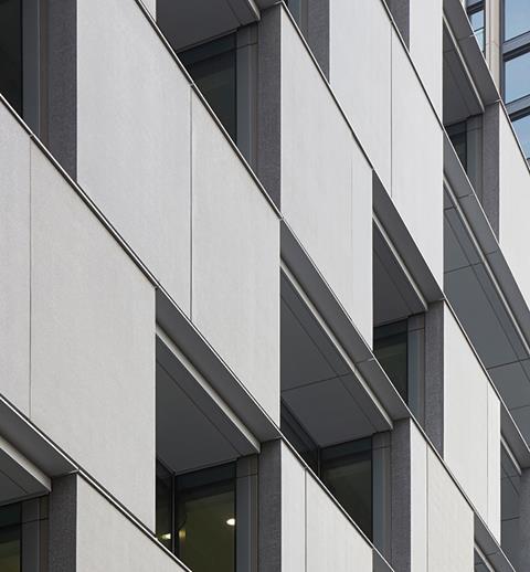
Perhaps chief among these was structure. Sea Containers House was built as a concrete frame structure but one whose unprepossessing grid-like elevations concealed extraordinary structural complexity. The elevations are subdivided into a series of bays separated by masonry mullions of polished reconstituted stone. Behind each mullion full-height concrete walls extended 2m into the space beyond to stabilise the structure. On the lower three storeys, the fins increase significantly in length up to 7m to help transfer loads to the ground and form a structural base for the building.
Even in its previous incarnation as an eighties office block, this bizarre structural configuration placed extraordinary constraints on the building interior. Internal flexibility and river views were heavily obscured by the fact that the space alongside external walls was segregated by projecting walls every 3.5m.
This situation was also a serious impediment to refurbishment and conversion but it is one which has now been cleverly integrated into the redeveloped building. From the fourth storey upwards the fins have been removed and replaced by columns. Below the fourth storey the fins have been retained because the span between them conveniently corresponds to the space required for a hotel suite.
Therefore the mix of uses within the redeveloped building is heavily determined by its structure. Sea Containers House has a T-shaped plan with the horizontal span facing the river. In its refurbished form, the vertical rear span is occupied by the hotel on all floors. The front horizontal span contains the hotel on the lower three storeys amidst the retained fins. Offices have been placed on the upper floors where the fins have been removed in order to optimise an open-plan arrangement.
However, a key component of the redevelopment scheme was also to open up the river frontage. While the retained fins might have been appropriate for the hotel suites, they would have obstructed the realisation of a porous and active floor. Therefore, significant transfer slab structures are installed above ground floor so that loads carried in the ‚Äúhotel‚ÄĚ fins above can be distributed through columns on the ground floor. This allowed for the crucial ground floor frontage, now occupied by a continuous sweep of bars and restaurants to be open to the adjacent river walkway.
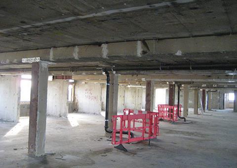
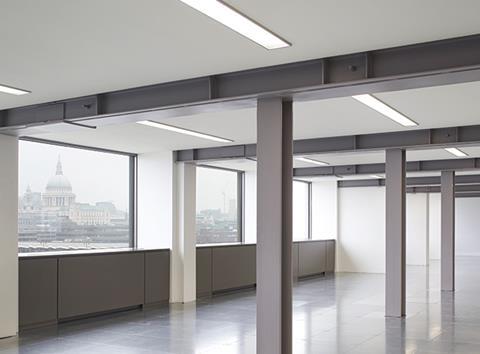
This careful process of structural retention and remediation characterises the complex and intricately forensic structural approach adopted for the building’s existing fabric. The entire building essentially had to be propped in place while the fins were removed. The removal of each fin was a painstaking, sequential process whereby the replacement column would be installed in-situ while the fin was still in place. Only when the column was fully in place would the remainder of the fin be removed.
Inspired a measure as the fin removal turned out to be, it was one that was very nearly a casualty of the recession, as Doug Smith, TP Bennett principal director explains. ‚ÄúWhen we were appointed in the project in 2009 the market conditions were very challenging. The tight budget meant that all the fins were initially retained, but luckily the brief evolved and the design solution evolved with it.‚ÄĚ
Earlier redevelopment schemes included the demolition of the entire building, with one proposal replacing it with a series of towers. Demolition was no longer being actively considered by the time TP Bennett was appointed, for a combination of sustainability and commercial reasons, as Smith explains. ‚ÄúHad we demolished the building then current building codes would have meant that if we rebuilt the building to the same overall height, we would have lost an entire floor.‚ÄĚ
Floor-to-ceiling heights also proved to be a significant challenge with the refurbishment. Original structural floor-to-ceiling heights of 2.825m had been configured for hotel floors rather than offices. With the additional modern services and floor build-up required as part of the renovation, headroom in new office areas was potentially severely restrained.
An innovative services distribution system solved the problem. Perimeter fan coil units were installed underneath the windows for fresh air intake. Ductwork was surgically threaded through a suspended ceiling just 80mm below soffit level serving further suspending fan coil units in the centre of the floorplate.
This configuration eliminated the requirement for additional lateral services distribution which would have further reduced head height and also allowed for the original down stand steel beams to be expressed within the new beam. It also enabled a minimum floor-to-ceiling height to be maintained in all office areas.
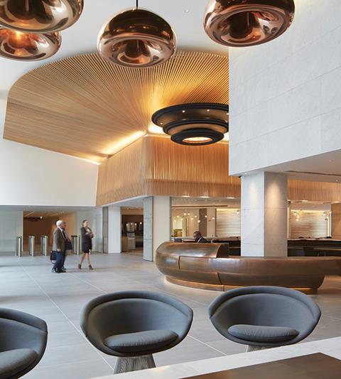
Apart from the refurbishment of the existing building, the most significant part of the project was the construction of the new office annexe. As with the existing building, this features a generous, lofty new office entrance and foyer clearly visible from the street. Its walls are lined with undulated wood panels designed to mimic either waves or a ship’s hull in a contemporary rendition of Platner’s nautical theme.
In stark contrast to the original block, the offices themselves assume a converted warehouse feel complete with stripped wooden flooring and designer chandeliers - an aesthetic deliberately designed to evoke the shared, informal and domesticated work environment that is a key cultural component of the growing start-up office sector.
Hotel interiors revel in the muted, hipster chic that is now the staple of trendy design hotels. Even an outside sign is omitted; an ironic move which desperately aspires towards the kind of ice-cool anonymity theatrically shunned by the gaudy fairground signage of the original building. Dixon also maintains the nautical theme with a large copper panel installation swooping, somewhat chunkily, over the reception desk and piercing the building exterior to evoke a ship’s hull.
While Sea Containers House has been transformed internally, from the first floor upwards and from river frontage at least, it remains largely the same. Short of demolition there is little that can or has been done to appease its unwieldy and oppressive bulk and its contribution to local townscape and particularly river views remains an undoubtedly negative one.
But there is one area where TP Bennett has cleverly softened and even enhanced its impact and that is public realm. While the building was once a barrier to local connectivity and callously maintained an inaccessible river frontage that languished blankly behind railings, new public routes to the river have been opened up through and alongside the building and new glazed foyers provide the transparency that links the river to the adjacent Upper Ground for the first time.
The biggest transformation is the river walkway, now lined and animated with the lively sequence of bars and restaurants that occupy much of Sea Containers’ ground floor and enable it to engage with the energetic cultural activity of its South Bank location at long last. This rejuvenated riverside walkway proves that even when architecture is as bad as that of the original building, within a thriving local context at least, imaginative reinvention can still enable public realm to flourish.
Project Team
Client Archlane
Architect TP Bennett
Contractor Byrne Group
Project manager GVA Second London Wall
Structural engineer Waterman Group
M&E engineer Hurley Palmer Flatt
Cost consultant Turner & Townsend
Landscape consultant Townshend Landscape Architects








No comments yet