The bizarre mixture of the dysfunctional,the delightful and the disappointing that is the Scottish parliament building opened in 2004. Five-and-a-half years later, Martin Spring returned to ask the MSPs it was built for what itŌĆÖs like to work in
As the seat of ScotlandŌĆÖs democratically elected legislature, the parliament is the countryŌĆÖs most public building. It was completed five years ago to a competition-winning design by the late Enric Miralles, and it went on to win the UKŌĆÖs top architectural award, the Stirling prize, in 2005. As such it should be popular. And indeed it is ŌĆō wildly so. It consistently attracts 400,000 visitors a year, making it ScotlandŌĆÖs most looked-at building after Edinburgh castle.
But ask how this home of democracy actually operates, and you get a more sullen response, at least initially. ║├╔½Ž╚╔·TV sent a number of letters to the parliamentary authorities to request permission to write a Revisit feature, which is essentially a road test of a project we covered just after it was completed. All were rejected. You donŌĆÖt have to be paranoid to wonder whether this uncooperative attitude betrays a lingering defensiveness dating from the scandal over the cost of the project, which rose from ┬Ż40m to ┬Ż414m; that works out at ┬Ż12,558/m2 in 2005 prices . Added to that, a series of defects have made themselves known after the building was finished, in the form of slipping beams, leaking roofs and an infestation of pigeons.
Undeterred, ║├╔½Ž╚╔·TV applied directly to the MSPs themselves. Three backbenchers from three parties responded positively. The first was the veteran politician Margo MacDonald, who is presently the parliamentŌĆÖs only independent, and an unflagging critic of the building. The second was Robin Harper, who is one of ScotlandŌĆÖs two Green party MSPs, and the convenor of two cross-party parliamentary groups, one on architecture and the built environment and the other on renewable energy and energy efficiency. Our third guide was Labour MSP Des McNulty; he had a leading role in setting up GlasgowŌĆÖs International Festival of Architecture and Design in 1999.
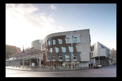
The first question to ask was how the exterior of the building strikes all those sightseers and passers-by. ŌĆ£People donŌĆÖt like it very much outside, because it doesnŌĆÖt harmonise with whatŌĆÖs around it,ŌĆØ says MacDonald. ŌĆ£And I donŌĆÖt know where the centre is.ŌĆØ
McNulty points out that, ironically, the buildingŌĆÖs entrance for visitors is its ŌĆ£least welcoming partŌĆØ. It is preceded by a deep canopy in grey concrete with a hefty concrete beam above it that bears weathering streaks and surface cracks. ŌĆ£ItŌĆÖs dark and gloomy, particularly in our climate, and it feels like a cave,ŌĆØ he adds.
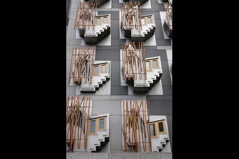
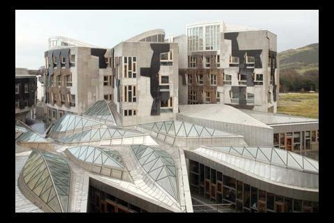
ŌĆ£The view from Salisbury Crags shows the building off in the way that Miralles intended,ŌĆØ says a more equivocal Harper. But how many of the 400,000 visitors a year will climb to the top of the wild volcanic peak to admire this view? They are more likely to approach the building by coach, from where they will be greeted by a baffling jumble of gaunt forms and dark materials such as Aberdeen granite, fairface concrete and a loose scattering of ŌĆ£bamboo polesŌĆØ (really varnished oak). If there is a key motif here, it is the repetitive concrete wall panels in the inexplicable shape of a sawn-off revolver.
If any building really does need to have an iconic form, it is a national legislature. Other than the aerial panorama, the most memorable view of the Scottish parliament building is of the highly sculptural ŌĆ£think podsŌĆØ that project from the MSPsŌĆÖ block, but this is tucked down a narrow side alley. As for a landmark skyline to rival Big Ben or the many towers and domes around Edinburgh, this just doesnŌĆÖt exist. Harper acknowledges this omission: ŌĆ£You donŌĆÖt walk past this building saying, ŌĆśThatŌĆÖs a big impressive building, thatŌĆÖs a parliament.ŌĆÖ You walk past saying, ŌĆśWhy?ŌĆÖŌĆØ.
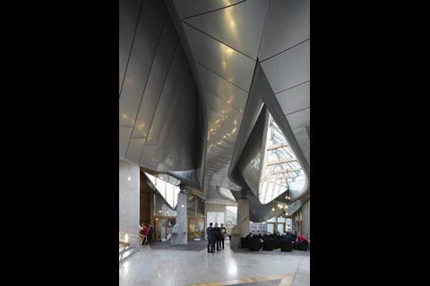
As for the buildingŌĆÖs interior, ubiquitously fitted out in natural oak, our three MSPs were unanimous about its positive impact. ŌĆ£For most people whoŌĆÖve been taken round, their immediate reaction is just to be stunned by the interior,ŌĆØ says Harper. ŌĆ£It does provide a certain inspiration. Architects in particular like the finish, and the general visitor likes the feel of it. Children love it; I think that says Miralles really did get it right.ŌĆØ
The central space is the garden lobby, which is furnished with tables and chairs and is covered by the ŌĆ£upturned boatsŌĆØ of elongated curved skylights in glass and polished steel. To McNulty, this lobby is the fulcrum of Scottish politics. ŌĆ£ItŌĆÖs a meeting place like a village centre, and if you sit here on a Thursday just before the first ministerŌĆÖs questions, just about everybody whoŌĆÖs anybody in Scotland goes past.ŌĆØ
Harper concurs: ŌĆ£You canŌĆÖt sit here for half an hour without picking up on the huge buzz of this building. And there is everything we need all around ŌĆō our food, our information centre, the doctor, the presiding officerŌĆÖs office and our garden.ŌĆØ
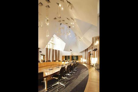
As for the four committee rooms that have grandstand views of Salisbury Crags, even MacDonald finds these irresistible.
ŌĆ£On a summerŌĆÖs day, itŌĆÖs wonderful to sit in them. You think youŌĆÖre sitting in the clouds.ŌĆØ
Harper thinks the committee tables, which are egg-shaped with hollow cores, provide good sight lines for delegates. But MacDonald points out that they are so inflexible that removing them temporarily for an exhibition or reception costs ┬Ż1,000.
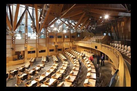
The fan-shaped debating chamber, with its flurry of oak roof beams and ample daylight, always gives McNulty a buzz as he enters. He also finds the sight lines good, and appreciates the sound amplification and audiovisual screens built into each desk. But for MacDonald, the orientation of the MSPsŌĆÖ desks towards the presiding officer does pose a problem. ŌĆ£Each MSP has a desk microphone, but itŌĆÖs not omnidirectional,ŌĆØ she says. ŌĆ£Our style of democracy and debate is to look each other in the eye. ItŌĆÖs not to listen to a lecture, as is common on the Continent. If an MSP in front addresses the presiding officer, itŌĆÖs his eloquent back we see. If he turns round, he goes off-mic. The mics should really be above our heads.ŌĆØ
Each MSP is assigned his or her narrow office with its own projecting window bay. Harper appreciates the space it provides for three employees, as well as the MSP, but McNulty criticises the lack of acoustic screens between the outer two desks and the corridor. And MacDonald adds: ŌĆ£Ask MSPs, and theyŌĆÖll tell you theyŌĆÖre very confining and very constrained. And everyone will tell you the lighting is poor.ŌĆØ
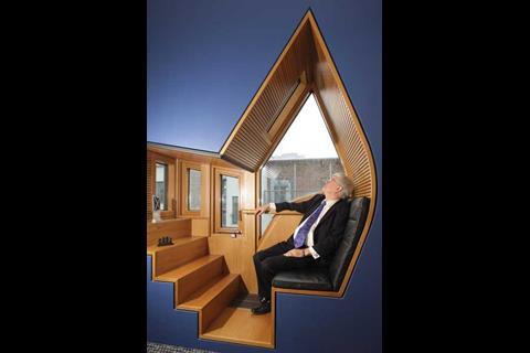
The peculiar form of the projecting bay window was actually designed as a ŌĆ£think podŌĆØ. But they donŌĆÖt impress MacDonald, who says: ŌĆ£They have had sticky-backed plastic put around them, because you bang your head when you try to sit down.ŌĆØ Harper was one MSP who overcame his initial scepticism and learned how to use his pod for the purpose intended. ŌĆ£Quite often, when I want to compose a complicated response to somebody, I will sit in the pod, as itŌĆÖs easier to think there. ThereŌĆÖs a little skylight above your head, and you can look up and see the clouds scurrying past.ŌĆØ
Though designed and built in a single 33,000m2 phase on a confined site, the building is not, as McNulty points out, a single unit but a combination of structures. For him, the whole complex comes together as an integrated campus that instils ŌĆ£a shared purpose and great loyalty to parliamentŌĆØ in all the MSPs and staff. All three MSPs also appreciate the convivial interaction between MSPs, staff and even visitors that is engendered by the compact layout.
The downside of the compact layout is that it is inflexible, yet alterations, and very likely extensions, will be inevitable over the buildingŌĆÖs 100-year design life. For example, male visitors are supplied with a single toilet cubicle that contains two urinals (MacDonald claims she pointed out this inadequacy at design stage). In addition Miralles curved forms and the structureŌĆÖs award-winning status will make substantial changes difficult. This does not apply, however, to alterations that increase security. Just last year, ferocious-looking security turnstiles were inserted into the ceremonial entrance off the Royal Mile. And a ring of security bollards with deep foundations are now being installed outside the complex at a cost of ┬Ż1.5m.
The contorted, multi-level layout also poses problems of accessibility. So how does MacDonald, who has walking difficulties, cope? ŌĆ£God knows. IŌĆÖve got wee hidey holes that I work out in advance. ItŌĆÖs not very good.ŌĆØ
Well, canŌĆÖt all the design faults that sheŌĆÖs pointed out be put right? ŌĆ£Oh no, no dear, this place is a thing of beauty,ŌĆØ she replies, possibly with her tongue in her cheek. ŌĆ£You can never get rid of these projecting windows on the MSPsŌĆÖ block, because theyŌĆÖre now on the tea towels.ŌĆØ
Harper and McNulty find the building ŌĆ£absolutely wonderfulŌĆØ and ŌĆ£very worthy of the Stirling prizeŌĆØ. But perhaps the last word should go to the indefatigable MacDonald. ŌĆ£My criticisms might seem churlish when the place cost almost half a billion pounds, but itŌĆÖs the frustration of seeing things that should, we thought anyway, have been basic to good design. If the whole design process were better managed, we might have avoided things like that.ŌĆØ
How it scores
Opened in August 2004, the ┬Ż414m Scottish parliament building was designed by EMBT of Barcelona and RMJM of Edinburgh as joint architects, with Arup as structural engineer, RMJM as services engineer, Davis Langdon as quantity surveyor and Bovis Lend Lease as project manager.
Functionality
3/5
The debating chamber and committee rooms all serve their democratic purpose well, and the garden lobby is the social hub of the complex, fostering vital interaction between MSPs, civil servants and the public. But MSPs feel squeezed into their compact offices, and curvilinear forms make the building inflexible.
Image
2/5
In its prime duty to be a national icon, the exterior of the Scottish parliament building fails. It is an indecipherable jumble of forms, while the granite and fairface concrete are dark, gloomy and growing even more dingy with weathering. The main internal spaces, however, are furnished in natural timber and awash in daylight, and so remain exhilarating, inspiring and resplendent.
Build quality
3/5
The buildingŌĆÖs 100-year design life has been severely undermined by a slipped roof beam in the debating chamber (pictured), along with persistently leaking roofs and pigeon infestation. To cope with such endemic problems and hard usage, maintenance is intensive. Despite being a naturally ventilated building, its actual energy consumption is high (see box below).
Environment and Energy usage
Although the Scottish parliament building has been praised for its reliance on natural ventilation, it is criticised by David Strong, chief executive of sustainable building consultancy Inbuilt, for its ŌĆ£extraordinarily highŌĆØ energy consumption.
The actual energy consumption recorded in 2008/09 was 293kWh/m2, which despite showing an improvement of 2.73% since 2005/06, is 2.3 times that indicated by the buildingŌĆÖs theoretical Energy Performance Certificate, which last year awarded the building a B rating. Actual energy consumption is 14% higher than that of LondonŌĆÖs City Hall, completed two years earlier to Foster + PartnersŌĆÖ design. Strong says: ŌĆ£I would reasonably have expected 150kWh/m2 at the top end.ŌĆØ
The buildingŌĆÖs facilities management team defends the high energy consumption, arguing that it has been boosted by ŌĆ£factors such as the building being open seven days a week, being open late three or four nights a week, having about 1,000 people working here each day and more than 400,000 visitors a year, and having broadcast facilities in operation from Tuesday to Thursday.ŌĆØ
A sharper insight into energy wastage comes from Robin Harper, a Green party MSP and a convenor of the cross-party group on renewable energy and energy efficiency. He blames the occupants themselves. ŌĆ£I go along my corridor sometimes in later autumn and I find the windows wide open. So the heating comes on, and then people say itŌĆÖs too hot and they open another window, and the heating jacks up even more to compensate. People should use their thermostats not the windows when the heating is on.ŌĆØ








No comments yet