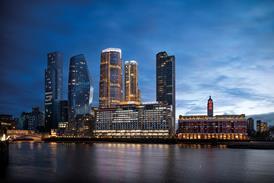
The first thing that strikes you about 88 Wood Street is that it is more orderly, better mannered and less frenetic ŌĆō although perhaps less exciting ŌĆō than its precursor. The front facade on Wood Street, for instance, is a meticulously tailored ŌĆō and by LloydŌĆÖs standards, demure ŌĆō flush facade of storey-height glass panels separated by horizontal strips of grey, colour-coated metal panels. Along the side facade on London Wall, however, are a few of the hi-tec high jinks that are RogersŌĆÖ hallmark ŌĆō bright yellow structural steel, panoramic lifts, and bright blue and red funnels that pop up from the pavement like gaudy toadstools.
If there is one component that distinguishes 88 Wood Street from the LloydŌĆÖs building, it is glazing. Clear, transparent glazing. And a specially refined glass at that ŌĆō one even more transparent than standard clear glass ŌĆō which added ┬Ż750 000 to the ┬Ż18m cladding contract. Known as low-iron glass, it is cast at high temperatures to burn out iron impurities. Specified in the 1980s for the famous glass pyramid outside the Louvre in Paris, low-iron glass manufactured by Saint-Gobain under the trade name Diamant Extra White Glass has been used for the bulk of 88 Wood StreetŌĆÖs external envelope, making it the largest quantity of the special glass ever used in a single building.
Like the emperorŌĆÖs new clothes, the glass vanishes when looked at, although, unlike the emperorŌĆÖs outfit, it exists as a physical, protective cover.
This super-transparent skin has allowed Rogers to flaunt many of its favourite hi-tec features, yet shield them from the damaging effects of British weather and London pollution. At 88 Wood Street, the panoramic lifts are every bit as exposed to view as those in the LloydŌĆÖs building, but they are protected by the frameless glazing encasing the lift shafts. The lift lobbies on each floor end in a single pane of nearly invisible glass that stretches from floor to ceiling and from one side to the other, visually turning the lift lobbies into external balconies overlooking the Barbican development and LondonŌĆÖs skyline beyond. The stairs and the panoramic lifts, both ensconced in their own fully glazed towers, offer even more exhilarating views as they zip up and down the flank of the building.
Such uncompromising transparency puts a premium on detailed design. As RogersŌĆÖ project architect Russell Gilchrist says: ŌĆ£The last thing you want to see is a dingy old lift shaft.ŌĆØ Accordingly, the lifts were manufactured in Japan by Mitsubishi to be the last word in precision engineering. The slenderest of steel guide rails were fitted in the lift shafts, aligned with just two sets of pencil-thin shims and lubricated with dirt-resistant silicone-based grease.
As far as the buildingŌĆÖs occupants are concerned, the glass has also been used to stunning effect on the office floors. Although otherwise conventionally fitted out with raised floors and flat, suspended ceilings, the office space is enclosed behind huge 3 m wide triple-glazed windows ŌĆō incorporating what are reputedly the largest double-glazed panels ever manufactured.
The result is that occupants have a panoramic view across the capital on three sides ŌĆō stretching from St PaulŌĆÖs Cathedral and the new London Eye to the west, around past the Barbican development to Docklands in the east. Indeed, this profusion of ultra-transparent glass is so dazzling that all external double-glazed panels to the offices are fitted with motorised cavity blinds to cut out glare.
The ultra-transparent glass also stars in the triple-height entrance hall, which occupies nearly half the ground floor. Here again, external walls are visually non-existent, as are the enclosing walls to the two pairs of lift and stair towers, so that space flows unimpeded from the building to the surrounding streetscape.
The only opaque or solid elements are one flank wall in polished plaster panels, a few rows of cylindrical concrete columns, a coffered concrete floor slab high overhead and rough granite slabs underfoot that extend beyond the glazed walls. The effect within the confines of the City is strangely liberating ŌĆō if rather raw and stark ŌĆō like finding yourself standing in the remains of a colonnaded temple preserved from antiquity.
The only dampener on this expansive scene is that, except for a postage stamp-sized park to the west, the building is surrounded by the visual chaos of London Wall and its sidestreets.
Turning from the buildingŌĆÖs fabric to its basic configuration, a deeper family resemblance to the LloydŌĆÖs building can be traced. The brief for the LloydŌĆÖs building was to create the largest possible insurance-dealing floor on a tight and irregular site. Rogers responded by placing the largest possible rectangular hall on the site, and mopping up the odd leftover corners for access and service functions.
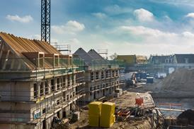
At 88 Wood Street, the designers have used a similar approach of logical geometry to fit standard building forms onto an irregular site. DaiwaŌĆÖs brief was to fit as much high-quality office floor space as possible onto the 65 m deep triangular site within a height restriction of 18 storeys imposed by City planners. RogersŌĆÖ response has been to extrude a standard 18 m deep strip of office space, cut it into three lengths of various heights and stack them in parallel across the site, with each block stretching from one site boundary to the other. The lift and stair towers, toilets and service risers have all been tucked into the 10 m gaps separating the three strips of office space.
This stacked arrangement has several advantages. First, unimpeded office space, which benefits from generous daylighting and views, is regularly and efficiently distributed across an irregular site. On the lower floors, where the office strips are linked together, the links can be used to house office equipment.
Second, the stacking arrangement enables the large 33 000 m2 building to be broken into three separate blocks that could be let to separate tenants.
Third, in architectural terms, the three parallel blocks rise up in three regular steps in response to the disparate cityscape surrounding the site. Starting with an eight-storey frontage that fits into the existing cornice line on Wood Street, the building steps up to a 14-storey middle block equivalent to existing buildings behind the site. It then rises to the uppermost 18-storey slab, similar in height to the adjacent Alban Gate by Terry Farrell & Partners and other office towers on London Wall.
Finally, the stacking arrangement of strips has, through its intrinsic geometry, generated elevations to the front and rear that are in marked contrast to the flank elevation facing London Wall ŌĆō a design feature commended by the Royal Fine Art Commission. The front and rear facades, facing Wood Street and the small park respectively, are formed by the full-length external elevations of the office strips. These smooth facades with their horizontal emphasis are as orderly and refined as hand-made pinstripe suits. The side elevation, however, is made up of the gable ends of these office strips along with the stair and lift towers. It is jagged in outline, vertical in emphasis and displays the contents of the lift and stair towers ŌĆō a dynamic scene that befits the traffic-dominated dual carriageway of London Wall.
Fourteen years after the completion of the controversial LloydŌĆÖs building, 88 Wood Street demonstrates that many of the hallmarks of the Richard Rogers Partnership are alive and well. These are the efficient arrangement of accommodation coupled with the visual excitement of flamboyant forms and expansive volumes. What has been dropped is the exposure of vulnerable service elements to the vagaries of the external environment.
Given the ┬Ż8m bill to repair exposed services on the LloydŌĆÖs building, this is hardly a loss. Yet, thanks to the ultra-transparent glass, these items are still displayed as an integral component of the architectural composition.
Why it took 11 years to develop
88 Wood Street in the City of London is the result of a convoluted development process that has taken 11 years from site acquisition to building completion. The development process ŌĆō although not the finished product ŌĆō has suffered from the pendulum swings of the Japanese economy, the dictates of British conservation laws and the liquidation of a key American subcontractor. 1988 Japanese banking giant Daiwa Securities bought two adjacent sites on London Wall with the aim of developing a landmark European headquarters building with dealing floors. Richard Rogers Partnership was appointed architect. March 1991 A historic telephone exchange covering one-third of the site was spot-listed by the Department of the Environment, putting the whole project at risk. June 1992 The spot-listing of the exchange was lifted after an appeal, but the core chamber contained telephone cabling for much of the City and so could not be removed. Late 1992 Detailed planning permission for 18 000 m2 of net office space was won by Richard Rogers Partnership. A design-and-build contract was negotiated by Daiwa with its old Japanese trading partner, Kajima, which formed a joint venture with Laing Management. The consultants, including Rogers, were novated to Kajima. Late 1992 The Japanese economy slumped before work could start on site. The project was mothballed. 1995 Daiwa reactivated the project, but as a speculative office development. In addition, the brief was increased by one-third to 24 000 m2 net lettable space. The design challenge to Rogers and structural engineer Ove Arup & Partners was to squeeze in the extra space without raising the height of the building, which was circumscribed by strategic views across London and agreed previously with Corporation of London planners. Four extra floors were fitted in, partly by shifting air-conditioning plant to the basements and partly by designing post-tensioned concrete to reduce floor thickness from 750 to 600 mm. 1995 Construction started on site. Then Daiwa decided to occupy nine floors of the building, requiring electricity generation capacity of 4 MW and a windowless communications ŌĆ£pavilionŌĆØ at the rear to service its dealing floor. ║├╔½Ž╚╔·TV directly over the telephone exchange chamber called for the installation of huge steel transfer beams spanning 20 m and up to 4 m deep and the excavation of two service tunnels beneath it to feed cooling pipes. Other underground obstructions included a tunnel for mail trains. July 1998 Daiwa decided not to move in after all. The opaque cladding to the communications pavilion was replaced by glazing panels for conventional office space. Total client variations are believed to cost in excess of ┬Ż20m. March 1998 US cladding subcontractor Harmon went into liquidation halfway through its ┬Ż18m contract. The contract, encompassing glass supplier Saint-Gobain and HarmonŌĆÖs French fabricating subsidiary, was transferred to French cladding contractor Renaldi Structel. October 1999 Practical completion 12 months late. The building has still to be sold or let.Downloads
Stacking office space in strips
Other, Size 0 kb
Credits
client Daiwa Europe Property architect Richard Rogers Partnership planning consultant Montagu Evans structural and services engineer Ove Arup & Partners cost consultant Gardiner & Theobald design-and-build contractor Kajima-Laing Management joint venture fit-out contractor Kajima-Hazama joint venture


