We are in The Deep, Britain's most glorified aquarium, which opens to the public in Hull this weekend. It packs in a total of 15 display fish tanks, including the deepest in Europe that measures 10 m from top to bottom, and has 2500 fish from 120 species. This is more than an aquarium, its managers claim – it is the world's only "submarium".
Although the attractions are grander and more exotic than any other British aquarium, this is all familiar territory. The Deep is a major publicly funded visitor attraction; a belated millennium project with nearly half its £45.5m capital investment coming from the Millennium Commission. The rest is pooled from local authority, regional and European funds, and topped up by private donations. Filled with live exhibits and the latest in interactive attractions, it combines fun with serious education in a blend devised to be irresistible to children. Based on the theme of the world's oceans, The Deep is unofficially described by Richard Dean, project manager of management contractor Bovis Lend Lease, as "the watery equivalent of Dynamic Earth in Edinburgh".
What is more, the development has regenerated a derelict site – in this case land formerly occupied by a shipyard. Beyond that, the ultimate objective is to provide a catalyst for the economic regeneration of a rundown city. With its fishing industry long gone and its legacy of high unemployment still alive and well, Hull is crying out for an economic lifeline.
A building iconic enough to register on the public imagination is reckoned to be a vital part of the millennium project formula. For The Deep, iconic architecture is provided with a flourish by Sir Terry Farrell as the jewel in the crown of his wider masterplan for the renaissance of the city centre.
In Terry Farrell & Partners' design, The Deep is half-building, half-sculpture, rising up dramatically on a spit of land where the River Hull joins the wide Humber Estuary. Its sculptural form and watery setting puts The Deep in the same category as the Lowry Centre and the Imperial War Museum North, overlooking Salford Quays, and the Glasgow Science Centre on the banks of the Clyde. How, then, does Farrell's contribution to the genre measure up?
No architectural elitist, Farrell recognises that "this type of leisure building is public architecture at its most populist". Here he has translated his populist intentions into the architectural metaphor of a wave, an iceberg, or a heavily eroded cliff face thrust by primordial forces out from the ground. The largely windowless interior is inspired by the watery depths of the sea itself.
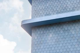
This eroded cliff face is clearly visible from Hull's historic pier front on the opposite bank of the Humber. The building rises at a 30° angle to form a sharp angular point directly above the spit between the river and the estuary. The earthbound base of the building is faced in dark grey render and black aluminium sheeting. Above that, it is clad in large panels of marine-grade aluminium in irregular rhomboid forms, suggesting fissured rock plates. And higher still, the cladding metamorphoses, as if by the subterranean heat and pressure, into gleaming ceramic tiles. The upward slope culminates in a crystalline pinnacle of clear glazing, behind which a high-level viewing gallery faces a wide panorama of the Humber.
As an icon to allure visitors from across the river, this view fits the bill. In sunlight, it even glows like a golden casket. But approach the visitor entrance from the other side of the building, and a cruder composition of massing, materials and colouring prevails. On this side, the walls are all rendered in mid to dark greys and are pockmarked with small, mean, square windows. A large charcoal-grey mass erupts up at a crazy angle out of the lower blocks, and this culminates in another high-level but much plainer viewing gallery. In Farrell's rationalisation, this is all part of the eroded monolith metaphor – but there is little visual linkage to the panel-clad facade on the other side.
Visitors entering the building are whisked by lift to the top floor, from where they descend a shallow, continuous ramp that zigzags gradually down, past aquariums large and small, interactive modules, wall hangings and other exhibits. This downward-spiralling route takes the visitor through the museum's storyline, which traces the chronological evolution from big bang, through the era of fossils, to the current state of the world's oceans. More literally, it also gradually plumbs the briny depths, and the geographical latitudes, of the oceans.
"The interior spaces were strongly influenced by the physical nature of the ocean," says Farrell. "The building's section offsets the solid (water) and void (circulation space), giving visitors a sensation of immersion within an ocean environment."
Here again, the architectur al metaphor intended by Farrell, as distinct from the didactic message of the exhibits, fails to hit its mark. Farrell is self-confident enough to rely entirely on the abstract symbolism of purely architectural elements rather than the Disneyland effects of fake stage scenery. The trouble is that the architectural elements have not been sufficiently controlled to read clearly. The architectural shell (designed by Farrell) conflicts with the exhibits (designed by John Csáky Associates), and the whole internal scene is dissipated in an uncoordinated flurry of materials and hues – magenta-painted perforated steel balustrading, stainless-steel handrails, navy-blue walls, light-grey fairface concrete floor soffits, off-white galvanised steel decks, charcoal-grey carpets, black light fittings and white air-supply nozzles – not to mention the multicoloured displays themselves. In places, the interactive modules take over, making the submarium resemble an amusement arcade. The most exciting feature is the world's first watery lift ride, in which a cylindrical acrylic lift car elevates visitors from the basement up through the largest aquarium.
No doubt that the budget dictated that basic materials be used in the fit-out – they largely consist of drylining, emulsion paint and softwood door frames. Will they stand up to the wear and tear caused by hundreds of thousands of children?
All these quibbles may amount to little compared with the Deep's extended spectacle of multicoloured corals, shoals of tropical fish, menacing sharks and the story of the evolution of the oceans. Provided the punters have not yet been sated by the recent spate of aquariums, they should find it all adds up to an exhilarating and instructive day out. The visitor centre even includes a serious research angle, as provided by a Hull University in a ground-floor wing. Architecturally, the building boasts a south facade that is eye-catching enough to imprint itself the public consciousness and entice families out to east Yorkshire. But the architecture could have added so much more to the excitement of the event once they get there.
Downloads
Insider’s view of the Deep
Other, Size 0 kb
Credits
client The Deep Millennium Project architect Terry Farrell & Partners project manager BDP Project Management structural engineer Jubb Consulting Engineers services engineer Waterman Gore quantity surveyor Gleeds exhibition designer John Csáky Associates landscape architect Casella management contractor Bovis Lend Lease principal trade contractors Heyrod Construction (concrete structures), Mero (cladding and glazing), Irvine Whitlock (brick and blockwork), NG Bailey (M&E), Reynolds Polymer (aquarium windows and waterproofing), JW Taylor (internal fit-out)


No comments yet