Ash SakulaŌĆÖs Carnival Arts Centre is LutonŌĆÖs answer to Notting Hill ŌĆō buzzing with life and invention and a haven for stiltwalkers and other forms of streetlife
Like the discovery that your maiden aunt is secretly a table dancer, it may come as a bit of a surprise to learn that Luton has become the UKŌĆÖs capital of carnival. While Notting HillŌĆÖs annual extravaganza still has the highest profile, the unassuming Bedfordshire town has the biggest one-day event in the country, attracting 2,000 participants and 100,000 revellers every May. And now, courtesy of Ash Sakula Architects and ┬Ż7m of funding from the Arts Council and the East of England Development Agency, it also has the UKŌĆÖs first purpose-built centre for the carnival arts ŌĆō and itŌĆÖs a building so vibrant and inventive that it will have even the most grudging Lutonian dancing in the streets.
Ash Sakula won the job over the likes of HawkinsBrown and Penoyre & Prasad back in 2006, and was immediately confronted with the question of where to begin. After all, nobody had ever built this kind of building before. ItŌĆÖs a centre for all things carnival, a place for working up ideas to be used for carnival, an education centre where you can do a degree in carnival studies and somewhere that offers business units for carnival specialists.
The first thing director Cany Ash did was to spend some time in a ŌĆ£mas campŌĆØ, where carnival folk prepare the floats, costumes and routines for each yearŌĆÖs event, to see what the community wanted and needed.
It soon became clear it was a more complicated brief than expected. ŌĆ£Mas camp is quite a secret activity,ŌĆØ explains Ash. ŌĆ£There is a lot of competition between different groups, and there needs to be the element of surprise. They were worried about it being a big open workshop where everyone could see everything.ŌĆØ
Ash SakulaŌĆÖs response was to create a centre with variety and flexibility at its core. On an unusual site broadly shaped like the lid of a grand piano (see plan, below), the architect placed a mas camp building on the side that curves along the road, and the centreŌĆÖs offices on the other, with a courtyard in between.
Rather than being a single uniform building, the mas camp is broken up into various spaces. You enter through the courtyard into a central space with concrete floors and ceiling-to-floor windows on one side of the room. Behind this is a large, 150m2 wood-floored space that is midway between a theatre and a dance studio, followed by three smaller classrooms and a workshop with power tools and desks.
We needed to make a tough feel to the ceiling so people wouldnŌĆÖt be afraid to bang a nail or bolt a rail through it
Cany Ash, Ash Sakula
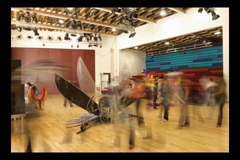
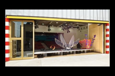
The layout is more complex than that, though ŌĆō the entrance space has an outdoor, glassed-off space that can be used for displaying costumes and posters, a kitchen complete with a deep fat fryer, and bathrooms and storage spaces. The large wood-floored studio adjoins a soundproof chamber where drummers can practice, and opens up to the courtyard on one side. It is much higher than the entrance space in order to accommodate lighting rigs and extravagant designs. Ash explains that some of the costumes designed for carnival stilt-walkers are as tall as 4m.
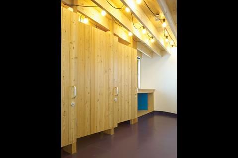
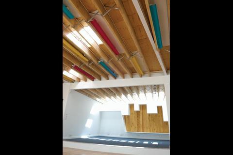
The design of the entrance space is deliberately sparse, with a bare concrete floor, exposed timber rafters on the ceiling and bare light bulbs hanging down. It looks unfinished ŌĆō an intentional effect, according to Ash. ŌĆ£We didnŌĆÖt want people coming in here and thinking, ŌĆśOh, we canŌĆÖt touch it, we canŌĆÖt do anything with itŌĆÖ,ŌĆØ she says.
ŌĆ£We needed to make it a tough surface on the floor, a tough feel to the ceiling so people wouldnŌĆÖt be afraid to bang a nail or bolt a rail through it.ŌĆØ
This is where, in the three months leading up to LutonŌĆÖs carnival, the mas camp participants will prepare. Ash imagines children sleeping on the floor and hanging swings from the ceiling. ŌĆ£Mas camp is a euphoric activity,ŌĆØ she says, ŌĆ£and we need to allow that to happen naturally.ŌĆØ
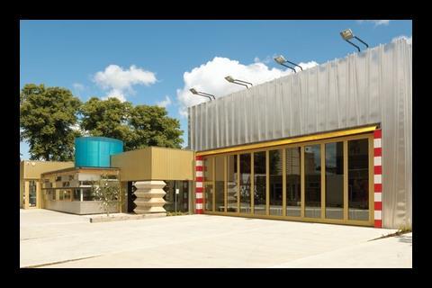
The windows are not ceiling-to-floor glass but instead a patchwork of different frame sizes, squares and rectangles. Ash says she wanted to avoid a ŌĆ£goldfish bowlŌĆØ effect, and the result sums up this unusual building quite appropriately. Each window on the public side of the building has a set of lights above, rather like a showroom. This will allow costumes and sets to be displayed to passing members of the public.
The performance space is less rough and ready ŌĆō partly through the requirements of the Arts Council, which needed it to be flexible for a variety of uses ŌĆō and this allows a rather more traditional aesthetic to creep in. The seats, for example, are in a rainbow variety of colours. Ash says her inspiration for this space was a television studio. ŌĆ£We wanted it to be ambiguous,ŌĆØ she explains. ŌĆ£Not a theatre, not a studio, not a gym, but somewhere in between.ŌĆØ
We wanted it to feel like a yard in Trinidad. It needs to look used
Cany Ash, Ash Sakula
The classrooms and workshop lead off from a corridor on the other side of the performance space. At the end is a ceiling-height window so that passers-by can see right through the building and out into the courtyard ŌĆō the artists will have to settle for working in secrecy elsewhere in the building.
The courtyard itself is, again, far from ordinary. The concrete has been power floated to provide a finish smooth enough for people to sit on comfortably, but rather than being simply an expanse of concrete, strips of earth infiltrate the yard. Although they are not bedded in yet, plants will eventually grow wild on these strips. ŌĆ£We wanted it to feel like a yard in Trinidad,ŌĆØ says Ash, noting that trucks have already left tyre marks on its light beige surface. ŌĆ£These are like stretchmarks. It needs to look used.ŌĆØ
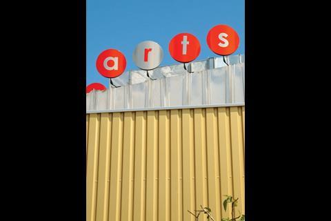
The courtyard is a good place to observe the exterior of the mas camp building, which is ŌĆō in a good sense ŌĆō a complete mess. No attempt has been made to integrate the variety of spaces inside ŌĆō instead, the outdoor cladding is a mind-melting mix of materials and signage. The main performance space is clad in welded Corus roofing panels, with rotating signs on top. Blue corrugated plastic sheeting disguises an extractor fan above the kitchen, and that is not even to mention the gold-tinted seventies-ish cladding, barbershop poles and Brancusi-like wooden sculpture at the entrance.
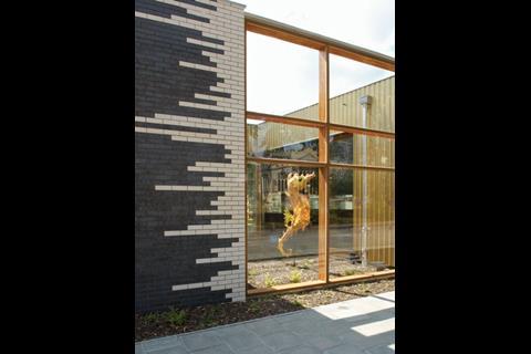
When added to the white brick and bamboo cladding used on the office building and small business units opposite, the effect is bewildering. Ash explains that it is meant to inspire creativity: the pile of rhomboids that is the wooden sculpture has already been compared by visitors to a jack-in-the-box and a heap of hamburger boxes.
Although the office units are necessarily more sober in tone, Sakula has clad them in bamboo strips and white brick to keep up the portmanteau feel of the centre as a whole. The only other element of the centre to note is a creche at the end of the office units that has been delightfully set out. Finished with a warm timber interior, the space is intended to be a kind of mini mas camp for children. There is a stage of sorts, and a landscaped outdoor area, complete with sandpit. Ash says the creche was inspired by Milieu teaching, a theory of educating children through natural settings and activities. ŌĆ£ItŌĆÖs my favourite bit of the whole building,ŌĆØ she says.
How to sum up this unique building? You couldnŌĆÖt call it beautiful, but it is adventurous and there is very little like it out there. What Ash Sakula has done with the Carnival Arts Centre is courageous, in that it has deliberately sacrificed aesthetic completeness for a dedication to the buildingŌĆÖs use. As a new building it reminded me of one of those pre-worn T-shirts designed to look like vintage clothing sold in high street shops. It has been designed to look like it was thrown together haphazardly like a maze of extensions and nailed-on extras. I suspect in a few yearsŌĆÖ time, when it has become worn out with use by the carnival community, it will look at its best ŌĆō like a piece of found architecture in a Jamaican township, loved by its community and infused with the madness and vivacity of carnival itself.
Mastering the unfinished look
In a building as full of surprises as the Carnival Arts Centre, it is perhaps most surprising that the contractor chosen to build it was the Apollo Group, a builder perhaps known better for its work in the social housing sector than for arts projects.
It wasnŌĆÖt only a new kind of job for Apollo, it was a new kind of job for anyone. ŌĆ£ThereŌĆÖs no rule book when it comes to building something like this,ŌĆØ says project manager Tony Bowcutt. ŌĆ£The key to its success was to work as closely as we could with the architect and our supply chain.ŌĆØ
The unique design of the building presented a variety of challenges to Apollo. The unfinished look of the ŌĆ£mas campŌĆØ had to be carefully engineered. ŌĆ£It couldnŌĆÖt actually be unfinished,ŌĆØ explains Bowcutt. Although the lights are simply naked bulbs, all loose wiring and ductwork had to be hidden above the exposed rafters.
Roof panels had to be welded together on site to act as cladding for the main performance space, and glazing ordered from Germany for the uniquely-sized windows. ŌĆ£There was no margin for error,ŌĆØ says Bowcutt. ŌĆ£If any of them broke, you couldnŌĆÖt just pop down to the builders merchants for another.ŌĆØ
The builders suffered plenty of late nights, particularly when it came to the power-floated concrete outside. ŌĆ£You have to wait for it to harden to stop it going glassy, and depending on the conditions it takes a different length of time each time,ŌĆØ says Bowcutt, shaking his head. ŌĆ£Every time it was in the middle of the night. It was in February we were doing that, so it was freezing.ŌĆØ
The contractor is extremely happy with the completed building ŌĆō and the prestige that goes with it. ŌĆ£ItŌĆÖs been great for us,ŌĆØ says Dan Germann, divisional director at Apollo. ŌĆ£Now we can say we have the ability to build a bespoke, high-quality type of building. ItŌĆÖs unlike anything weŌĆÖve done before.ŌĆØ
Carnival: a short history
Carnival first came to the UK in the fifties courtesy of migrants from the West Indies. Notting HillŌĆÖs three-day carnival began in 1958 but other street events cropped up across the country in places like Leeds and Luton as the West Indian population spread and integrated with other communities. LutonŌĆÖs carnival, which began in 1976, is now the biggest one-day carnival in the country, attracting 100,000 revellers and 2,000 participants every May. It was there that the Arts Council and the East of England Development Agency came together with the idea to fund a ┬Ż7m centre to foster the communityŌĆÖs enthusiasm for carnival.
Project team
Client Luton Carnival Arts Development Trust
Architect Ash Sakula Architects
Project manager David Beidas
Structural engineer Adams Kara Taylor
M&E consultant Michael Popper Associates
Cost consultant Appleyards DWB
Acoustic consultant Paul Gillieron Acoustics
Theatre consultant Charcoalblue
Main contractor Apollo Group
Downloads
In plan
Other, Size 0 kb
Postscript
Original print headline: 'Party Tricks'





No comments yet