Bermondsey Square, the centrepiece of a ┬Ż60m regeneration project in south-east London, is intended to seduce the young and trendy with its take on inner-city living
║├╔½Ž╚╔·TVs that sound like fashion brands. Celebrity endorsements. Loft living in Accrington ŌĆ” LetŌĆÖs face it, urban regeneration since the nineties has been built on the premise that you can design, build and market the concept of coolness.
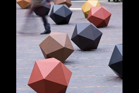
This is not an idea that is lost on Igloo, the regeneration body behind Bermondsey Square, a new public space and mixed-use scheme in south-east London that has aspirations of serious cool. It wears its trendiness on its sleeve, from the bespoke bike shed in the corner of the square to the lighting scheme and landscaped street furniture in its central plaza. Eastenders this is not.
ŌĆ£Urban safarians is what we call them,ŌĆØ says David Roberts, IglooŌĆÖs deputy managing director, of the target demographic for the square. ŌĆ£People who are attracted to the vibe that comes from inner-city living.ŌĆØ
Bermondsey Square is Igloo RegenerationŌĆÖs first development in London, following the successful completion of phase one of Islington Wharf in Manchester, as part of its Isis joint venture with British Waterways. Like Urban Splash, Igloo believes in using imaginative architecture to bring a distinct urban identity to its inner-city developments.
The square is located at the end of Bermondsey Street, an address that during the last decade has undergone a regentrification similar to Shoreditch or Dalston. Butted up against the rather-less-gentrified Tower Bridge Road, it is at the outer limit of the city centre. If you stand on the roof of architect Munkenbeck + MarshallŌĆÖs eight-storey building in the development, you can see City skyscrapers in one direction, and the low-lying boroughs of south-east London in the other. The aim is for the square to become the heart of Bermondsey.
Originally Igloo was only a funding partner for the scheme, along with Urban Catalyst, but it took over as main development partner in 2007 when that vehicle was forced to pull out. The square has been built in collaboration with Southwark council, which wanted a place to put Bermondsey antiques market. This market is something of an antique itself ŌĆō it dates back to 1855 ŌĆō and has become a London landmark. Southwark still owns the land, but in exchange for funding the construction of the square, Igloo was able to build three commercial buildings around it. One is a hotel, one a block of apartments and one is office space.
Igloo commissioned four architects to work up the scheme. Munkenbeck + Marshall took on an Arup masterplan and designed the three buildings. East laid out the square. Sarah Wigglesworth designed a bike shed, and Dive Architects carried out interiors work in the lobby and corridors of the apartment block.
The square is intended to be the focal point of the entire scheme. Even Stephen Marshall, director at Munkenbeck + Marshall, admits the three eight-storey buildings were designed so as not to distract attention away from it. Despite some bold interventions at its fringes ŌĆō notably the 20-sided bollards ŌĆō it is for the most part a large, open space. Julian Lewis of East says the concept, inspired by the market, is of a large carpet with ŌĆ£trinketsŌĆØ scattered onto it.
It has to be large to house the 200 market stalls that set up there every Friday, but this means that at other times the space can look bleak. The design team has done its best to ameliorate this through patterned red and blue clay paving and catenary lighting above, which lends a cinematic air to the space once night falls.
ŌĆ£ItŌĆÖs got a tough, gritty feel,ŌĆØ says Lewis. ŌĆ£ItŌĆÖs not attractive in a classic sense. We didnŌĆÖt want to dictate to people: you have to sit here or you have to do that.ŌĆØ It is adaptable, so that open-air events or parties can easily be staged there.
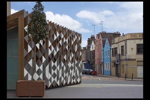
Sarah WigglesworthŌĆÖs bike shed is the largest trinket of all, a solid timber structure made of Douglas fir and clad in triangular stainless steel panels that catch the light, and provide a suitably ornamental touchstone to those entering the square from the south.
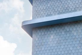
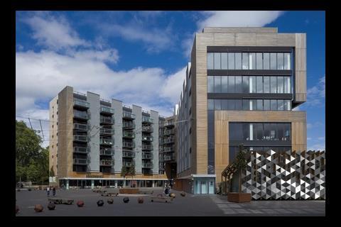
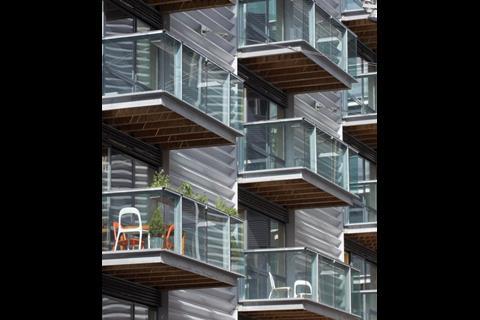
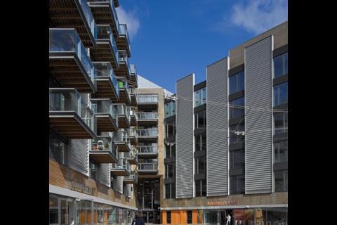
Marshall describes his practiceŌĆÖs contribution as ŌĆ£not object buildings, but edge buildingsŌĆØ. Knitted together by the European-style catenary lights ŌĆō which, it ought to be said, almost everyone on the project team claims credit for ŌĆō the three buildings are, from the outside at least, a mixed success. Marshall says he took inspiration from the warehouses at the riverfront, and there is certainly an industrial feel to the uniform of vertical steel panels, enhanced by the mesh cladding at the north-facing end, and the stark balconies.
The metallic grey threatens to overwhelm the palette, but it is broken up by a ribbon of timber cladding that circles the square at first-floor level
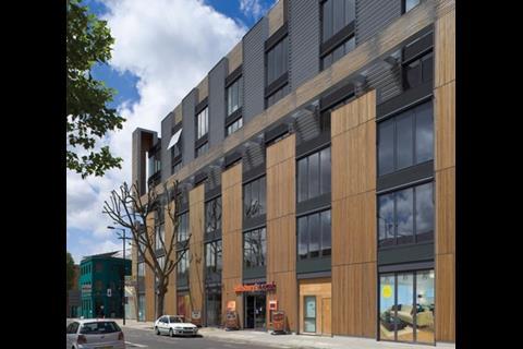
At points, the metallic grey threatens to overwhelm the palette, but it is broken up by a ribbon of red laurel timber cladding that circles the square at first-floor level, before rising vertically and making up a large part of the facade on Tower Bridge Road. This side of the development is the most aesthetically pleasing ŌĆō Munkenbeck + Marshall has broken the elevation at the fifth floor so that the verticals are not too severe. At the northern end, the balconies are wrapped in a mesh. This, according to Marshall, was simply a response to the weather. ŌĆ£It protects from the wind,ŌĆØ he says. ŌĆ£The building is pretty pragmatic.ŌĆØ
From the northern tip, the side of the building facing Abbey Road is less successful. Brick slips have been used instead of timber, apparently at the plannersŌĆÖ request, and there is little attempt to present an open face to the road. None of the retail units give onto the road, and all there appears to be to break up the ground-floor facade is an emergency exit for the cinema on the other side. Apparently there are plans for a lighting system, and I would agree that something is needed to make it seem less like the buildingŌĆÖs rear.
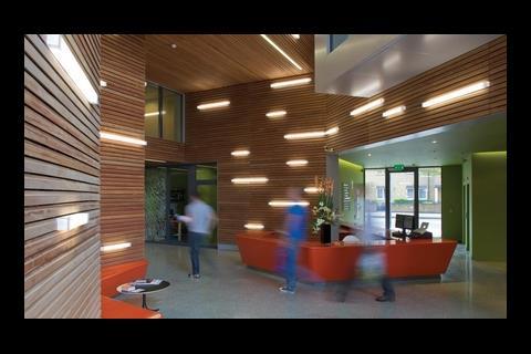
The entrance to the apartments and office units is inside the square, where the two buildings join, and it is the most welcoming point in the development. With a ceiling at second-floor height, it is clad in warm timber with imaginatively-placed wall lighting and sleek red furniture designed by Dive.
Munkenbeck + MarshallŌĆÖs masterstroke here has been to have a window looking in from the first floor of the commercial building opposite one looking in from the residential block. From the residentsŌĆÖ lobby at first-floor height, you can see right across the office floor to the windows beyond. It is a neat, sculptural way of linking the two buildings.
The two architects worked together on the shared interiors of the residential building, and the result is a youthful feel. The corridors on each of the eight floors have a different colour scheme and patterned carpet, as well as wall-mounted strip lighting that makes it seem more like a hotel than an ordinary housing development.
Munkenbeck + Marshall did the apartments on its own and, though they are hardly spacious, they have bells and whistles to please the young clientele at whom the development is being marketed ŌĆō plenty of storage space, sculptural ceiling-height radiators, and built-in plant holders on the balcony. Flats on the top floor even have their own roof gardens, accessible through a motorised skylight exit.
Although not all of the apartments are sold, the ground-floor units are all let to tenants whose aspirations reflect the young, inner-city feel the developers have aimed for ŌĆō evident from the independent cinema to the upmarket bar and restaurant and independent clothes store.
The building envelope of the hotel is more or less the same as the residential and commercial buildings, save for a roof terrace at first-floor level above the hotel lobby and restaurant. Inside, the hotel has been decorated in a typical boutique style that does not merit much analysis. The main point of interest of the hotel is that it exists. ŌĆ£If youŌĆÖd told me eight years ago that this area of Bermondsey would have a four-star hotel, IŌĆÖd have laughed in your face,ŌĆØ says Roberts. ŌĆ£It shows how far weŌĆÖve come.ŌĆØ
All parties are keen to stress that the square is a work in progress. Marshall says that the vertical steel strips could yet be converted into display cases for large-scale public art, and Roberts says that residents are encouraged to personalise their balconies with furniture and greenery. ŌĆ£If it looks a bit shiny and corporate, itŌĆÖs because we want the community to make it their own space. That will happen as it gets occupied.ŌĆØ
IŌĆÖm not sure it does feel corporate. You only have to spend a bit of time in the square to realise that it is already being populated by the skinny jeans set who trip out of the galleries and shops of Bermondsey Street. But the problem with being cool is that it can sometimes feel a bit, well, cold. Munkenbeck + MarshallŌĆÖs industrial-flavoured buildings, when combined with EastŌĆÖs open spaces and sparse, geometrical furniture, risk putting a chill on a space that is, after all, supposed to welcome residents and visitors.
However, it is testament to the holistic attitude of the scheme that its constituent parts somehow knit together in a way that is not exactly beautiful, but certainly attractive to the urban safarians of SE1.
Downloads
Plan of the square
Other, Size 0 kb
Postscript
For more on Igloo, search
Photographs by Tim Crocker











No comments yet