As for the building itself, it is the antithesis of the slouch-shouldered characters and dreary buildings that inhabit Lowry's paintings. One of the first major buildings to have been totally designed by Michael Wilford since the untimely death in 1992 of his senior partner and mentor, Sir James Stirling, it has that boisterous, brash character that was Stirling's trademark.
However, its bulky, angular, disjointed forms – which look as though they might have been tossed in the air by a rampaging elephant – and its vibrant internal colours go quite a few steps beyond Stirling's designs.
Far from being LS Lowry architecture, this is Beryl Cook architecture. The blowsy forms and lurid colours evoke Cook's plump ladies on the razzle. Yet even if it does not match Lowry's paintings, the extrovert style is not unsuited to the building's function as a lottery-funded people's palace and to its setting in Manchester's Klondike of Salford Quays.
The most roguish aspects of the building hit the approaching visitor full in the face. The entrance canopy is a split cylinder propped up on two giant A-frames and with its flat top surface tilted backwards. Although as massive in form as an Egyptian temple, it is curiously insubstantial, being clad in translucent perforated steel panels.
To one side of the entrance canopy stands a high cylindrical tower, which is likewise clad in perforated steel panels – although these are fixed in diagonal spirals and incorporate large diagonal gashes where panels have been omitted. Behind the entrance canopy, the curving window wall to the main foyer bulges outward drunkenly. Above the eaves rises the polygonal bulk of the main theatre auditorium, which tilts forward like the window wall below.
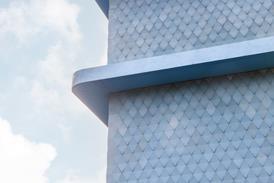
Other than the entrance canopy and cylindrical tower, the entire superstructure is clad in silvery overlapping stainless steel shingles. These are laid at an angle, accentuating the raking forms they enclose.
The site is nearly as dramatic as the building. It is the apex of a sharp promontory that juts out between the Manchester Ship Canal and the longest of the three Salford quays. The building slots neatly into its triangular site so that its extravagant forms and silvery cladding are mirrored in the water on either side.
As the complex progresses away from the main entrance towards the apex of the promontory, it becomes less disjointed and more rational. The two flanks of the buildi ng, enclosing art galleries on one side and a restaurant on the other, are faced in conventional vertical window walls shaded by vertical aluminium louvres.
In pride of place at the tip of the triangle stands the smaller theatre with a rehearsal studio-cum-function space above it.
These two spaces have been formed into a double-decker drum beneath a saucer-shaped roof. Far from being outlandish, this composition is a classic way of finishing off a sharp corner with a flourish.
The building interiors continue in the Beryl Cook vein, but more in matters of colour than form. Lurid purples, lime greens and deep crimsons adorn the internal surfaces – and not just as the odd splash, but covering the entire walls, ceilings and furnishings of both auditoria as well as the foyer spaces. In addition, walls curve and bulge outward crazily, and the upper foyer is covered by a roller-coaster ceiling in bright yellow.
As a relief from the technicolour interiors, the gallery spaces are plain, white-painted cubes. They are topped, however, by saw-tooth rooflights running at an angle to the walls below.
Such a motif harks back to Stirling's first blockbuster, the Leicester University engineering building of 1963. What, then, are we to make of this extravagant if baffling architectural tour de force?
Although Wilford is reticent on the matter, the disjointed forms and crazy angles were no doubt inspired by the abstruse, anti-rational theories of deconstruction that amused academics a decade ago. It is a design that begs comparison with Frank Gehry's instant world landmark, the Guggenheim Museum in Bilbao, and Daniel Libeskind's Imperial War Museum of the North, which is about to start construction on a site directly across the ship canal. The silver Lowry is more chaotic and less curvaceous than the Guggenheim, yet less disruptive than the War Museum with its images of a metal casket ripped open by a bomb.
With or without the theory, the bold sculptural forms and vibrant colours of the Lowry undoubtedly have a strong impact. In any historical city centre they would be wildly disruptive, but in Salford Quays these gross forms have a curious affinity with their surroundings. As Manchester's answer to London Docklands, Salford Quays seems to have created its own gargantuan jelly-mould style combining traditional brickwork, luridly tinted curtain walls and scalloped rooflines.
Salford Quays has never been a place to linger fondly, but the flailing shapes of the Lowry will certainly stick in the memory of visitors bussed in for the occasional musical or comedy. The Lowry is also the archetypal lottery building in form and content. Attracting a total of £64.3m from three of the five lottery funds, it has something for everyone, combining performing, visual and electronic arts in both low and high cultures. As for the building's anarchic architectural form, it expresses perfectly the recklessly optimistic gamble of the lottery itself.
The wild forms of the Lowry will probably never appeal to architectural purists. Ungainly interfaces are inevitable where disjointed forms meet, as in an awkward triangular tuck detail where two sloping wall facets and their trapezoidal stainless-steel cladding panels meet at an angle.
Wilford's architectural vision is also undermined by more practical weaknesses. The perforated stainless-steel panels have tarnished already, giving them an unsightly brown tinge at variance with the bright silver of the solid cladding panels covering the main building. Even more fundamental, and beyond the architect's control, is a crude new multistorey car park for visitors, which has been erected in front of the Lowry's main entrance and makes a mockery of its signature architecture.
Wilford has summed up his design as "a fusion between the monumental tradition of public buildings and the informal, populist image of today's places of public entertainment". Whatever the rationale behind many of the monumental forms, Wilford has created an unforgettable landmark cultural centre on a challenging site. And although it would have offered little solace to Lowry's depressive matchstick men of the 1930s, the building has enough populist pizzazz to appeal to Cook's hedonistic ladies.
��ɫ����TV the project of the millennium
Earlier this month, the Lowry was named the UK’s best millennium project. Peter Roberts, project director of management contractor Bovis Lend Lease, was presented with the top prize of the government’s Celebrating Construction Achievement Awards by construction minister Nick Raynsford. The judges looked for architectural excellence, high-quality construction and an outstanding performance by the team. Bovis was brought in at detailed design stage to complete the project in time for the millennium. The judges were particularly impressed by the following achievements:- Construction is on course for completion to the original deadline of Easter 2000, which was agreed when the £59m contract was signed in December 1996
- The building’s sculptural forms with sloping, undulating surfaces were set out by a system of horizontal and vertical co-ordinates
- Groundworks involved sinking 803 piles and then excavating the basement while concrete diaphragm walls were sunk around it. The unusual sequence of operations obviated the need to de-water the basement, which was 2 m below the canal water level.
- The cladding is overlapping stainless steel shingles with interlocking edges, which were fixed to a plywood backing
- The air supplied in the building is cooled by heat exchangers located in the canal. Zebra mussels were introduced as an eco-friendly purification system for the water. But to prevent mussel larvae from fouling the heat-exchange plates, the water turbulence had to be increased and supply tubes for cleaning fluid had to be incorporated into the system.
Credits
Client The Lowry Trust Architect Michael Wilford & Partners Project Manager Gleeds Management Services Structural and Services Engineer Buro Happold Theatre Consultant Theatre Projects Consultants Museum Consultant Lord Cultural Resources Acoustic Consultant Sandy Brown Associates Quantity Surveyor Davis Langdon & Everest Management Contractor Bovis Lend Lease


