Like Peckham, Oldham has been dogged by chronic urban deprivation – it was the scene of riots by an aggrieved Asian minority last summer – and both local authorities have put their faith in culture and education as catalysts of regeneration.
This coming weekend, Oldham Metropolitan Borough Council unveils a new state-of-the-art gallery. Costing £9m, with 50% funding from the European Regional Development Fund, this is the first phase of an ambitious "cultural quarter" that is planned to include a new library, an adult education centre, a refurbished art gallery and a performing arts centre.
The Oldham gallery is the work of fledgling London-based practice Pringle Richards Sharratt, which rose to prominence with a gallery in Sheffield city centre, completed last spring. Just as Alsop Associates did at the Peckham Library, Pringle Richards Sharratt has designed an upside-down building, with the main public attraction on the top floor. And as at Peckham, this top-floor event is conspicuously signposted by a bizarre architectural form that is quite alien to the Victorian townscape.
The top floor of the gallery takes the form of a huge squashed tube of metal hoops bulging out from the flat walls. This floor is connected by a bridge to the attic storey of Oldham's earlier gallery, a Victorian rough-cut stone building in a half-hearted French chateau style – but it makes not the slightest nod towards it in style, proportions or materials.
This stylistic aloofness is quite deliberate on the part of both architect and client. When Pringle Richards Sharratt first visited the site in 1999, they saw a panoramic photograph of the area in Victorian times. It showed an outlandish forest of brick chimney stacks and gasometers that powered the town's former cotton industry. "We were taken aback by the photograph, and it gave us a lead in our design. We wanted something similar that would be a marker in the sky," recalls director Ian Sharratt.
Another design influence was Antony Gormley's giant Angel of the North sculpture, which had just been completed in Gateshead. "We thought of constructing the tubular top floor using a similar method of steel plate with projecting ribs," says Sharratt. "This would produce a raw structure in the tradition of the industrial chimneys."
A limited budget put paid to the steel-plated attic floor. "But by that time, the client had fallen in love with the shape, and persuaded us to keep it. So we came up with the notion of external balconies beyond vertical walls and set behind curved steel hoops."
Rachel Sharman, the council's project co-ordinator for the cultural quarter development, explains what appealed to the client's project team, which saw itself as serving a multi-ethnic community. "The curved roof is no accident," she says. "We wanted to get away from references to the old library, which was a symbol of pride in the Victorian tradition. We wanted something that would be forward-looking, but would still be accessible to socially excluded groups.
"For instance, at first the architects proposed timber cladding for the lower walls of the building," she adds, "but local people would have found that very odd. In the end, we chose terracotta panels, which refer to the traditional red brick buildings of the area."
Although the architectural styling may be provocative, the overall form of the new building fits remarkably snugly into its surroundings. The client team had in mind a building that would continue on the axis of the existing art gallery at the rear. Instead, the architect came up with an elongated building placed at right angles to the older building, so that it runs through from one side of the city block to the other.
"This arrangement gave us the opportunity to turn the space in front into a forecourt where events could take place," explains Sharratt. "We also argued that the gallery should be able to stand alone, in case future phases of the cultural quarter were delayed or abandoned. And we proposed that a Victorian garden in front should be remodelled with a winding path replacing steps to give disabled access."
In this arrangement, the new gallery stands as the gateway to the planned cultural quarter, facing the main road that runs beyond the existing gallery and Victorian garden. A spacious glazed entrance hall is located at the centre of the elongated building and passes right through it to serve the future library and adult education centre.
The two lower floors of the new building include an exhibition hall, cafe, art stores and offices. From either side of the entrance hall, two large goods lifts whisk visitors to the top floor.
It is on the top floor where it all happens. The visitor arrives in a large hall, which, like the entrance hall directly below, has two clear-glazed external walls. Although useless for hanging paintings, the hall does have two breathtaking attractions – the panoramic views to front and rear. To the front, the view is to the old art gallery and Victorian garden. To the rear, an astonishing vista of the former cotton town unfolds. A carpet of two-storey terrace houses unfurls itself over rolling hills, and out of this erupt, at regular intervals, the redbrick megastructures of the old cotton mills. The entire scene is encircled by the bleak ridges of the Pennines.
At either end of the glazed gallery lies a toplit gallery for hanging paintings. They are generously proportioned beneath a shallow vaulted ceiling. Their main feature is a central ridge skylight, with a boom running directly below to reduce daylight and support uplighters and spotlights.
The gallery is built using modish materials – terracotta cladding panels, clear glazing and exposed fairface concrete. Insitu concrete has been used for internal shear walls, and precast concrete planks for the vaulted ceiling. Environmental controls for temperature and humidity have been designed to national Museum & Galleries Commission standards, which enable the gallery to exhibit precious art collections. By acting as a heat sink, the exposed concrete provides a low-energy method of achieving the MGC environmental standards.
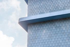
The most novel material in the building is stainless steel mesh, which is supposed to be for plastering but has here been fixed to external steel hoops on the top floor. The mesh makes an attractive diaphanous veil to the top of the building as well as sun-shading to the top gallery. The question is whether it will stay that way or whether, over the years, it will attract wind-blown litter, dust and pollution, which could be difficult to clean off and end up looking particularly scruffy in this high-profile position.
One of the most exhilarating components of the project is the artworks that have been commissioned for it. Most prominent of these is a large modern chandelier that hangs as a centrepiece in the entrance hall. Five giant test tubes, in honour of the world's first test-tube baby – born in Oldham – radiate the colours of the rainbow and serve as a beacon for the new cultural quarter.
Local response to the smart new gallery seems to be remarkably positive, with an elaborate opening parade planned for this weekend. "The gallery appears to have caught people's imagination," says Sharman. "They are very modest people round here, and they are quite touched that this is for them. The building could well have been a target for vandalism, as it lies close to the Glodwick district, which saw some of the worst disruption last year. But there wasn't even graffiti on the site hoarding."
Downloads
Oldham’s culture quarter
Other, Size 0 kb
Credits
client Oldham Metropolitan Borough Council architect Pringle Richards Sharratt structural and services engineer Arup quantity surveyor Davis Langdon & Everest landscape architect Camlin Lonsdale Landscape Architects public art consultant The Art Department management contractor Mowlem Management








No comments yet