Franklin + Andrews: Swiss Re tower
Mini-Re
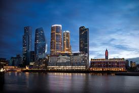
Mike Greenland, an associate of QS Franklin + Andrews, and Simon Rogers, associate director of Franklin + Andrews' project management arm Osprey PMI, picked Lord Foster's Swiss Re tower. Unlike Norm's unmistakable gherkin-shaped edifice, this mini-Re cleared planning hurdles swiftly and was soon rising majestically. The basic structure was completed quickly by sticking a bottle into a cardboard box, giving the team time to lavish attention on the detailing, including a final touch: a small torch to light the tower from inside, immediately proving that skyscrapers really do look better at night. A minute fir tree completed the festive scene.
Still, mini-Re was drawing admiring remarks from the crowd. "Imagine if that was the Mayor's seat," one of the Jestico + Whiles team commented as the mighty tower rose from the ground. "He'd definitely have more fun."
Close, but no cigar.
Team 2:
Jestico + Whiles: GLA headquarters
Festive Foster
Another Foster creation, the headlamp-shaped Greater London Authority headquarters, was the choice of the Jestico + Whiles team, which consisted of architects Ben Marston and Frank Reynolds and associate James Dilley. "It seemed like the most fun," said James, enthusiastically. The fastest and most cost-efficient way of recreating the building's unique shape was for Frank to wrap James' head in cling film, but ultimately this proposal was abandoned in favour of more traditional techniques, possibly because of concerns over the internal space. The challenge of Foster's design was rapidly evident. "As it's not modular, the pieces are unique," James explained, "so we've got to put together each one individually." Ben was put to work cutting ovals out of cardboard for the individual storeys.
As bubble wrap replaced high-performance glass in this bold interpretation of the building, solar gain is reduced by the addition of Santa's hat. "You did ask for a festive touch," Frank said.
Team 3:
Fluid: Imperial War Museum North
A mint Imperial
The brave lads from multidisciplinary consultant Fluid opted for the most difficult job of the lot: the curved lines and sharp edges of Daniel Libeskind's Imperial War Museum of the North, now almost complete in Salford. Director David Crookes was unfazed, however, as he was accompanied by architectural engineer Ahmet Ucakan. "If we lose, he gets the blame," he explained, chirpily.
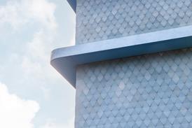
Both became excited at the discovery of a roll of baking foil, and began to explore it as an alternative to the museum's sleek aluminium cladding. It was later rejected, however, in favour of ��ɫ����TV's own pictures of the museum's sleek cladding. Thus, in one fell swoop their model had the honour of becoming the first building ever to be clad in pictures of its own cladding. Explaining his choice, David said he had found the foil "too garish". But he displayed the typical engineer's pragmatism: "If it looks crap, we'll clad it in baking foil."
Team 4:
Techniker: Gateshead Millennium Bridge
Blinkin' brilliant
Megan McLaurin, project director of engineer Techniker, and Stephen Foster, a project engineer, leapt at the chance to outdo spanmeister Wilkinson Eyre's winking Gateshead Millennium Bridge. So confident were they that they decided to make their bridge operational, tilting to allow ships to pass along their tiny Tyne. "We're optimistic," said Stephen as construction progressed. "It's tight, but we can do it."
As the steel arch (formerly a coathanger) and the curved cardboard deck came together, tension mounted. "We're not there yet," Stephen said as the polystyrene bascules were put into place. "We've still got the hydraulic machinery to put in."
Careful early planning paid off, however. The bridge's tilt went like a dream, and the first cardboard pedestrians went across to the sound of champagne corks popping.


