Penoyre & Prasad is giving GuyŌĆÖs Hospital Tower ŌĆō a brutalist eyesore in central London ŌĆō a new ┬Ż25m facade. But, says Ike Ijeh, it will take more than a clever bit of cosmetic surgery to turn this one into a looker
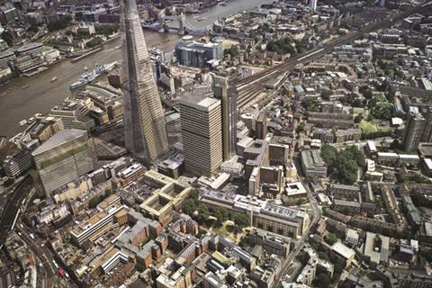
GuyŌĆÖs Hospital Tower is a demented slab of brutalist concrete that has been terrorising staff and patients since 1974. Once the tallest hospital in the world, in 1991 it was beaten into second place by a mere two metres when Cesar PelliŌĆÖs OŌĆÖQuinn Medical Tower opened in Houston, Texas. But in London its reign of intimidation proceeds unhindered and along with the Barbican and Southbank Centre, it ranks as one of the capitalŌĆÖs foremost brutalist bullies.
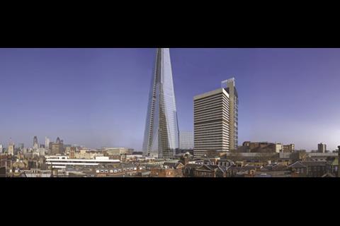
Up until a few years ago London Bridge, where the hospital stands, was overlooked by a squalid gulag of vacuous modernist high-rises. Southwark Towers was a gaudy morass of sub-Manhattan bling and New London Bridge House resembled a 29-storey site hut. But even half-complete, the purging properties of the Shard have been astonishing. GuyŌĆÖs Hospital Tower is now the only one of the terrible trio left and it sulks in awkward isolation while its svelte new neighbour surges relentlessly towards the skies.
Ironically, the potential turning point in the hospitalŌĆÖs fortunes came at the towerŌĆÖs most vulnerable point. In 2008 a feasibility study into the fabric of the building was commissioned by the GuyŌĆÖs and St ThomasŌĆÖ NHS Foundation Trust. It revealed severe deterioration of the towerŌĆÖs concrete facade, failing windows and chronically inefficient environmental performance.
In the same year architect Penoyre & Prasad was appointed to perform the emergency surgery the tower so desperately needs. After a public exhibition held late last year, a planning application has recently been submitted and, if approved, the towerŌĆÖs new ┬Ż25m facade will be in place by mid-2013 - just a few months after completion of the Shard.
Although the architectŌĆÖs brief extends only to renovating the external facade of the tower, it coincides with a rolling programme of piecemeal refurbishment that is under way internally. This in turn forms part of Vision 2020, a comprehensive estate renewal masterplan that will see the extensive upgrading and replacement of facilities throughout the hospital grounds.
But the GuyŌĆÖs Tower facade is undoubtedly the catalyst within this ambitious renewal. Crucially, it is the only element of the hospital to wield a visual townscape impact far beyond the confines of its campus. So a huge amount depends on Penoyre & PrasadŌĆÖs proposals. Not only does it aim to revitalise the physical fabric of a sickly building but it holds the redemptive promise of exorcising one of LondonŌĆÖs bleakest eyesores.
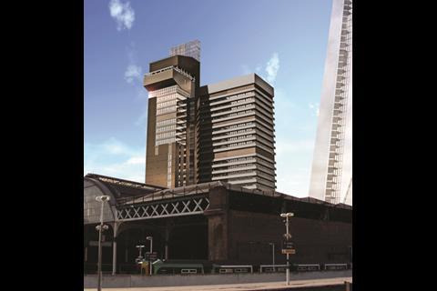
Although GuyŌĆÖs Hospital was founded in 1721, its tower was designed by Watkins Gray Architects in the late sixties. It actually comprises two towers joined by a bridge link that spans each floor. The main tower is the shorter and larger and now houses research and clinical accommodation. The 34-storey service tower stretches to 143m and contains vertical circulation and ancillary space. Its chamfered roof and cantilevered prow are the result of the lecture theatre perched incongruously at its peak.
Horrifically, we may well have been saddled with multiple main towers had initial plans been carried out. The service tower was conceived as a nucleus designed to feed a series of identical blocks flanked around it, not just one. Mercifully this dystopian chimera was never realised but the empty lift shafts within the service tower provide eerie testimony to how close it came.
But despite the tower being a high-rise structure it is a relatively efficient building. Hospitals traditionally occupy low-rise ŌĆ£groundscraperŌĆØ structures to optimise the ratio between floor-plates, circulation and services. However, by separating circulation from accommodation and providing unencumbered floor-plates of 1,200m2, the main tower is able to achieve an impressive level of efficiency for a high-rise building.
Its deteriorating facade is a different matter, however. On the service tower, extensive spalling is painfully evident on many areas of concrete leaving gaping gaps across the envelope. To make matters worse, its in-situ construction has made remedial work difficult. The trust has estimated that, if allowed to degrade at its current rate, extensive repairs would be needed at least every six months, an untenable long-term solution. Although the balconies wrapped around the main tower are pre-cast concrete and in reasonably good structural condition, they too have become badly stained, further corroding the towerŌĆÖs already caustic impact.
Penoyre & PrasadŌĆÖs strategy is three-fold: a new aluminium skin for the service tower, extensive cleaning of the pre-cast concrete panels on the main tower and - most significantly - the replacement of the main towerŌĆÖs windows with a new glazed and aluminium skin.
Project architect, Neil Allfrey, describes the proposal as a new ŌĆ£jacket for the towerŌĆØ. The interconnecting bridge link, destined to be re-clad in curtain wall glazing, is reconfigured to ŌĆ£reconnect with the city and accentuate the fact that the tower is one whole made of two distinctive partsŌĆØ.
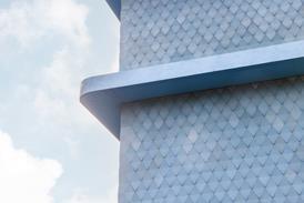
On the service tower the new cladding will certainly make for a less desolate surface than the concrete straitjacket it resembles today. ŌĆ£Profiled aluminium sheets will be folded and anodised to provide variations in texture and different interplays of light, all of which will emphasise its verticality,ŌĆØ says Allfrey. The service tower will be surmounted by a steel and light sculptural installation by artist Carsten Nicolai. This is envisaged as a cultural emblem for the institution but should also wrest the title of worldŌĆÖs tallest hospital back from Houston.
But the most innovative and ambitious remedy is saved for the main tower. The new glazed and aluminium skin will be fixed to the outer face of the existing concrete column structure. Not only will this provide an independent thermal envelope but it will enable windows behind the ŌĆ£outerŌĆØ skin to be replaced incrementally in conjunction with phased internal refurbishment. Furthermore, windows in what will become the ŌĆ£innerŌĆØ skin can be replaced when necessary without compromising the towerŌĆÖs thermal integrity.
Project director Dan Cossins of Arup, which is providing integrated consultant services from project management to structural design, describes this solution as one that ŌĆ£minimises fixings, minimises construction and causes the least amount of noise and disruptionŌĆØ. The new facade will also provide environmental benefits, saving 18% of the towerŌĆÖs total energy consumption. Cossins describes the cladding as ŌĆ£the lowest possible embodied carbon solutionŌĆØ.
These refurbishment proposals are undoubtedly a subtle and sophisticated series of interventions that are very likely to satisfy the trustŌĆÖs intentions of extending the towerŌĆÖs lifespan by an additional 30 years. The technical and environmental benefits are considerable and, crucially, the cladding strategy has the flexibility to allow future refurb to take place internally and to enable full hospital operation during construction.
Contractual arrangements also appear sensible and the single appointment model, which involves a concentration of consultant roles solely under Arup, reduces the clientŌĆÖs project management burden and increases accountability.
The proposed architectural solutions appear to be characterised by a genuine determination to humanise the towerŌĆÖs nihilistic impact. The introduction of a perforated variation of the service towerŌĆÖs new aluminium cladding at the base of the main tower, woven into HeatherwickŌĆÖs seminal Boiler Suit beside it, is probably the most convincing visual proposal.
However, no matter how sophisticated the proposals may be technically, they cannot obscure the fact that this will only ever be a cosmetic makeover that fails to address the fundamental problems created by the original architecture. GuyŌĆÖs Tower will remain an insensitive monolith whose scale, massing and articulation is completely at odds with its local and wider urban context.
Whereas the Shard is tapered and translucent, GuyŌĆÖs Tower is the exact opposite - a belligerent vertical barricade that segregates rather than unifies the city. Cleaning the balconies on the main tower may well help soften its superficial impact. But the change two its overall appearance, particularly when viewed from a distance or from the ground, will be negligible.
These acute conditions irresistibly lead towards the only convincing solution: demolition. This was considered by the design team in the early stages of the project. But as Chris Moriarty-Baker, programme manager for the GuyŌĆÖs and St ThomasŌĆÖ NHS Foundation Trust explains: ŌĆ£Demolition was just not feasible as it would not have been possible without significant decanting and relocation of much of the hospital to another site.ŌĆØ But prioritising these concerns above all others means condemning cities to a state where they can neither evolve nor improve.
John Keats claimed that a thing of beauty is a joy forever. It will take much more than cosmetic surgery before GuyŌĆÖs Hospital Tower comes close to being either.
’╗┐All dressed up: high-performance cladding
’╗┐Remedial work to the service tower will be carried out over three stages. First, the spalling concrete on the wall will be stabilised and cleaned. A high-performance thermal layer will then be applied - this is a layer of insulation fixed to the outer face of the repaired concrete wall. The final stage will be the addition of a rainscreen cladding, which will form the new external envelope. This last is a bespoke folded aluminium profile with an anodised finish. The aluminium panels will be fixed to the facade by support rails and separated from the thermal insulation layer by a void. The void will be subdivided by fire barriers at each floor to comply with fire regulations.
Any damaged concrete on the main tower will also be repaired. A high-performance thermal layer will also be applied to the outer face of the concrete columns behind the balconies. It will be separated from the existing structure by a shallow void. This will act as a thermal sleeve that will minimise thermal bridging. The new layer here will be curtain walling consisting of glazing and flat-profiled anodised aluminium facing.
Thermally broken frames will be applied to the argon-filled glazing units and the aluminium panels will be finished in varying colour tones to mimic the current bay and column configuration. The glazing will use solar selective glass in order to minimise solar gain and optimise orientation. Where glazing abuts internal walls, an internal frit will be applied to conceal exposed blockwork ends. The frits, however, can be removed in conjunction with future internal refurbishment programmes.











No comments yet