Within spitting distance of the notorious Chelsea Barracks site is this startlingly modern block of flats by Make Architects. Yet, so far, the good burghers of Belgravia havenŌĆÖt uttered a word against it. And nor has you-know-who. WhatŌĆÖs going on?
The saga of Richard RogersŌĆÖ Chelsea Barracks scheme may have led you to conclude that the residents of SW3 will accept nothing but neoclassical pastiche in their backyard. That assumption has been shattered by none other than Ken Shuttleworth, whose firm Make has just signed off a couple of blocks of flats at Grosvenor Waterside, a stoneŌĆÖs throw from the now notorious site on the Chelsea Bridge Road.
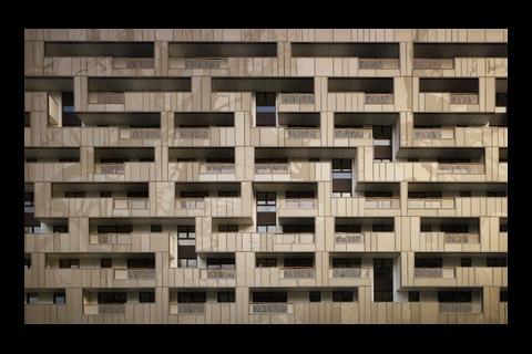
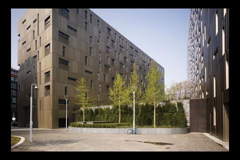
There are no doric columns or Palladian arches on MakeŌĆÖs new buildings. In fact, with its gold-hued aluminium panels and the Tetris-like rhythm of its balconies and windows, the scheme could lay claim to being as modern a design as that so reviled by the opponents of Chelsea Barracks. But neither Prince Charles nor the Belgravia Residents Association have voiced the least indignation. Who said you canŌĆÖt do contemporary architecture in Chelsea?
MakeŌĆÖs buildings, Bramah House and Woods House, are the most recently completed units at Grosvenor Waterside, a large riverside development led by Berkeley Homes subsidiary St James and masterplanned by Broadway Malyan. Three buildings by Allies and Morrison and Twigg Brown have already been completed. MakeŌĆÖs buildings are the next, and a sixth development designed by Sheppard Robson is approaching completion. A seventh is planned for an empty site facing Ebury Road, and the architect of that one will no doubt have to address whatever ends up being designed for the Chelsea Barracks site on the other side of the road.
Although no architect splits the publicŌĆÖs opinion like Rogers, among architects one man is at least as divisive. Ken Shuttleworth is the marmite of architecture. Speak to one of his peers and they will tell you he is overrated; speak to another and theyŌĆÖll say heŌĆÖs one of the few architects bringing a splash of individuality to a crowded market. There may be more than a bit of envy, here, too: although it has been hit by the recession, Make built up a turnover of ┬Ż22m and more than 100 employees in less than five years, and did it by designing buildings like these.
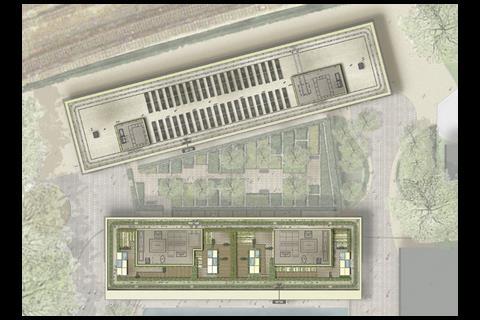
Bramah House, which contains 103 market properties, faces a lock in the centre of the St JamesŌĆÖ development. Behind it sits Woods House, which has 196 affordable units, overlooking the train tracks leading into Victoria station. Whereas Bramah is oriented along the quayside, Woods nestles up against the tracks, meaning that there is a triangle of land between them. On here, St James has built a one-storey health club with a garden on top for residents of Bramah House. In Chelsea, no piece of land can be wasted.
In Chelsea, you see the influence of architect Charles Voysey. ThereŌĆÖs always been that side to it as well as the brash, champagne-drinking side
Ken Shuttleworth, make
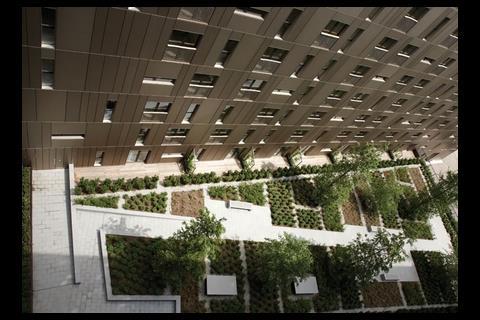
Bramah House has, on its western elevation, a fairly simple yet striking architectural conceit. Instead of having a building envelope with balconies and windows protruding from it, the external elements puncture the box. This allows more balcony space and gives greater prominence to the decorative cladding panels. Make has worked with artist Clare Woods to illustrate the facade with shadowy patterns (see images), and the disordered rhythm of the openings resemble a puzzle. Although the mosaic on the panels looks complex, there are only four shapes. The balconies have been finished with machine-cut balustrades and wooden handrails.
Make says this buildingŌĆÖs language was inspired by the arts and crafts movement. ŌĆ£If you look around Chelsea,ŌĆØ says Shuttleworth, ŌĆ£You see the influence of [architect and designer Charles] Voysey. ThereŌĆÖs always been that side to it as well as the brash, champagne-drinking side. The panels, the balconies, and especially the wood balconies help lock the building into that tradition.ŌĆØ Project architect Stuart Fraser adds that the pieces of wood ŌĆō which are weathered like driftwood ŌĆō were sourced from Cornwall. ŌĆ£ThereŌĆÖs only one bloke in the whole country who does them,ŌĆØ he says.
Although the cladding gives it a sense of refinement, Bramah House is still a hefty building. At the western side, it meets the ground with a series of eight double-height arches in front of a colonnade with stairs down to the waterŌĆÖs edge. It is here that the bulk of the building is at its most overpowering. Although St James hopes that members of the public will sit here and relax by the waterside, it is unlikely they will feel all that comfortable doing so.
The interiors of the building are decked out in dark pine and thick brown carpets and give you the impression of being in a sports car. Even without furniture they feel small, although this is mitigated by the balconies.
You would think that people wealthy enough to afford one of these flats might want a bit more space for their money, but apparently not. In a quirk of fate even Lord Rogers might chuckle at, Chelsea Barracks developer Qatari Diar has bought the apartments in bulk from St James. They made it into Chelsea eventually, it seems.
In a quirk of fate even Lord Rogers might chuckle at, Chelsea Barracks developer Qatari Diar has bought the apartments in bulk from developer St James
But why is it that the man behind the Gherkin got away with building flats in ChelseaŌĆÖs back garden while the man behind the Millennium Dome failed so spectacularly? Paul Pritchard, St James development director for Grosvenor Waterside, says it is difficult to compare the schemes. ŌĆ£WeŌĆÖve been careful to knit the development as a whole into the environment. While weŌĆÖve been reverential to the surrounding areas, we were able to encourage a modern idiom with MakeŌĆÖs building because of its siting.ŌĆØ In other words, it is well hidden from Chelsea residents wielding flaming torches. In fact, you cannot see MakeŌĆÖs buildings from Ebury Bridge Road ŌĆō they are more visible from the other side of the river, where Shuttleworth says you can see the sun hit its facade.
The teamŌĆÖs relationships with the notorious residents groups ŌĆō none of whom were prepared to comment on Grosvenor Waterside ŌĆō were positive, he says. ŌĆ£WeŌĆÖve been considerate, and we feel weŌĆÖve won the localsŌĆÖ trust. The scheme has been running for eight or nine years now, and itŌĆÖs been a positive relationship.ŌĆØ
It cannot be denied that MakeŌĆÖs buildings make less of a statement of wealth than RogersŌĆÖ fancy apartments for Chelsea Barracks, and the opposition to that scheme was to do with the ostentation of the design as much as anything else. Despite its modernity, the Make scheme is more humble and the champagne-tinged glow of the cladding panels is in fact quite attractive.
And it must have something to do with Shuttleworth himself. Whatever you might think about his architecture, MakeŌĆÖs founding director is without doubt one of the canniest salesmen in the industry, having successfully marketed a particular brand of off-the-wall design to commercial clients who might otherwise baulk at pointy angles, bright colours and geometric facades. If heŌĆÖs done that by dumbing down to suit the more risk-averse end of the British construction industry, then more power to him. There are plenty of architects out there designing cutting-edge buildings that will not be built.
Although this building is not as wacky as some of MakeŌĆÖs back catalogue, it is still very much in the love-it-or-hate-it category. Critics will carp about the treated aluminium facade, the odd bits of machine-engineered ŌĆ£individualityŌĆØ and the sheer bulk of the thing. But it pays homage to MakeŌĆÖs ingenuity ŌĆō perhaps more as a business than as an architect. The fact that it managed to build this building in the heart of Chelsea without a squeak of complaint is testament to the palatable nature of MakeŌĆÖs modernism.
Art on a grand scale
Completed in June this year, the Bramah House element of MakeŌĆÖs Chelsea scheme is a ŌĆ£canvasŌĆØ of phenomenal scale. Artist Clare Woods, who worked closely with public art consultant Futurecity on the project, took inspiration from photos taken of the surrounding buildings, railway, dock and trees, in order to unlock the character of the place. These were turned into drawing, blown up in scale and then transposed onto the facade through a process of etching onto its anodised aluminium panel (left). Dressed in this two-tone panelling, the building responds to changes of natural light as it hits different areas on its surface throughout the day. Mark Davy, founder of Futurecity, says standalone public sculptures are becoming less relevant, as developers begin to embrace ŌĆ£embedded artsŌĆØ ŌĆō that is, the cohesion of the designed object with its surrounding environment. Futurecity encourages architects to bring in artists during the preliminary stage of the design. Woods was brought in before the foundations were built, and worked right through to the manufacturing of the panels. She says: ŌĆ£It was hard to keep the vision going for so long. I worked on the project since 2004. As an artist, IŌĆÖm used to working a lot faster. But it was an amazing experience to have a piece of work made at that scale. There is definitely a lot more scope for artists, designers and architects to collaborate.ŌĆØ
Laura Chan









No comments yet