When youŌĆÖre building a hotel for the young and fabulously wealthy, bronze cladding may not sound excessive, but it was still proving beyond the means of the team behind the DorchesterŌĆÖs new extension project - until they discovered a spray-applied alternative ŌĆ” ║├╔½Ž╚╔·TV reports
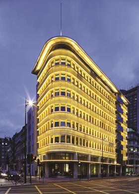
The Dorchester may be one of LondonŌĆÖs top hotels but, like most of its upper-crust rivals, it screams ŌĆ£old peopleŌĆØ the minute you walk through the door. Aware that some young people can also afford to stay in a top-end hotel, the Dorchester decided it wanted to fill this gap in the market. When a tired sixtiesŌĆÖ office block came up next door, it engaged New York architect and interior designer The Office of Thierry W Despont and London-based executive architect Paul Davis + Partners, and seized the opportunity.
ŌĆ£The brief was that it had to be the hotel of choice for the younger generation of the worldŌĆÖs 100 richest families, so it had to be modern and fresh,ŌĆØ explains Andrew Davidson, managing partner for Paul Davis & Partners. Unfortunately the single-glazed, precast concrete building was anything but. ŌĆ£It was pretty nasty,ŌĆØ says Davidson. ŌĆ£The idea was to transform it into something glamorous and exciting that reflected the art deco character of the Dorchester.ŌĆØ
The team has made an admirable job of converting the building into a hotel that reflects the thirties feel of its illustrious neighbour. It has an industrial aesthetic, created by wrapping prominent brise-soleils around the curved end of the building, making it reminiscent of a radiator grille. The Park Lane side of the building has a vertical stack of balconies with a sculptural bronze facing that looks like water rippling up the side of the hotel.
These balconies fulfil Westminster councilŌĆÖs planning requirement for the project to include a work of public art. ŌĆ£They envisaged a large-scale piece of public art to add a special emphasis to the facade and create something attractive and be a talking point,ŌĆØ explains Davidson.
Unfortunately, the polished cast bronze needed to face the balconies and create the rippling effect was going to cost over ┬Ż1m. The team turned to a technique called ŌĆ£repouss├®ŌĆØ, where flat metal sheets are beaten into the required shape. A metalworking firm called Les Metalliers Champenois was identified to do the work and created a prototype panel, but according to Davidson it was still going to cost a budget-busting ┬Ż500,000-┬Ż600,000.
The team looked for a cheaper alternative. The answer came in the form of a patented process called LuminOre from a firm of that name in California. LuminOre is a process whereby metal particles are cold spray applied to a base material. A polymer binds the particles together to create a metal surface just 0.25mm thick, which can be given the usual treatments such as polishing or acid etching.
The system would cost a far more agreeable ┬Ż315,000 to create 24 balcony facing panels. But would the planners accept it? ŌĆ£Having got planning consent for cast bronze they had to be convinced it was the right technique,ŌĆØ says Davidson. A sample was prepared and unveiled at a planning meeting. ŌĆ£They were very happy with it,ŌĆØ he says.
To make the panels, glass-reinforced plastic was used to create a C channel shaped frame, which was then embedded into a 100mm-thick piece of polyurethane foam. The panels vary in size from 1.9m x 1.5m up to 3m x 2.7m. Three-dimensional digital models of the panels, created by a Brooklyn-based firm called Situ Studio, were used to drive a computer controlled cutter, which shaped the polyurethane foam into a rippled surface. A coat of urethane was applied over the foam, then a layer of nickel silver alloy was cold-sprayed over the coat. This was sanded, polished and protected with a coat of clear lacquer to stop the panels from ageing.
Another advantage of the panels is that they weigh only 40kg/m2, which means they can be attached to the main floor slabs easily. Panel transport, scaffolding and fixing cost another ┬Ż190,000.
Before the panels were installed, the old single-glazed window were taken out and the precast concrete cleaned. New Sch├╝co double-glazing units were installed and the building was insulated on the inside. The insulation was extended over the floors and soffits by a metre to tackle the cold bridge created by the slabs.
The sleek industrial look comes courtesy of the brise-soleil system. Davidson says the only firm that could create the seamless curve at the end of the building was Levolux. A further flourish is provided by yellow LEDs, which illuminate the building at night.
This young, modern building could also spell the renaissance of an unfashionable cladding finish. The team had to remove the cladding to the rear of the building, which they assumed to be precast concrete, but turned out to be blockwork with a pebbledash finish. They took the decision to recreate this look, as it cut out the long lead times needed for precast. The cladding uses render applied over expanded metal lathing, with pebbledash dry-applied. So not only does the Dorchester have new-found youth appeal, itŌĆÖs got the common touch too ŌĆ”
Project team
client The Dorchester Collection
designer The Office of Thierry W Despont
architect Paul Davis + Partners
main contractor Kier Wallis
planning consultant Gerald Eve
engineer WSP
project manager Buro Four
fabrication consultant Situ Studio
fabricator LuminOre
lighting design Schwinghammer
facade lighting Spanlite








No comments yet